Computing Foundations › Systems Foundations: Storage, Observability, and Tooling › Day 40
Day 40: Observability: Logs, Metrics, Traces, and Dashboards
After this lesson you will be able to explain how a running system reports what it is doing through logs, metrics, and traces, compute a real percentile from raw latencies, and reason about dashboards, alerting, sampling, and cost — the literacy you will reuse to instrument every service you build.
Hands-on lab for this lesson
Lab files on GitHub: https://github.com/ai-roadmap-365/ai-roadmap-365.github.io/tree/main/labs/sections/computing-foundations/day-040-observability-logs-metrics-traces-and-dashboards
- Get the hands-on files. Clone the labs repository once (you can reuse this clone for every lesson). This works on macOS, Linux, and Windows (PowerShell or WSL):
git clone https://github.com/ai-roadmap-365/ai-roadmap-365.github.io.git cd ai-roadmap-365.github.io - Open this lesson's lab. Move into the directory for this specific day. Every lab lives at the same predictable path — section / subsection / week / day:
cd labs/sections/computing-foundations/day-040-observability-logs-metrics-traces-and-dashboards - Read the lab guide. Open `README.md` in that directory. It lists the exact commands, what each does, the expected output, and how to check your work — read it before running anything.
- Run it and check your work. Follow the README's "How to run" section: run the example first to see the finished result, then complete the numbered exercises in `starter/`, then run the tests. The tests pass (exit 0) only when your work is correct.
bash tests/run_tests.sh # or the test command named in the lab README
You can also open the lab as a local page (works offline, shows the file tree and expected output).
Learning objectives
By the end of this lesson you will be able to:
- Explain the three pillars of observability — logs, metrics, and traces — and the distinct question each one best answers
- Distinguish structured (JSON) logging from plain text and state why structure makes signals answerable at scale
- Identify the three metric types (counter, gauge, histogram) and compute a rate and a p95 percentile from raw values by hand
- Describe how a trace follows one request across services as nested spans sharing a trace ID
- Explain dashboards, alerting on symptoms rather than causes, and SLIs/SLOs at an introductory level
- Distinguish monitoring (predefined questions) from observability (asking new questions), and reason about sampling and telemetry cost
Prerequisites
- Day 6 and Day 7 (operating systems and processes) — what a running program and its output are
- Day 14 (logging in automation) — the idea of a program writing records as it runs
- A terminal with bash and python3 (both preinstalled on macOS and Linux)
Why this matters
Sooner or later a system you built will misbehave in production — a page that loads in two seconds for you takes thirty for a user in another country, a background job silently stops, a bill arrives triple what you expected. When that happens, you have exactly two options: guess, or look. Observability is the discipline of always being able to look. It is the difference between “I think it might be the database” and “requests to the database jumped from 20 milliseconds to 4 seconds at 14:32, and here are the ten slowest ones.”
This matters for your path into AI more than almost any other systems topic, because the systems you will build are unusually hard to reason about from the outside. An AI feature can be slow, expensive, and wrong all at once, and none of those failures throws a neat error. A model call that costs a fraction of a cent per request is invisible until you multiply it by a million requests and open the invoice. A response that takes six seconds instead of one drives users away, but only if you measure it. A pipeline that retrieves the wrong documents produces confident, plausible, incorrect answers — the most dangerous failure of all, because nothing crashes. You cannot fix what you cannot see, and you cannot improve what you do not measure.
The engineers who stay calm during an outage are not smarter than everyone else; they have instrumented their systems so that the answer is already recorded somewhere, waiting to be queried. Today you build the mental model behind that calm: the three kinds of signal every running system can emit, how they combine into dashboards and alerts, and the concrete practice of turning raw events into numbers you can act on. By the end you will have built a tiny observability pipeline by hand, from plain log lines to a percentile latency, so that the tools you meet later are never mysterious.
The idea in plain language
A running program is a black box. From the outside you see inputs going in and results coming out, but the interesting part — what it did, how long each step took, what went wrong — happens invisibly inside. Observability means deliberately making the inside visible by having the program emit signals as it runs, and then collecting and reading those signals.
There are three classic kinds of signal, often called the three pillars. Logs are timestamped records of individual events: “at 14:32:07 a request for user 91 finished in 240 milliseconds.” They are the diary of the system, one line per thing that happened. Metrics are numbers measured over time: the count of requests per second, the fraction that failed, the memory in use. Where a log describes one event, a metric summarizes many events into a number you can chart. Traces follow a single request as it travels through the system — through the web server, the database, an external service — recording how long each hop took, so you can see exactly where a slow request spent its time.
None of these is exotic. A log line is just text written to a file. A metric is just counting or timing and reporting the total. A trace is just logs that agree to share an identifier so you can stitch them back together. The skill is not in the machinery; it is in emitting the right signals, in a structured form, and then asking them good questions.
Historical background
System logging is nearly as old as multi-user computing itself. On Unix systems the syslog facility, written by Eric Allman in the early 1980s as part of the Sendmail project, gave programs a standard way to record events with a severity level and a category; it became so widespread that it was eventually formalized as an internet standard (RFC 3164, later RFC 5424). For decades, “monitoring” mostly meant scraping those text logs and watching a handful of gauges — CPU, disk, memory — with tools such as MRTG (1995) and later Nagios (1999) sounding an alarm when a threshold was crossed.
Two shifts changed the picture. First, systems stopped being single machines. Through the 2000s and 2010s, applications were split into many small services running across fleets of servers, so a single user request might touch a dozen programs on a dozen hosts — and no one log file told the whole story. Google’s 2010 paper on Dapper, its internal distributed-tracing system, described how to follow one request across services by propagating a shared identifier, and directly inspired the open-source tracers that followed. Second, the numbers themselves became a first-class product: the Prometheus project, started at SoundCloud in 2012 and later donated to the Cloud Native Computing Foundation, popularized pulling numeric time-series metrics from every service and querying them with a purpose-built language.
The word observability itself is borrowed from control theory, where Rudolf Kálmán defined it in 1960 as the degree to which a system’s internal state can be inferred from its external outputs. Around 2016–2018 the software industry adopted the term to name the goal these tools were reaching toward, and to distinguish it from older, narrower “monitoring.” In 2019 two competing tracing standards, OpenTracing and OpenCensus, merged into OpenTelemetry, giving the field a single vendor-neutral way to emit all three signals. That is the lineage you are stepping into: forty years of making the black box less black.
What it is — and what it is not
Observability is a property of a system: the extent to which you can understand what is happening inside it purely from the signals it emits, including questions you did not think to ask in advance. A system is observable if, when something surprising happens, you can investigate it with the data already being collected — without shipping new code, adding a print statement, and waiting for the problem to recur.
Every word of that carries weight. Purely from emitted signals: you are not attaching a debugger to a live production process; you are reading logs, metrics, and traces it already produces. Questions you did not think to ask in advance: this is the line between observability and mere monitoring, which we return to shortly.
It is equally important to say what observability is not. It is not a specific product you buy, though many are sold. It is not “having lots of logs” — a firehose of unstructured text you cannot query is noise, not visibility. It is not the same as testing, which checks behavior before release; observability watches behavior after release, in the real world, under real load. And it is not free: every signal costs something to produce, transmit, and store, so a real system is always a deliberate trade-off between how much it can see and how much that sight costs.
| Common misconception | The reality |
|---|---|
| ”We have logs, so we’re observable.” | Unstructured logs you cannot search or aggregate give little insight; structure and metrics are what make signals answerable. |
| ”Observability is a tool we install.” | It is a property of the system earned by instrumenting it well; tools help, but bad instrumentation is invisible with any tool. |
| ”Monitoring and observability are the same thing.” | Monitoring answers questions you defined in advance; observability lets you ask new questions after the fact. |
| ”The average response time looks fine, so users are happy.” | Averages hide the slow tail; the p95 and p99 (the slowest 5% and 1%) are what real users actually feel. |
| ”More signals are always better.” | Every signal has a cost; past a point, more data means higher bills and harder searches, not more insight. |
Why it was created and what problems it solves
The core problem is simple to state and brutal in practice: production is not your laptop. In development you have one request at a time, a debugger, and the ability to add a print statement and run it again. In production you have thousands of concurrent users, code you cannot pause, failures that happen once in ten thousand requests, and a problem that vanished by the time anyone looked. The old debugging loop — reproduce, inspect, fix — breaks down when you cannot reproduce and cannot inspect.
Observability solves this by moving the inspection earlier: you instrument the code once, so that when the rare failure happens, the evidence is already recorded. It solves the scale problem by turning thousands of events into a handful of numbers you can watch on a chart. It solves the distributed problem with traces that reassemble one request’s journey from fragments scattered across many machines. And it solves the human problem of not being able to stare at everything at once, by letting you define alerts that call you only when something crosses a line that matters. In short, it converts “we have no idea why it broke” into “here is exactly what happened, at what time, for which users,” which is the entire game when a system is down and money is leaking.
How it works
Let us walk through each pillar concretely, then see how they feed dashboards and alerts.
The three pillars
Logs are discrete, timestamped events. The single most important practical decision you will make about logs is to emit them structured — as machine-readable key–value data (usually JSON), not free-form prose. Compare these two lines recording the same event:
Plain text:  2026-07-12 14:32:07 ERROR request for user 91 failed after 4200ms

Structured:  {"ts":"2026-07-12T14:32:07Z","level":"ERROR","event":"request_failed","user_id":91,"latency_ms":4200}
Both are readable by a human, but only the second is readable by a machine without fragile text-parsing. With structured logs you can ask “show me every ERROR with latency_ms over 3000” as a precise query; with plain text you are writing regular expressions and hoping the format never changes. Logs also carry a level — commonly DEBUG, INFO, WARN, ERROR, and FATAL — so you can record richly but filter to just the serious lines when a system is under stress.
Metrics are numeric measurements sampled over time, forming a time-series: a sequence of (timestamp, number) pairs you can chart and aggregate. There are three fundamental shapes, and knowing which to use is half the skill:
| Metric type | What it measures | Only goes | Example | Typical question |
|---|---|---|---|---|
| Counter | A running total of events | Up (resets to 0 on restart) | Total requests served | ”How many requests per second?” (its rate) |
| Gauge | A value that can rise or fall | Up or down | Current memory in use; queue length | ”How full is the queue right now?” |
| Histogram | The distribution of many measured values into buckets | Up (per bucket) | Request latencies | ”What is the p95 latency?” |
From a counter you compute a rate — the change per second — which is almost always more useful than the raw total; “40 requests per second” tells you more than “18,203,113 requests since Tuesday.” From a histogram you compute percentiles. The p95 latency is the value below which 95% of requests fall: if p95 is 800 milliseconds, then 95 of every 100 requests finished faster than that and 5 were slower. Percentiles matter because averages lie about tails — a service can have a 200-millisecond average while one user in twenty waits four seconds, and it is that unlucky twentieth user who complains and churns. The p95 and p99 are the numbers that describe real experience.
Traces follow one request end to end. Each unit of work — a database query, a call to another service, a computation — is recorded as a span, with a start time, a duration, and a name. Spans nest: the top-level span for the whole request contains child spans for each step, and each of those may contain its own children. Every span in one request shares a trace ID, which is how fragments logged on different machines are stitched back into a single timeline. When a request is slow, the trace shows you which span ate the time — the database, the external API, your own code — instead of leaving you to guess. This is the pillar that only distributed systems truly need, and it is exactly the technique invented by Dapper.
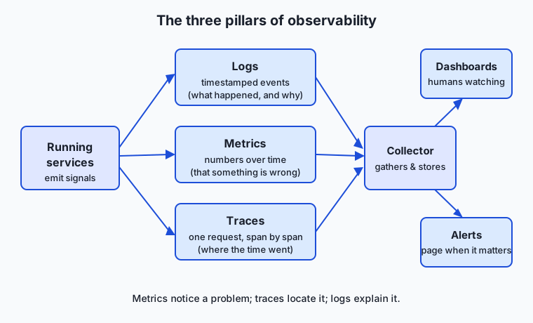
Read the diagram left to right: your running services emit all three kinds of signal; a collector gathers them; and they flow into dashboards you watch and alerts that page you. The three pillars are complementary, not competing — you use metrics to notice that something is wrong, traces to find where, and logs to learn why.
Dashboards, alerting, and service levels
A dashboard is a screen of charts built from metrics, giving you the system’s vital signs at a glance: request rate, error rate, latency percentiles, resource use. Dashboards are for humans watching; alerts are for humans not watching. An alert is a rule — “page someone if the error rate exceeds 2% for five minutes” — that turns a metric crossing a threshold into a notification.
The single most valuable rule of alerting is: alert on symptoms, not causes. Alert on what the user feels — high error rate, slow responses, orders not completing — rather than on internal conditions like high CPU that may or may not actually be hurting anyone. A busy server is fine if requests are still fast; paging an engineer at 3 a.m. because CPU hit 80% while everything worked perfectly is how teams learn to ignore their alerts. This connects to the practice of SLIs and SLOs. A Service Level Indicator (SLI) is a precise measurement of user experience — say, the percentage of requests that succeed in under 300 milliseconds. A Service Level Objective (SLO) is the target you commit to for that indicator — say, 99.9% over each 30-day window. SLOs give alerting a principled basis: you page when you are at risk of missing the objective that represents real user happiness, not when an arbitrary internal number twitches.
An everyday analogy
Picture the intensive care unit of a hospital. A patient in the ICU is a running system you must keep healthy without being able to see inside them directly, and the staff have exactly the three pillars.
The vital-signs monitor beside the bed — the beeping screen tracing heart rate, blood pressure, and oxygen saturation second by second — is metrics: numbers sampled continuously over time, charted so a trend is obvious at a glance. The heart-rate line is a gauge; the running count of breaths is a counter; the spread of blood-pressure readings over the night is a distribution you could take percentiles of. The nurse does not read every individual heartbeat; she watches the shape of the lines.
The patient’s chart — the timestamped notes each nurse and doctor writes (“14:32, administered 5mg, patient stable”) — is logs: discrete, timestamped events, a diary of what happened and when. When something goes wrong, you read the chart to reconstruct the story, which is exactly why a well-kept, consistently formatted chart (structured logs) beats a pile of illegible sticky notes (unstructured text).
Following one patient’s journey through admission, the emergency room, imaging, surgery, and recovery — with the time spent in each department recorded — is a trace: one request moving through many services, each stop a span, so you can see that the four-hour ordeal was mostly two hours waiting for an imaging slot. The nurses’ station with its wall of monitors is the dashboard, and the alarm that beeps when oxygen drops below a threshold is an alert — and notice the hospital sets that alarm on the symptom (oxygen falling, which endangers the patient) rather than on some internal cause that might be harmless. Keep this ICU in mind and the whole field falls into place.
Examples in practice
Let us make metrics concrete by computing a percentile the way the tools do internally. Suppose ten requests finished with these latencies, in milliseconds:
120, 95, 210, 180, 4200, 130, 160, 90, 175, 140The average is (120 + 95 + 210 + 180 + 4200 + 130 + 160 + 90 + 175 + 140) ÷ 10 = 5500 ÷ 10 = 550 ms, which sounds alarming — but it is a lie caused entirely by the single 4200 ms outlier. Nine of ten requests were faster than 210 ms. This is why we prefer percentiles. To find the p95, first sort the values:
90, 95, 120, 130, 140, 160, 175, 180, 210, 4200
 1   2    3    4    5    6    7    8    9    10
With the common “nearest-rank” method, the p95 is the value at rank ⌈0.95 × 10⌉ = ⌈9.5⌉ = rank 10, which is 4200 ms, and the p50 (the median) is at rank ⌈0.50 × 10⌉ = 5, which is 140 ms. Read together, they tell the true story: a typical request takes about 140 ms (p50), but the slowest 5% can take 4200 ms (p95). No single number could have told you both the normal case and the painful tail; that is the whole reason percentiles exist. In the lab you will compute exactly this over a larger set of latencies your own program emits.
A trace makes the inside of one slow request visible in the same concrete way. The diagram below shows a single request drawn as a trace: one parent span for the whole request, and nested child spans for each step it took, each labelled with the time it consumed.
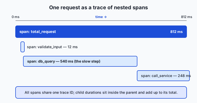
The child spans sit inside the parent on the timeline, and their durations account for the parent’s total — here the database query is clearly the step to investigate. This is precisely the picture the lab reconstructs from plain log lines at the end of the exercise.
Now a real-world sketch of the three pillars working together during an incident. Users report the site feels slow. You glance at the dashboard and see the p95 latency metric has climbed from 200 ms to 3 seconds while the error rate is still near zero — so requests are succeeding but crawling. That is metrics telling you that something is wrong. You open a trace of one slow request and see that of its 3 seconds, 2.8 were spent inside a single database-query span — so now you know where. You filter the structured logs to that query and find every slow one carries "missing_index": true — so now you know why. Metrics, then traces, then logs: notice, locate, explain. Without the instrumentation, all three of those steps would have been guesswork.
Implications: security, privacy, performance, scalability, and cost
Security. Logs are a security asset and a security liability at once. They are your audit trail — who did what, when — and often the only record of an intrusion. But logs are also where secrets leak: a careless line that records a full request may capture a password, an API key, or a session token in plain text, and that log may then be shipped to a third-party service and retained for a year. The rule is absolute: never log credentials, tokens, or full request bodies without scrubbing. Treat your logs as sensitive data, because they are.
Privacy. Because logs and traces record real user activity, they routinely contain personal data — email addresses, IP addresses, identifiers, sometimes message content. That brings them under privacy regulations and data-retention rules. Responsible instrumentation means logging identifiers rather than raw personal data where possible, setting retention limits, and being able to delete a user’s records on request. Observability that quietly builds a permanent dossier on every user is a liability, not an asset.
Performance. Instrumentation is not free at runtime: writing a log line, incrementing a counter, and starting a span all cost a little time and memory. Usually this overhead is negligible and worth it many times over, but in a hot loop that runs a million times a second, logging every iteration can dominate the work itself. The craft is to instrument at the right granularity — per request, not per byte.
Scalability. A single busy service can produce gigabytes of logs an hour, and a fleet of them can overwhelm any storage you throw at it. This is why high-volume systems sample: they keep, say, one trace in a hundred rather than all of them, trading completeness for affordability while still preserving the statistical shape. Metrics scale far better than logs here, because a metric summarizes a million events into a few numbers rather than a million lines — which is why the first thing to reach for at scale is usually a metric, not a log.
Cost. All of the above meet in the invoice. Ingesting, indexing, and retaining telemetry is one of the larger line items in many production budgets, and it is entirely possible to spend more observing a system than running it. Good teams treat their telemetry bill as a first-class engineering concern: they sample aggressively, set sane retention, prefer cheap metrics over expensive logs for high-volume signals, and periodically delete dashboards and alerts no one reads.
Alternatives: free, open source, and commercial
The good news for anyone starting out is that a complete, production-grade observability stack can be assembled entirely from free, open-source parts. Here are the leading tools, what each is for, and when to reach for it.
| Tool | Pillar | What it does and when to use it | Cost |
|---|---|---|---|
| Structured logging (JSON) | Logs | Not a product but a practice: have every service emit logs as JSON key–value lines. Do this from day one; it costs nothing and makes every later tool more useful. | Free (built into every language) |
| Prometheus | Metrics | Pulls numeric time-series from your services and stores them; query with its PromQL language. Reach for it when you need to chart rates, gauges, and percentiles. | Free, open source |
| Grafana | Dashboards | Turns metrics (from Prometheus and many other sources) into shared dashboards and drives alerting. Use it when humans need to watch the numbers. | Free, open source (paid hosted tiers exist) |
| OpenTelemetry | Traces and all signals | The vendor-neutral standard and libraries for emitting logs, metrics, and traces the same way everywhere. Instrument with it so you are never locked to one vendor. | Free, open source |
| ELK stack (Elasticsearch, Logstash, Kibana) | Logs | Collects, indexes, and searches large volumes of logs with a powerful query UI. Choose it when you need deep, fast search over structured logs. | Free, open source (paid hosted tiers exist) |
| Grafana Loki | Logs | A lighter, cheaper log store that indexes only labels rather than full text, pairing naturally with Grafana and Prometheus. Choose it when log-storage cost is the constraint. | Free, open source |
Commercial platforms — the hosted, all-in-one services — bundle these capabilities with polished interfaces, managed storage, and support, and they save you from operating the plumbing yourself. Their trade-off is cost that scales with data volume, which is exactly the bill discussed above. A sensible path is to learn and prototype on the free stack, understand what each signal costs you, and only then decide whether a paid platform’s convenience is worth its price for your scale.
Comparison with related concepts
| Concept A | Concept B | Key difference |
|---|---|---|
| Monitoring | Observability | Monitoring watches predefined questions (“is CPU over 90%?”); observability lets you ask new questions after the fact (“why were requests from region X slow last Tuesday?”) |
| Logs | Metrics | A log is one detailed event; a metric is many events summarized into a number over time — logs explain, metrics quantify |
| Metrics | Traces | Metrics aggregate across all requests; a trace follows one request in detail across services |
| Average | Percentile (p95/p99) | An average is pulled around by outliers and hides the tail; a percentile describes what a given fraction of users actually experience |
| Dashboard | Alert | A dashboard is for a human actively looking; an alert notifies a human who is not looking |
| SLI | SLO | An SLI is the measurement of user experience; an SLO is the target you commit that measurement to meet |
The pairing to hold onto is monitoring versus observability. Monitoring is asking questions you wrote down in advance and watching their answers — necessary, but limited to failures you predicted. Observability is the richer property that, because you emit enough well-structured signal, you can investigate failures you never imagined when you wrote the code. Every unfamiliar outage is a question you did not think to ask in advance, which is precisely why the distinction is the heart of the field.
When to use it — and when not to
Instrument for observability whenever a system runs unattended and its failures cost something — which is essentially every production service. The moment code leaves your laptop and starts serving real users, “add a print statement and rerun it” stops working, and pre-recorded signals become the only way to understand it. Reach hardest for observability when systems are distributed (traces become indispensable), when failures are rare and intermittent (you cannot reproduce them, so you must have already recorded them), and when cost or latency is user-visible (you must measure to manage them).
Know equally when restraint is wise. A throwaway script you run once by hand needs no telemetry pipeline; a print is fine. Do not instrument every line — signal at the granularity of meaningful units of work, not every variable assignment, or you drown the real signal and inflate the bill. And resist the urge to build dashboards and alerts you will never look at: an alert no one trusts is worse than no alert, because it trains everyone to ignore the screen. The professional stance is to instrument deliberately — enough to answer the questions that will actually arise, structured well enough to answer new ones, and no more than you will pay for and read.
The bridge to your AI work is direct, and you will cross it many times later in this course. AI systems must be observable for reasons ordinary software can ignore, because they fail in ways ordinary software does not: they are slow in bursts, they cost real money per request, and they can be confidently wrong without any error at all. So the signals you will track on an AI feature are the same three pillars wearing new labels — latency (how long each model call took, watched at p95 not average), cost (tokens consumed per request, a counter you turn into a running bill), error and retry rates (a metric on failed or refused calls), and quality (a measurement of whether the output was actually good, the AI equivalent of an SLI). And when an AI application chains several steps — retrieve some documents, call a model, call it again, use a tool — following that single request through its steps, timing each one, is not a new idea you will have to learn from scratch: it is exactly distributed tracing, spans and all, which you built the intuition for today. When you later instrument an AI pipeline, you will be applying this lesson, not a new one.
Knowledge check
Try these from memory before looking back:
- Name the three pillars of observability and, in one sentence each, say what kind of signal each provides and the question it best answers.
- A colleague says their service is healthy because its average response time is 200 ms. Explain why the p95 might tell a very different story, and why you would trust the p95 more.
- Give the difference between a counter, a gauge, and a histogram, with one example metric of each.
- Explain the difference between monitoring and observability, and why an unfamiliar production incident tends to require the latter.
- State the rule “alert on symptoms, not causes” and give one example of a good symptom-based alert and one bad cause-based alert.
Hands-on exercise
Time to build the three pillars with your own hands, from nothing but plain log lines. In the Day 40 lab you will run a small shell program that behaves like a tiny web service: it does some work, emits structured JSON logs (each with a timestamp, a level, an event name, and a latency_ms field, including deliberate ERROR lines), and then you derive metrics from those logs — total requests, the error rate, and the p95 latency computed as a real percentile — print them as a tiny text dashboard, and finally emit and reconstruct a trace of nested spans for one request. Everything comes from plain logs, so you can see there is no magic in any of the pillars.
Open a terminal in the lab directory and run the finished reference first to see the whole pipeline:
bash examples/observe.shThis writes a structured log file, computes the metrics, prints the dashboard, and shows a reconstructed trace. Then open starter/observe.sh and complete its four numbered exercises — emit a structured log line, count the errors, compute the error rate, and compute the p95 latency — and run it the same way. When your version prints a dashboard with a plausible error rate and a numeric p95, check your work with the tests.
Expected output
A typical run of the reference prints something like this (your exact numbers vary because the workload is randomized, but the shape is fixed):
=== Observability Dashboard ===
Total requests:   50
Errors:           6
Error rate:       12.00%
p95 latency (ms): 812
p50 latency (ms): 168
=== Trace: request abc123 ===
  span total_request        812 ms
    span validate_input      12 ms
    span db_query           540 ms
    span call_service       248 ms
=== End of dashboard ===
Read it top to bottom: the first block is metrics derived from the logs — a counter (total requests), an error count and the error rate computed from it, and two percentiles from the latency histogram. The second block is a trace: the total request span and its three nested child spans, whose durations add up to the parent, so you can see the db_query span dominated this request’s time.
Validate your work
You are done when you can check every box:
- Your program wrote a log file whose lines are valid JSON, each with
ts,level,event, andlatency_ms. - The dashboard prints a total request count matching the number of log lines for requests.
- The error count equals the number of
"level":"ERROR"lines, and the error rate is that count divided by the total, as a percentage. - The p95 latency prints as a single number that is at or above the p50.
- The trace shows nested spans whose child durations are consistent with the parent total.
Troubleshooting
python3: command not found. The percentile step usespython3, which ships with macOS and nearly every Linux distribution; if it is missing, install it from your package manager (for examplesudo apt install python3on Debian/Ubuntu).- The p95 looks wrong or is empty. You are probably feeding it the whole log line instead of just the numeric
latency_msvalue — extract the number first (the starter shows thegrep/sedstep) and make sure you sorted numerically, not as text. - The error rate is always 0. Your error count is matching nothing; confirm you are searching for the exact string
"level":"ERROR"as it appears in the log file, quotes included. Permission denied. Run the script through bash explicitly —bash starter/observe.sh— rather than executing the file directly.
Common mistakes
- Averaging instead of taking a percentile. The mean latency is dominated by a few slow requests and hides the tail; always report p95/p99 alongside (or instead of) the average, exactly as the worked example showed.
- Parsing unstructured logs. If your log lines are prose, you end up writing brittle regular expressions; emit JSON from the start so every field is addressable.
- Counting the total wrong. Make sure your “total requests” counts request-completion lines only, not every line in the file (span lines and the header are not requests).
Practice assignment
Open starter/observability-worksheet.md in the lab and fill it in from a real run of your completed script. Record your total requests, your error rate, and your p95 latency, and then write the one thing a dashboard should alert on for this service and why — phrased as a symptom the user would feel, not an internal cause, with a concrete threshold (for example, “page if the error rate stays above 5% for five minutes, because that means one user in twenty is seeing failures”). Then, in three or four sentences, explain which of the three pillars you would consult first if this service suddenly felt slow, and what each pillar would tell you next. Keep the worksheet; it is the template you will reuse when you instrument a real service later.
Extension challenge
Extend the pipeline one step further into real observability practice. First, add the p99 latency to your dashboard alongside the p95, and note in the worksheet how far apart they are — a large gap between p95 and p99 means a small number of requests are dramatically slower than the rest, which is often the most important thing to investigate. Second, add a new structured field to each log line — a fake region such as "us" or "eu" — and then compute the error rate per region, so you can answer a question you did not build the dashboard to answer in advance (“are errors concentrated in one region?”). That last step is the essence of observability rather than mere monitoring: because your logs were structured, you could slice them a new way after the fact, without changing the running program at all. Write two or three sentences on how this differs from a fixed dashboard, and why structured logging is what made it possible.
Quiz
Q1. What are the three pillars of observability?
- Firewalls, backups, and load balancers
- Logs, metrics, and traces
- Testing, staging, and production
- CPU, memory, and disk
Show answer
Answer: B. Logs, metrics, and traces
The three pillars are logs (timestamped events), metrics (numbers over time), and traces (one request followed across services). Together they let you notice, locate, and explain a problem.
Q2. Why is structured (JSON) logging generally preferred over plain-text logging?
- It uses less disk space than plain text in every case
- It is the only format that operating systems can write
- Its fields are machine-readable, so you can query them precisely instead of writing fragile text-parsing rules
- It hides sensitive data automatically
Show answer
Answer: C. Its fields are machine-readable, so you can query them precisely instead of writing fragile text-parsing rules
Structured logs record events as machine-readable key-value data, so you can ask precise questions like "every ERROR with latency_ms over 3000" without brittle regular expressions over free-form text.
Q3. Which metric type is best suited to measuring a value that can rise and fall, such as the current length of a queue?
- A counter
- A gauge
- A histogram
- A trace
Show answer
Answer: B. A gauge
A gauge measures a value that can go up or down at any moment, such as current memory in use or queue length. A counter only ever increases, and a histogram records the distribution of many measured values.
Q4. A service has an average response time of 550 ms, but its p50 is 140 ms and its p95 is 4200 ms. What does this most likely indicate?
- The average is the most trustworthy number to report
- Every request is consistently slow at around 550 ms
- A typical request is fast (140 ms), but a small tail of requests is very slow, and that tail is pulling the average up
- The percentiles were computed incorrectly
Show answer
Answer: C. A typical request is fast (140 ms), but a small tail of requests is very slow, and that tail is pulling the average up
The median (p50) of 140 ms shows typical requests are fast, while the p95 of 4200 ms reveals a slow tail. The average is dragged upward by those few outliers, which is exactly why percentiles describe real user experience better than an average.
Q5. In distributed tracing, what is a span?
- The total number of servers a system runs on
- A single unit of work within a request, with a start time, a duration, and a name, nested under a parent span
- The gap in time between two separate requests
- A log line that contains no timestamp
Show answer
Answer: B. A single unit of work within a request, with a start time, a duration, and a name, nested under a parent span
A span records one unit of work — a database query, a service call, a computation — with its start, duration, and name. Spans nest under a parent span and all share a trace ID, so one request can be reassembled across many machines.
Q6. What is the key difference between monitoring and observability?
- Monitoring is free while observability always requires paid tools
- Monitoring watches questions defined in advance; observability lets you ask new questions after the fact from the signals already collected
- Observability only applies to hardware, monitoring only to software
- They are two names for exactly the same thing
Show answer
Answer: B. Monitoring watches questions defined in advance; observability lets you ask new questions after the fact from the signals already collected
Monitoring answers predefined questions ("is CPU over 90%?"). Observability is the richer property that, because you emit enough well-structured signal, you can investigate failures you never anticipated when you wrote the code.
Q7. What does the guidance "alert on symptoms, not causes" mean?
- Only send alerts about hardware failures
- Alert on internal conditions like high CPU rather than on user-facing behavior
- Alert on what the user actually feels — errors or slow responses — rather than on internal conditions that may be harmless
- Never set up any alerts, because they are always noise
Show answer
Answer: C. Alert on what the user actually feels — errors or slow responses — rather than on internal conditions that may be harmless
Good alerts fire on symptoms the user experiences, such as a high error rate or slow responses, not on internal causes like high CPU that may not be hurting anyone. Alerting on harmless causes trains teams to ignore their alerts.
Q8. Why do high-volume systems often sample their traces, keeping only a fraction of them?
- Because traces are inaccurate unless sampled
- Because storing and processing every trace can cost more than running the system itself, and a sample still preserves the overall statistical shape
- Because sampling makes the system run faster for users
- Because traces are illegal to store in full
Show answer
Answer: B. Because storing and processing every trace can cost more than running the system itself, and a sample still preserves the overall statistical shape
Telemetry has a real cost to ingest, index, and retain. Keeping, say, one trace in a hundred trades completeness for affordability while still preserving the statistical picture — one of the central cost trade-offs in observability.
Glossary
- observability
- The extent to which you can understand what is happening inside a running system purely from the signals it emits, including questions you did not think to ask in advance.
- log
- A timestamped record of a single event that happened in a system, such as a request completing or an error occurring — the diary of the system, one line per event.
- structured logging
- The practice of emitting each log entry as machine-readable key-value data (usually JSON) rather than free-form prose, so its fields can be queried precisely.
- metric
- A numeric measurement sampled over time, forming a time-series of (timestamp, value) pairs that can be charted and aggregated across many events.
- counter
- A metric that only ever increases (resetting to zero on restart), such as the total number of requests served; its rate of change per second is usually what you chart.
- gauge
- A metric that can rise and fall over time, such as current memory in use or the length of a queue right now.
- histogram
- A metric that records the distribution of many measured values into buckets, such as request latencies, from which percentiles like the p95 are computed.
- percentile
- A value below which a given fraction of measurements fall; the p95 latency is the value below which 95% of requests finished, describing the slow tail that averages hide.
- trace
- A record of a single request as it travels through a system, reassembled from many spans that share one trace identifier, showing where the time was spent.
- span
- One unit of work within a trace — a database query, a service call, a computation — with a start time, a duration, and a name, nested under a parent span.
- dashboard
- A screen of charts built from metrics that shows a system's vital signs at a glance, such as request rate, error rate, and latency percentiles, for a human who is actively watching.
- alert
- A rule that turns a metric crossing a threshold into a notification for a human who is not watching, best configured to fire on user-facing symptoms rather than internal causes.
- SLO
- A Service Level Objective: a target you commit to for a measurement of user experience, such as 99.9% of requests succeeding in under 300 ms over a 30-day window, giving alerting a principled basis.
Sources and further reading
- Observability (software) — Wikipedia (accessed 2026-07-12)
- What is OpenTelemetry? — OpenTelemetry (accessed 2026-07-12)
- Monitoring Distributed Systems (Site Reliability Engineering) — Google (accessed 2026-07-12)
- Prometheus — Overview — Prometheus (accessed 2026-07-12)
- Log file — Wikipedia (accessed 2026-07-12)
Kept in this browser, no account needed. Your progress page turns the whole record into one link you can bookmark or open on another device.