Math, Statistics, and Data › Linear Algebra II and Calculus › Day 112
Day 112: Visualizing Optimization
After this lesson you will be able to look at an optimization run and know, from the picture alone, things a final loss number cannot tell you. Two runs measured for this lesson land within 3% of the same final loss and yet differ by over 13x in how far they actually travelled to get there — one descended almost straight to the minimum, the other zig-zagged across a narrow valley for most of its steps. You will build, from nothing but NumPy arrays and Pillow's ImageDraw, the four pictures that tell these runs apart: a loss curve where the log-scale slope literally is the convergence rate, proved collinear from the picture's own pixel coordinates to a residual near machine precision; a contour map with the descent path drawn across it, the only picture that shows why a run was slow; the gradient's own magnitude over time, which distinguishes a run that has converged from one that is merely oscillating on the boundary of stability; and a learning-rate sweep whose shape — slow, then a broad basin, then a sharp cliff at the exact theoretical threshold — proves that a good learning rate is a range, not a single number. matplotlib is not installed in this environment, and that turns out to be a gift: you will draw a contour plot as ASCII art in a terminal before you ever draw one with a library, then a heatmap PNG, a path drawn on top of it with a hand-written coordinate transform, an animated GIF one frame per step, and a full learning-rate sweep that catches numeric divergence deliberately rather than letting it crash. The lesson closes by naming matplotlib, Plotly, TensorBoard and Weights & Biases honestly from their own documentation, with free-versus-paid stated plainly and no output claimed from any of them that was not actually run.
Hands-on lab for this lesson
Lab files on GitHub: https://github.com/ai-roadmap-365/ai-roadmap-365.github.io/tree/main/labs/sections/math-statistics-and-data/day-112-visualizing-optimization
- Get the hands-on files. Clone the labs repository once (you can reuse this clone for every lesson). This works on macOS, Linux, and Windows (PowerShell or WSL):
git clone https://github.com/ai-roadmap-365/ai-roadmap-365.github.io.git cd ai-roadmap-365.github.io - Open this lesson's lab. Move into the directory for this specific day. Every lab lives at the same predictable path — section / subsection / week / day:
cd labs/sections/math-statistics-and-data/day-112-visualizing-optimization - Read the lab guide. Open `README.md` in that directory. It lists the exact commands, what each does, the expected output, and how to check your work — read it before running anything.
- Run it and check your work. Follow the README's "How to run" section: run the example first to see the finished result, then complete the numbered exercises in `starter/`, then run the tests. The tests pass (exit 0) only when your work is correct.
bash tests/run_tests.sh # or the test command named in the lab README
You can also open the lab as a local page (works offline, shows the file tree and expected output).
Learning objectives
By the end of this lesson you will be able to:
- Explain why a final loss number alone cannot distinguish a robust convergence from a lucky one, using a real pair of measured runs as evidence
- Evaluate a function over a 2D grid with numpy.meshgrid and locate its minimum from the resulting array
- Build a hand-written contour renderer, first as ASCII text and then as a Pillow heatmap, and explain the difference between shading by level band and tracing by level line (marching squares)
- Write and test a world-to-pixel coordinate transform in isolation, and explain which axis has to flip and why a bug in it can be invisible in one picture and obvious in another
- State why loss should be read on a log-scaled axis for a linearly convergent method, and prove that a specific run's log-scale points are collinear rather than merely claiming it
- Read a loss curve that has stopped decreasing and know, from the gradient's own magnitude, whether the run has converged or is stalled on a plateau or oscillating on a stability boundary
- Run and read a learning-rate sweep, including catching numeric overflow deliberately with numpy.errstate rather than letting it crash the sweep
- Explain, with a measured example, why "a good learning rate is a range" is a claim a sweep can demonstrate and a single run cannot
- Build an animated GIF with Pillow's save(..., save_all=True) and verify its frame count matches the number of steps drawn
- State, for matplotlib, Pillow, Plotly, TensorBoard and Weights & Biases, when to choose each one, how it is called, and whether it is free or paid
- Apply the honesty-and-accessibility rule that a picture's only copy of a fact should never live in colour alone, and that axes and colour ramps need their units and meaning stated in the picture itself
Prerequisites
- Day 111 — gradient descent from scratch: the update rule x <- x - eta * grad(x) and the three learning-rate regimes for a quadratic. This lesson implements its own descent loop rather than importing Day 111's, but assumes the reader already knows what that loop is doing
- Day 109 — partial derivatives and the gradient, which is what grad(x) computes at each step and what "gradient norm" refers to throughout this lesson
- Day 104 — NumPy arrays and vectorized thinking, including numpy.meshgrid
- Day 43 — python3 -m venv and installing a package with pip
- Days 71 to 74 — running pytest and reading its output
- No image-processing background assumed. Every Pillow call used here is explained at first use
Why this matters
Here are two training runs. Both start at the point (4, 4) on the same kind of bowl-shaped loss surface. Both take exactly sixty steps of plain gradient descent. Both use the same learning rate, 0.038. Read only their final numbers and you would call them the same run:
well-conditioned final loss: 2.431009e-03
ill-conditioned final loss:  2.507203e-03
A gap of three percent. If a final-loss number is all you ever look at — and for most of the history of this course so far, it has been the only number you have looked at — these two runs are indistinguishable. You would write them up the same way. You would trust them the same amount.
Now look at how far each run actually travelled to get there:
well-conditioned path length: 5.6075
ill-conditioned path length:  75.9767
Thirteen and a half times further. The first run walked almost straight to the minimum in sixty short, purposeful steps. The second run spent most of its sixty steps bouncing back and forth across a narrow valley, overshooting one wall, correcting, overshooting the other, and arrived at nearly the same loss more by the accumulation of many small corrections than by anything you would call a clean descent. Change the starting point slightly, or the learning rate slightly, or the shape of the valley slightly, and the first run keeps working. The second run is one bad step away from exploding — you will watch that happen later in this lesson, on command, at a specific learning rate.
The final-loss number could not tell these two runs apart. Only a picture could. That is the entire subject of today: the four pictures that actually diagnose an optimization run, built from nothing but arrays of numbers and the pixels you choose to put where.
There is a second thing worth being honest about before you go further: the tool most people reach for to draw these pictures, matplotlib, is not installed in the environment this lesson and lab were written in. Neither is scipy, pandas or Plotly. That turned out to be a gift rather than an obstacle. Every picture in this lesson — a filled contour map, a path drawn across it, a loss curve on a log axis, an animated descent — is built with nothing but NumPy arrays and Pillow’s ImageDraw, which means nothing about how these pictures actually reach the screen is hidden behind a library call. You will draw a contour plot by hand before you ever call one from a library, and an even more primitive version of it will print directly to your terminal as characters.
By the end of this lesson you will be able to read a training curve the way an experienced practitioner does: knowing what a straight line on a log axis means, knowing the difference between a run that has converged and one that has merely stopped moving, and knowing that a good learning rate is a range you can measure, not a number you guess.
The idea in plain language
A number tells you where a process ended up. A picture tells you how it got there. Optimization — repeatedly nudging a set of numbers to make some loss smaller — produces both kinds of evidence at every single step, and almost all of that evidence gets thrown away the moment you print only the final loss.
Think of two hikers trying to reach the bottom of a valley in the fog, using nothing but a compass that tells them which way is steepest downhill from where they currently stand. One hiker is descending a valley shaped like a round bowl: every direction downhill points roughly toward the bottom, so a few confident strides get them there. The other hiker is descending a valley shaped like a narrow, steep-walled canyon: the steepest-downhill direction at almost every point actually points mostly across the canyon, toward the opposite wall, and only a little bit along it, toward the true bottom. That hiker takes the compass’s advice literally at every step, crosses the canyon, corrects, crosses back, corrects again, and eventually — through dozens of small zig-zagging corrections — ends up close to the bottom too. Ask both hikers “how close to the bottom are you?” at the end and you might get similar answers. Ask them to draw a map of the path they walked and the difference is immediate and undeniable.
Optimization visualization is drawing that map. It has four standard forms, and this lesson builds all four, in the order they earn their place:
- Loss against iteration — how the altitude changed over time, and on the right axis, the rate of descent becomes visible as a straight line.
- The path on a contour map — the map itself, showing exactly where the zig-zagging happened and why.
- Gradient norm against iteration — whether the hiker is still moving downhill at all, or has simply stopped.
- A learning-rate sweep — what happens to the whole story if you change how bold each stride is.
Each one answers a question the other three cannot.
Historical background
The mathematics underneath today’s pictures is old. Gradient descent itself traces to Augustin-Louis Cauchy’s 1847 note on solving systems of equations by the “méthode générale,” and contour maps — lines connecting points of equal elevation — were already established cartographic practice by then, formalized in the late eighteenth century for depicting terrain. The two ideas did not need to wait for computers to meet in principle; a nineteenth-century mathematician sketching a bowl-shaped function by hand and drawing a path across it would have understood exactly what this lesson’s contour-and-path picture shows.
What changed with computers was not the concept but the cost. Producing a contour map by hand means evaluating a function at enough points to trace its level curves accurately — tedious but possible for one picture. Producing one automatically, for every training run, as a routine diagnostic rather than a special occasion, needed cheap, repeated numerical evaluation, which is exactly what became available as scientific computing tools matured through the twentieth century. Log-scale plotting of error or loss curves shows up throughout numerical analysis and control theory from the mid-1900s onward, wherever an iterative method’s convergence rate needed to be verified rather than assumed. The specific practice this lesson teaches — plotting a neural network’s training loss on a log axis to read its convergence rate, and watching a live loss curve as the primary signal during training — became a default habit of the field as gradient-based training of large models turned from an occasional experiment into the daily working method, and as tools built specifically for that habit (TensorBoard, first released alongside TensorFlow in 2015, and later Weights & Biases, founded in 2018) turned “watch the curve while it trains” into infrastructure rather than an afterthought.
What it is — and what it is not
Visualizing optimization is the practice of turning the numbers an optimization run produces at every step — the loss, the parameters, the gradient — into pictures that make the shape of the run legible: how fast it moved, whether it moved efficiently, and whether it is still moving. It is not a single chart type, and it is not decoration added after the fact to make a report look more finished.
It is not the same thing as visualizing a trained model’s behavior — a confusion matrix, a saliency map, an attention heatmap. Those describe what a finished model does. Today’s pictures describe how the model got finished: the process, not the artifact. It is also not the same thing as hyperparameter tuning, though the two are close cousins; a learning-rate sweep (picture four, below) is a visualization technique that happens to also be the raw material for a tuning decision.
And it is emphatically not a substitute for the final metric. A loss curve does not replace a validation accuracy number; it explains the number’s context. The two runs that opened this lesson had almost the same final loss and completely different stories — the picture does not overrule the number, it tells you which number to trust and how far.
Why it was created and what problems it solves
Three problems, all real and all expensive if left unsolved.
The final number is under-determined. As you have already seen, two runs can land on nearly the same final loss by completely different routes, and only one of those routes generalizes to a slightly different problem. Relying on the final number alone means you cannot tell a robust convergence from a lucky one.
Failures that look identical in aggregate look completely different close up. A run that has converged (the gradient is genuinely near zero, further steps would not help) and a run that has stalled on a flat plateau (the gradient is near zero for a different reason — the surface is locally almost flat, not because you are near the true minimum) can produce the same “loss stopped decreasing” signal. Only tracking the gradient’s own magnitude — not the loss — tells these apart, which is exactly why picture three exists.
A single learning-rate number hides a whole shape. Report “we used learning rate 0.01” and a reader learns almost nothing about how sensitive the result was to that choice, whether 0.008 would have been just as good, or whether 0.02 would have blown up entirely. A learning-rate sweep — final loss as a function of the rate you tried — turns “we picked a number” into “here is the whole basin of numbers that work, and here is where it ends.”
How it works
Step one: evaluate the function over a grid
Every picture in this lesson starts the same way. You have a loss function of two variables — for a real neural network it would be millions of variables, but two is where you can see it — and you want to know its value at a whole grid of points, not just wherever the optimizer happens to have visited.
X, Y = meshgrid(linspace(xmin, xmax, n), linspace(ymin, ymax, n))
Z = f(X, Y)
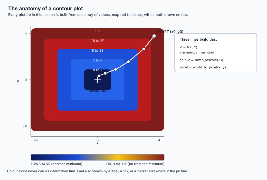
numpy.meshgrid takes two 1D arrays of coordinates and expands them into two 2D arrays, X and Y, such that X[i, j] and Y[i, j] together give the coordinates of grid cell (i, j). Applying f to both arrays at once — vectorized, no Python loop — gives Z, a 2D array of function values, one per cell. This triple, (X, Y, Z), is the entire raw material every contour plot, heatmap, or 3D surface plot in any library is built from. matplotlib’s contour and contourf both consume exactly this shape.
The lab’s two loss surfaces are both quadratic bowls, f(x, y) = a·x² + b·y², with a minimum of exactly zero at the origin. With a = b = 1 the bowl is perfectly round — this is the “well-conditioned” case. With a = 1, b = 25 the bowl is squeezed twenty-five times narrower along y than along x — the “ill-conditioned” case, the canyon from the analogy above.
Step two: map a value to something visible
Once you have Z, you need a rule that turns a number into a pixel, a colour, or a character. This lesson builds two versions of that rule, from crudest to least crude, deliberately in that order.
The crudest version — genuinely the most primitive contour renderer that still counts as one — prints directly to a terminal. Rescale every value in Z linearly between its own minimum and maximum onto a small range of character “density,” floor each value to the nearest band, and print one character per cell:
#+:+#
+. .+
:   :
+. .+
#+:+#
That is f(x, y) = x² + y² on a 5×5 grid spanning [-2, 2] × [-2, 2], rendered with the five-character ramp " .:+#" — space is the lightest (lowest value), # the densest (highest). The centre cell, the true minimum, is a plain space. Every corner, the maximum value on this small grid, is #. This picture needs no image viewer, no library, and no colour — and it is genuinely useful for exactly that reason: if you get a row and column transposed, or flip an axis by mistake, a bowl that should be symmetric top-to-bottom and left-to-right stops looking symmetric immediately, in plain text, before you have written a single line of image code.
The less-crude version does the same rescaling but maps each value to an RGB colour instead of a character, using a small set of named colour “stops” and linear interpolation between them — dark blue at the low end, through blue and gold, to dark red at the high end. numpy.interp does the interpolation for each of the three colour channels independently, and the resulting array of colours becomes an image with PIL.Image.fromarray. The pixel sitting exactly at the analytic minimum of a bowl painted this way comes out as (13, 27, 84) — the colour ramp’s own darkest stop, read back from the saved file, not merely assumed to be there.
Both of these are level-band renderers: every cell gets shaded according to which band its value falls into, and the boundary between two bands is wherever two adjacent cells happen to land in different bands. This is not the only way to draw a contour. The more careful approach, called marching squares, walks the grid cell by cell and, for one specific value (a “contour level”), works out exactly where that value’s curve crosses each cell’s four edges by linear interpolation, then connects those crossing points into a smooth line — a level line, not a level band. matplotlib’s contour function (as opposed to the filled contourf) does this properly. This lesson’s renderers do not, on purpose: shading by band is simpler to write correctly, cheaper to compute, and for the purpose of seeing where a descent path went relative to the surface’s shape, the coarser picture is entirely sufficient. Where it would not be sufficient — publishing a precise contour line at a specific loss value, say — is exactly where you would reach for the real tool instead, and that boundary is worth knowing rather than blurring.
Step three: the coordinate transform that every bug in this lesson hides inside
Turning a data point (x, y) into a pixel (column, row) sounds like it should be trivial, and three-quarters of it is: x grows to the right in both data space and pixel space, so pixel column grows with x, with no flip needed. The remaining quarter is where almost every bug in a hand-built plotting tool actually lives.
pixel_column = (x - xmin) / (xmax - xmin) * (width - 1)
pixel_row    = (ymax - y) / (ymax - ymin) * (height - 1)
y grows upward in data space — a larger y means higher on the page — but pixel row 0 is the top of the image, and pixel rows count downward from there. So pixel row has to be computed from (ymax - y), not (y - ymin). Get this backwards and something strange happens: a heatmap of a bowl centred at the origin still looks completely correct on its own, because that particular picture happens to be symmetric top-to-bottom regardless of which way the flip goes. The bug is invisible until you draw something asymmetric on top of it — a descent path that starts in one corner and should walk toward the centre instead walks toward the wrong edge entirely. This is exactly why the lab’s world-to-pixel function is written, tested, and reasoned about completely separately from the drawing functions that call it: a bug here is silent everywhere except in the one picture that matters, and testing the transform in isolation, against known corners, catches it before it can hide.
Reading the log axis
A method converges linearly when its error shrinks by roughly the same multiplicative factor every step: loss_after_step ≈ r × loss_before_step, for some constant ratio r between 0 and 1. Plain gradient descent on a well-conditioned bowl is exactly this kind of method. Run it out and the loss after step n is approximately c × r^n for some starting constant c.
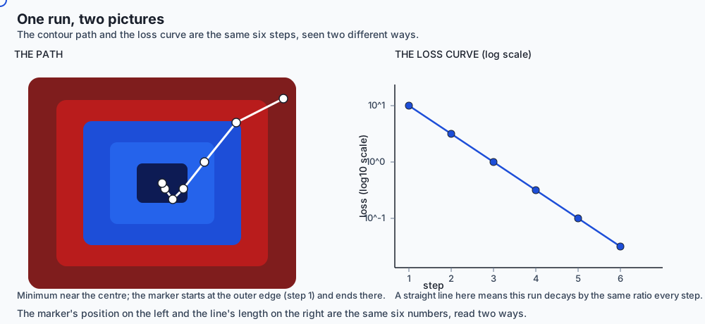
Take the logarithm of both sides: log(loss_n) = log(c) + n × log(r). That is the equation of a straight line in n, with slope log(r). Which means: plot loss against iteration on a log-scaled vertical axis, and a linearly-convergent run draws a straight line, and the line’s slope literally is the convergence rate. A curve that bends away from straight — steepening, flattening, kinking — is telling you the rate itself changed partway through the run. This is the single most useful reading skill this lesson teaches, because it turns “the loss went down” into a quantitative, checkable claim about how it went down.
The well-conditioned run measured throughout this lesson is close enough to a textbook case that you can check the claim directly rather than take it on faith. Its loss starts at 32.0 and ends at 2.431009e-03 after sixty steps, and — because a = b = 1 makes the update rule an exact linear recursion — the ratio between every consecutive pair of losses is identical to machine precision: 0.853776, every single step. Fit a straight line to the log-axis pixel coordinates the lab actually draws, and the largest deviation of any point from that line is on the order of 1.7 × 10⁻¹³ pixels — which is to say, not a claim about what the picture should look like, but a measurement of what it does look like, expressed in the same units the picture itself is drawn in.
The path on the contour map
The loss curve tells you that a run was slow or fast. It cannot tell you why. For that you need the second picture: the same contour map from step one, with the descent path drawn across it as a line, with a small marker at every step.
This is the picture that makes the ill-conditioned run’s story visible rather than merely inferable. On the round, well-conditioned bowl, the path from (4, 4) heads almost straight for the origin. On the narrow, ill-conditioned bowl — squeezed twenty-five times tighter along y — the same starting point, the same learning rate, and the same number of steps produces a path that crosses back and forth across the narrow axis dozens of times before it settles anywhere near the bottom. That zig-zag is completely invisible in a loss-against-iteration plot, which only ever shows one number going down. It is the first thing you see in a contour-and-path plot.
Gradient norm: converged, or merely stopped
A loss that has stopped decreasing is ambiguous. It could mean the run has genuinely reached a minimum, where the gradient is truly zero and no further step could help. Or it could mean the run has wandered onto a flat plateau — a region where the surface happens to be nearly level without being near its lowest point — where the gradient is small for a completely different reason. Both situations print the same symptom in a loss curve: a flat line. They demand different responses: the first means you are done, the second means you likely need a different starting point, a different learning rate, or more steps.
The magnitude of the gradient at each step — ‖∇f(x)‖, the length of the gradient vector — tells these apart, and unlike the first two pictures it needs no new machinery at all: the gradient at every step is already computed by the descent loop itself, on its way to deciding how far to move. On the well-conditioned run, the gradient’s magnitude falls from 11.31 at the start to 0.099 after sixty steps — shrinking steadily, in step with the loss, which is the signature of genuine convergence. On the ill-conditioned run it falls from a much larger 200.16 down to 0.366 — larger throughout, because the narrow axis produces much steeper local slopes, but still monotonically toward zero by the end.
Contrast that with a run sitting exactly on the boundary of stability. At a learning rate of exactly 1.0 on the one-dimensional bowl f(x) = x², the update multiplies x by -1 at every single step: 4, -4, 4, -4, ..., forever. The loss — x² — never changes: it sits at 16.0 on every step, which by itself might read as “converged, nothing left to do.” The gradient’s magnitude, |2x|, tells the true story instead: it sits at exactly 8.0, forever, never shrinking. That is not a plateau near a minimum — it is a run that is oscillating and never approaching one, and the gradient norm is the number that says so when the loss cannot.
The learning-rate sweep
The fourth picture asks a different question of the same setup: not “how did this one run go”, but “what would have happened at a different learning rate?” Run the same descent, from the same starting point, for the same number of steps, once for each of a whole range of learning rates, and plot the final loss against the rate that produced it.
Sweeping η (eta) from 0.05 to 2.45 in steps of 0.1 on f(x) = x², for 300 steps starting at x₀ = 4.0, produces a shape with three distinct regions, and the boundary between the second and third is not approximate — for this function it is the exact value η = 1. Below it, ten of the swept rates (0.05 through 0.95) drive the loss to a value indistinguishable from zero; the very best in the sweep, η = 0.45, sits comfortably inside that basin rather than at either edge of the range that was tried. Every rate above 1.0 is, mathematically, already diverging — but “diverging” and “already too large to represent” are different states, and the sweep passes through both: at η = 2.05 the run’s value has grown to 1.05 × 10²⁹⁶, enormous but still a finite floating-point number, while at η = 2.15 the very same growth has crossed the largest number a 64-bit float can hold and become inf.
That overflow is not a bug to prevent — it is the expected, correct behaviour of a learning rate that is too large, and it has to be caught deliberately rather than allowed to crash the sweep or silently corrupt it. NumPy’s errstate context manager, set to ignore overflow warnings around exactly the arithmetic that might overflow, combined with an explicit isfinite check after every step, lets the sweep record float('inf') as a genuine, meaningful data point rather than letting a RuntimeWarning escape unnoticed or an unguarded operation raise an exception and stop the whole sweep partway through. The resulting picture has a name-worthy shape: slow on the far left, a broad basin of rates that all work well, and then a sharp cliff. A good learning rate is a range, not a single magic number — and this picture is the only one of the four that makes the width of that range visible at all.
An everyday analogy
A car’s dashboard carries a speedometer and an odometer, and they answer different questions on purpose. The speedometer tells you your instantaneous rate right now — useful for noticing you have slowed to a crawl, or that you are still accelerating hard. The odometer’s trip counter tells you the total distance actually driven since you started — useful for noticing that a “quick trip across town” somehow took forty miles of driving because you kept missing turns and doubling back.
A single “we arrived” statement — the equivalent of a final loss number — tells you neither. Two drivers can arrive at the same destination, at nearly the same time, having burned very different amounts of fuel and covered very different distances, and “we arrived” cannot distinguish the driver who took the direct route from the one who kept overcorrecting at every turn. The loss curve is the speedometer, read over the whole trip rather than at one instant. The path-on-the-contour-map is the map with the actual route drawn on it — the thing that finally makes an odometer reading of forty miles for a ten-mile trip make sense. The gradient norm is the speedometer again, but pointed at a different question: are you still slowing down because you are near your exit, or because you are stuck behind traffic that has nothing to do with how close you are? And the learning-rate sweep is the answer to “how hard should I press the accelerator” — not a single number, but a felt-out range: too gentle and the trip takes forever, too aggressive and you overshoot every turn, and somewhere in the middle is a wide, comfortable band rather than one exact pedal position.
Examples in practice
Reading the two-run comparison end to end
The full picture, gathered in one place, for the pair of runs this lesson opened with — both starting at (4, 4), both using learning rate 0.038, both run for 60 steps:
| Quantity | Well-conditioned (a=b=1) | Ill-conditioned (a=1, b=25) |
|---|---|---|
| Final loss | 2.431009e-03 | 2.507203e-03 |
| Relative gap in final loss | — | 3.04% |
| Path length | 5.6075 | 75.9767 |
| Path length ratio | — | 13.55x |
| Gradient norm, step 0 | 11.31 | 200.16 |
| Gradient norm, step 60 | 0.099 | 0.366 |
Every number in that table came from a real run of the lab’s own code, printed by examples/06_two_runs_same_loss.py. Nothing here is a worked example constructed to look tidy after the fact — the learning rate, 0.038, was chosen by trying a handful of values and keeping the one that produced two runs close enough in final loss to make the point sharply; the resulting numbers are exactly what that run produced.
Building the picture from a grid to a finished PNG
The lab’s heatmap_png function is the shortest complete example of the whole from-scratch pipeline. Given a 101×101 grid of values from evaluate_grid, it rescales those values to the range zero to one, maps them through the four-stop colour ramp with numpy.interp, flips the result vertically (because the grid’s row zero is the smallest y, but an image’s row zero must show the largest y), and hands the resulting array to PIL.Image.fromarray. Nothing about that pipeline is specific to loss surfaces — the same four steps, evaluate a grid, rescale, colour, flip, are exactly what any heatmap of any two-dimensional data is built from, whether it is a loss surface, a correlation matrix, or a satellite image band.
The animated version
Pillow can write an animated GIF with no additional library at all: build one still image per frame — in this lesson’s case, the heatmap with the descent path drawn up through step k, for k from 1 to the total number of steps — convert each frame to Pillow’s palette ("P") mode, since GIF is fundamentally a palette-based format capped at 256 colours per frame, and call frames[0].save(path, save_all=True, append_images=frames[1:], duration=..., loop=0). A 25-step descent produces a 26-frame GIF (the starting point counts as frame one), and Pillow’s own Image.open(path).n_frames reading the file back confirms exactly that count — the animation mechanism is entirely contained in that one save call, with nothing hidden behind it.
Implications: security, privacy, performance, scalability, and cost
Performance and scalability. Every picture in this lesson is built from arrays that are already computed as a side effect of running the optimizer — the loss, the parameters, and the gradient at each step. Recording them costs essentially nothing extra; the expensive part is the optimization itself, not the bookkeeping. Where cost does show up is in how often you draw the picture: writing a PNG or a GIF frame every single training step of a real model is wasted work and wasted disk, and every real training-visualization tool (this lesson’s TensorBoard and Weights & Biases both included) exists partly to solve exactly that problem — buffering, downsampling, and writing summaries at a sane interval rather than every step.
Cost. The pictures themselves are free to produce, in every sense: no paid library was needed to draw any of them, and the free tiers of the hosted tools discussed below are enough for an individual’s experiments. Cost enters only at scale — many collaborators, long-running experiment tracking, hosted dashboards with retention guarantees — which is exactly the boundary between the free and paid tiers described in the tools section below.
Security and privacy. A loss curve or a contour plot, on its own, reveals very little about training data. But a live dashboard that many people can view, or a hosted experiment-tracking service, is a place where model architecture details, dataset descriptions, and sometimes literal data samples end up logged as a side effect of debugging — worth treating with the same care as any other internal engineering log, and worth checking what a hosted tool’s default retention and sharing settings actually are before pointing it at anything sensitive.
Honesty and accessibility — the part worth genuinely getting right, not just checking off. Never let a picture’s only copy of a fact live in colour alone: a reader with colour-blindness, or a black-and-white printout, should still be able to read the shape of the story from position, labels, and markers, not from which shade of blue a pixel happens to be. Every axis needs its units stated, not just its variable name — “loss” alone is less useful than “loss (log scale)”. And say, in words near the picture, what the colour ramp actually means: which end is low, which end is high, and whether the scale between them is linear or something else. A picture that needs a caption elsewhere in the document to be unambiguous is not a finished picture — the caption’s content belongs on the picture itself.
Alternatives: free, open source, and commercial
| Tool | When to choose it | How it is called | One concrete example | Cost |
|---|---|---|---|---|
| matplotlib | The default choice for a static contour or loss plot in almost any Python data-science context; enormous ecosystem, every tutorial assumes it | pyplot.contour / pyplot.contourf for level curves and filled contours | plt.contourf(X, Y, Z, levels=20); plt.plot(path[:,0], path[:,1], 'w-o') | Free, open source (BSD-style licence). No output from matplotlib is reproduced in this lesson — it is not installed in this environment, and every claim about it here is drawn from its own documentation, not from a run. |
| Pillow | When you need pixel-level control, no plotting-library dependency, or to produce an animated GIF with nothing else installed — exactly this lesson’s situation | PIL.Image, PIL.ImageDraw, Image.save(..., save_all=True) for animation | img = Image.fromarray(colour_array); ImageDraw.Draw(img).line(points, fill=(255,255,255)) | Free, open source (MIT-CMU licence). Everything in this lesson’s lab was actually run with Pillow 12.3.0, and every number and picture attributed to it came from a real execution. |
| Plotly | When the picture needs to be interactive — zoomable, hoverable, embeddable in a web page or notebook — rather than a static image | plotly.graph_objects.Contour or plotly.express for a quick interactive contour | go.Figure(go.Contour(z=Z, x=xs, y=ys)) | Free and open source for the core plotting library; Plotly’s hosted “Chart Studio” and enterprise dashboarding products are paid. Not installed here; described from documentation only. |
| TensorBoard | Live training-curve monitoring while a real model trains, especially with TensorFlow or PyTorch already in the loop | SummaryWriter.add_scalar("loss", value, step), then tensorboard --logdir runs to view | Logs a scalar per step to an event file; the dashboard reads and plots it live as new steps arrive | Free and open source, self-hosted. Not installed here; described from documentation only. |
| Weights & Biases | Same job as TensorBoard, hosted rather than self-run, with team-shared dashboards, experiment comparison, and hyperparameter sweeps built in | wandb.log({"loss": value, "step": step}) inside the training loop | One line per step inside the loop; the web dashboard aggregates automatically | Free tier for individuals and small projects; paid tiers for team collaboration, private hosting, and higher usage limits. Not installed here; described from documentation only. |
Of the five, only Pillow was actually run to produce anything in this lesson or its lab. The other four are described accurately from their own documentation, and nothing attributed to them is a claim about a measurement — only about how they are called.
Comparison with related concepts
| Concept | What it visualizes | Answers | Does not answer |
|---|---|---|---|
| Loss curve (linear axis) | Loss value over training steps | Is the loss going down at all? | How fast, in a way you can compare across runs |
| Loss curve (log axis) | log(loss) over training steps | What is the convergence rate, read as a slope | Anything about the parameter space itself |
| Contour + path | The 2D (or projected) shape of the loss surface, and the exact route taken across it | Why a run was slow — conditioning, zig-zag, a saddle | Anything beyond two or three visualized dimensions |
| Gradient norm | The size of the gradient vector over training steps | Converged vs. stalled on a plateau vs. still moving | Whether the point reached is a good minimum or a poor one |
| Learning-rate sweep | Final loss as a function of one hyperparameter | The usable range for that hyperparameter, and where it breaks | Anything about a fixed run’s internal trajectory |
| Confusion matrix / accuracy curve | The trained model’s predictions, after training | Whether the finished model is any good | Anything about how training got there |
When to use it — and when not to
Use a full contour-and-path visualization when you are debugging why an optimizer is slow or unstable, when you are teaching or explaining an optimization method, or when you genuinely have two or three parameters you can project onto — small models, toy problems, or a two-dimensional slice through a larger model’s parameter space held at fixed values elsewhere. Use a loss curve, on a log axis by default, for essentially every real training run, because it costs almost nothing to produce and catches a startling fraction of problems (a rate that suddenly changes, a plateau, an outright divergence) before they become expensive.
Do not reach for a full 2D contour map when your model has millions of parameters and no natural two-dimensional slice — the picture would show you an arbitrary, likely misleading projection rather than the actual high-dimensional geometry the optimizer is navigating. Do not treat a learning-rate sweep on a toy quadratic as a substitute for tuning the real model’s learning rate — the shape of the sweep (a basin, then a cliff) generalizes as a lesson; the specific numbers on the axis do not. And do not let any of these pictures replace the metric you actually care about — validation accuracy, calibration, whatever the task demands. They explain the metric’s story; they are not the metric.
Knowledge check
- Two training runs land within 5% of the same final loss. What single additional measurement from this lesson would tell you whether one of them is more robust than the other?
- A loss curve, plotted on a log-scaled vertical axis, is a straight line for the first half of training and then visibly bends flatter. What does the bend tell you about the run’s convergence rate?
- Why does
world_to_pixelneed(ymax - y)rather than(y - ymin)when computing a pixel row, but(x - xmin)rather than(xmax - x)when computing a pixel column? - A run’s loss has stopped decreasing for the last twenty steps. Name the one additional plot from this lesson that distinguishes “converged” from “stuck on a plateau”, and explain what each case would look like on it.
- In the learning-rate sweep described in this lesson, why is
η = 2.05recorded as a large finite number rather than asinf, whileη = 2.15is recorded asinf? - What is the difference between shading a contour plot by level band and tracing it by level line (marching squares), and why does this lesson’s lab implement only the first?
- Name one thing a contour-and-path plot can show you that a loss-against-iteration plot cannot, and one thing the reverse is true of.
- Why is “a good learning rate is a range, not a number” a claim that a learning-rate sweep can demonstrate but a single training run cannot?
Hands-on exercise
Work through labs/sections/math-statistics-and-data/day-112-visualizing-optimization/. Read starter/00_brief.md first — it lists all eight coding exercises in the order you should attempt them, each with a short “approach” hint. Install the lab’s dependencies, then check yourself as you go:
cd labs/sections/math-statistics-and-data/day-112-visualizing-optimization
python3 -m venv .venv
.venv/bin/pip install -r requirements/requirements.txt
.venv/bin/pytest starter -q
On an untouched checkout this reports 13 skipped — a skip means “not attempted yet,” not a failure. As you complete each function, its corresponding test switches from skipped to either passed or failed, with a failed test printing your answer next to the expected one.
Expected output
Once every exercise is complete, pytest starter -q reports 13 passed. Running the reference scripts directly shows the underlying numbers:
$ .venv/bin/python3 examples/06_two_runs_same_loss.py
well-conditioned bowl: f(x, y) = 1 x^2 + 1 y^2
ill-conditioned bowl:  f(x, y) = 1 x^2 + 25 y^2
both start at (4.0, 4.0), learning rate 0.038, 60 steps

well-conditioned final loss: 2.431009e-03
ill-conditioned final loss:  2.507203e-03
relative gap between the two final losses: 0.0304

well-conditioned path length: 5.6075
ill-conditioned path length:  75.9767
ratio: 13.55x longer
Validate your work
bash tests/run_tests.shPrints a running tally of every check and finishes with a line of the form N checks, 0 failure(s)., exiting with status 0 only if every check passed. The harness re-runs itself once with a threshold the measured runs cannot meet, to prove to you that it is capable of reporting a real failure rather than always printing green.
Troubleshooting
The lab’s own troubleshooting.md documents every issue actually hit while building it, including the y-axis flip, the ASCII ramp’s character direction, GIF palette conversion, and the overflow-handling pattern for the learning-rate sweep. Read it before searching elsewhere — every entry there was a real bug, not a hypothetical one.
Common mistakes
The most common and most instructive mistake is world_to_pixel’s y-flip, backwards — described in detail in “How it works” above. The second most common is plotting losses directly on what is meant to be a log axis, instead of log10(losses); the picture still renders, it is simply not proving what the collinearity check expects, and the test catches the gap immediately rather than passing loosely.
Practice assignment
Using only examples/gridviz.py and examples/imaging.py’s existing functions, produce a heatmap-and-path picture for a third bowl of your own choosing — pick any a and b you like, other than the two already in dataset.py — and write down, in a short paragraph, a prediction of how its path length should compare to the well-conditioned and ill-conditioned runs before you run it. Then run it and compare. State plainly whether your prediction was right, and if it was not, say what about the bowl’s shape you misjudged.
Extension challenge
Implement a proper marching-squares contour tracer for one specific level value of a bowl function — described but not built in this lesson — and draw the resulting level line directly on top of the level-band heatmap this lab already produces. Confirm by eye that the traced line follows the boundary between two adjacent shaded bands. This is the gap between what this lesson built (level bands, numpy, and Pillow only) and what matplotlib’s contour function does for you automatically — and closing it by hand is the fastest way to understand exactly what that convenience is worth.
The AI thread
A training curve is the single most-consulted diagnostic instrument in applied machine learning — more consulted, in raw frequency, than almost any other artifact a practitioner produces, because it is the one piece of evidence available while a model is training rather than only after. Every skill this lesson taught transfers directly and immediately to that instrument: reading a log-scale slope tells you whether a model’s convergence rate is changing partway through a run, worth stopping for; recognizing a plateau in the gradient norm rather than only in the loss tells you whether a stalled run has actually finished or is stuck for a fixable reason; and understanding a learning-rate sweep’s basin-then-cliff shape is the difference between tuning a model by guessing single numbers and tuning it by measuring a range. None of that requires the terminology of a specific framework — it requires having drawn one of these pictures yourself, pixel by pixel, once, so that when a dashboard shows you the polished version, you know exactly what arithmetic produced every line in it.
Quiz
Q1. Two training runs land within 3% of the same final loss. Their path lengths, measured this lesson at 5.6075 and 75.9767, differ by over 13x. What does that difference tell you that the final-loss number alone could not?
- Nothing real — path length is an artifact of the coordinate system, not the optimization
- The run with the longer path used a larger learning rate and will always converge faster on a new problem
- One run descended nearly straight to the minimum while the other zig-zagged across a narrow valley for most of its steps, which is a sign the second run is more fragile to a changed starting point or learning rate
- The two runs actually reached different minima, and the final-loss numbers are misleading
Show answer
Answer: C. One run descended nearly straight to the minimum while the other zig-zagged across a narrow valley for most of its steps, which is a sign the second run is more fragile to a changed starting point or learning rate
Both runs in this lesson start at the same point, use the same learning rate, and take the same number of steps — the only difference is the shape of the bowl they descend. The short, direct path (5.6075) belongs to a well-conditioned, round bowl; the long, zig-zagging path (75.9767) belongs to an ill-conditioned, narrow one, where the steepest-descent direction points mostly across the valley rather than along it. A run that only just arrived by accumulating many small corrections is one bad step away from overshooting entirely — you can watch that happen at a slightly larger learning rate in the sweep. The final-loss number cannot see any of this; only the path can.
Q2. A loss curve is plotted on a log-scaled vertical axis. For the first half of training it is a straight line; for the second half it visibly bends flatter. What does the bend mean?
- Nothing — a log axis always looks slightly curved and the bend is a plotting artifact
- The run has diverged, because a straight line means convergence and a curve means the opposite
- The convergence rate itself changed partway through training — the run is no longer decaying by the same constant ratio per step
- The loss function changed definition partway through, which is the only thing that can cause a log-axis bend
Show answer
Answer: C. The convergence rate itself changed partway through training — the run is no longer decaying by the same constant ratio per step
For a linearly convergent method, loss_n is approximately c times r to the n, so log(loss_n) is a straight line in n with slope log(r) — the rate. A bend away from straight is telling you, directly and quantitatively, that r itself is no longer constant: the run sped up or slowed down. This is the single most useful reading skill the lesson teaches, because it turns "the loss went down" into a checkable claim about how. The well-conditioned run measured in this lesson is exactly linear (consecutive-loss ratio 0.853776 on every one of its sixty steps), and fitting a line to its own drawn pixel coordinates gives a residual on the order of 1e-13 — not asserted, measured.
Q3. world_to_pixel computes pixel column from (x - xmin) but pixel row from (ymax - y), not (y - ymin). Why the difference between the two axes?
- It is arbitrary — either formula for y would work equally well as long as it is used consistently
- x grows rightward in both data space and pixel space, so no flip is needed; y grows upward in data space but pixel row 0 is the TOP of the image, so a larger y must produce a SMALLER row
- Pillow requires row-major arrays, which forces the row formula to subtract from ymax rather than ymin
- The flip corrects for the fact that meshgrid returns Y before X
Show answer
Answer: B. x grows rightward in both data space and pixel space, so no flip is needed; y grows upward in data space but pixel row 0 is the TOP of the image, so a larger y must produce a SMALLER row
Two coordinate systems disagree about which way is "up": data coordinates put larger y higher on the page, while pixel coordinates count rows downward from the top. x has no such disagreement — larger x is to the right in both systems — so its formula needs no flip. Getting the y-flip backwards is dangerous specifically because a heatmap of a bowl centred at the origin is vertically symmetric on its own, so the bug is invisible until something asymmetric — a descent path — is drawn on top of it, at which point it walks toward the wrong edge.
Q4. A run's loss has been flat for the last twenty steps. The gradient norm over the same twenty steps is also flat, holding steady at a nonzero value rather than approaching zero. What does that combination indicate?
- The run has converged to a good minimum — a flat loss always means convergence
- The run is oscillating rather than converging — a genuinely converged run's gradient norm should be shrinking toward zero, not holding steady at a nonzero value
- The learning rate is too small, which is why the loss looks flat
- The gradient norm is irrelevant once the loss has stopped changing
Show answer
Answer: B. The run is oscillating rather than converging — a genuinely converged run's gradient norm should be shrinking toward zero, not holding steady at a nonzero value
A flat loss is ambiguous by itself — it could mean genuine convergence (gradient near zero, nothing left to do) or a plateau (gradient small for an unrelated reason). But a gradient norm that is flat and NONZERO is a third, distinct signal: at exactly the stability threshold of a quadratic (eta = 1 for f(x) = x^2), x flips sign every step forever, the loss sits fixed at its starting value, and the gradient magnitude sits fixed at exactly 8.0, never shrinking. That is neither convergence nor a plateau near a minimum — it is a run stuck oscillating on the boundary of stability, and only tracking the gradient's own magnitude reveals it.
Q5. In a learning-rate sweep on f(x) = x^2 over 300 steps, eta = 2.05 produces a large but finite loss (about 1.05e296) while eta = 2.15 produces float('inf'). Both are past the theoretical divergence threshold eta = 1. What is the correct way to describe eta = 2.05's result?
- It is converging, just slowly, because the value is still finite
- It is a bug in the sweep — a diverging run should always report inf
- It is already diverging exponentially; it simply has not yet grown past the largest number float64 can represent within the 300 steps this sweep runs
- It is a rounding error and should be discarded from the sweep
Show answer
Answer: C. It is already diverging exponentially; it simply has not yet grown past the largest number float64 can represent within the 300 steps this sweep runs
A run with |1 - 2*eta| > 1 diverges exponentially regardless of whether the specific number your interpreter prints is finite or inf — "finite" and "converging" are not the same claim. eta = 2.05 and eta = 2.15 are both past the exact threshold eta = 1; they differ only in whether 300 steps of exponential growth from x0 = 4.0 has yet exceeded roughly 1.8e308, the largest representable float64. Treating "still prints a number" as "still converging" is exactly the mistake this lesson warns against, and the sweep code catches the eventual overflow deliberately with numpy.errstate rather than letting a warning or exception interrupt it.
Q6. Why does this lesson's lab shade a contour by level BAND (rescale values into a small number of ranges and colour each range) rather than trace level LINES with marching squares?
- Level-band shading is simpler and cheaper to compute, and is entirely sufficient for showing where a descent path went relative to the surface's shape — precise level lines matter more when publishing an exact contour at a specific value, which is a different job
- Level bands are mathematically more accurate than level lines
- Marching squares cannot be implemented without matplotlib installed
- Level lines only work for one-dimensional functions
Show answer
Answer: A. Level-band shading is simpler and cheaper to compute, and is entirely sufficient for showing where a descent path went relative to the surface's shape — precise level lines matter more when publishing an exact contour at a specific value, which is a different job
Marching squares finds, for one specific value, exactly where that value's curve crosses each grid cell's edges by linear interpolation, then connects the crossings into a smooth line — real extra work for a real extra guarantee (a precise, continuous contour at an exact level). For this lesson's purpose, seeing roughly where a path crossed a valley versus where it ran along the bottom, shading by band is both simpler to implement correctly and entirely sufficient. matplotlib's contour function does the marching-squares version for you; contourf does level bands. Neither is "more accurate" in general — they answer different questions.
Q7. What is the one thing a loss-against-iteration curve can never show you that a contour-and-path plot can?
- The final loss value reached
- Whether the run diverged
- WHY a run was slow — for example, that it zig-zagged across a narrow valley rather than heading directly toward the minimum
- How many steps the run took
Show answer
Answer: C. WHY a run was slow — for example, that it zig-zagged across a narrow valley rather than heading directly toward the minimum
A loss curve shows one number — how altitude changed over time — and a zig-zagging, inefficient path can produce a perfectly ordinary-looking, monotonically decreasing loss curve, the same shape a direct, efficient path produces. The zig-zag is only visible once you draw the actual route on the actual surface. This is precisely why the lesson opens with two runs whose loss curves would look unremarkably similar and whose contour-and-path pictures would look completely different.
Q8. A learning-rate sweep on f(x) = x^2 finds that etas from 0.05 through 0.95 all drive the loss to near zero, with the best result at eta = 0.45. What does the existence of that whole range, rather than a single best value, demonstrate?
- That the sweep has a bug, since only one eta should be optimal
- That the function f(x) = x^2 is unusually forgiving and real loss surfaces would not show this basin
- That eta = 0.45 is a coincidence and any value in the range would perform identically on a different problem
- That a good learning rate is a range you can measure, not a single number you must guess exactly right — something a single training run at one fixed rate could never show you
Show answer
Answer: D. That a good learning rate is a range you can measure, not a single number you must guess exactly right — something a single training run at one fixed rate could never show you
A single run at a single learning rate tells you whether that one choice worked. Sweeping many rates and plotting the result reveals the SHAPE of the whole space of choices: slow convergence at the low end, a broad basin of rates that all work well, and a sharp cliff at the exact theoretical threshold (eta = 1 here) beyond which every run diverges. That basin's width is the practical, transferable finding — "pick something in this range" is a far more useful, and far more honestly earned, statement than "pick exactly 0.45."
Glossary
- Contour plot
- A picture of a function of two variables built from level curves or level bands — regions of roughly equal value. Every contour plot in this lesson starts from the same triple of arrays, (X, Y, Z), produced by evaluating a function over a grid.
- numpy.meshgrid
- A NumPy function that takes two 1D arrays of coordinates and expands them into two 2D arrays, X and Y, such that X[i, j] and Y[i, j] together give the coordinates of grid cell (i, j). Applying a function to both arrays at once, vectorized, produces a value array Z with the same shape.
- Level band
- A range of values shaded with one character or colour. This lesson's ASCII and Pillow contour renderers both shade by level band: every grid cell is assigned to a band by where its value falls between the grid's own minimum and maximum, and the boundary between two bands is wherever two adjacent cells happen to land in different bands.
- Marching squares
- An algorithm that traces a level LINE rather than shading a level band: for one specific value, it finds exactly where that value's curve crosses each grid cell's edges by linear interpolation, then connects the crossings into a smooth line. matplotlib's contour function implements this; this lesson describes it but implements only the simpler level-band version.
- World-to-pixel transform
- The function that maps a data-space point (x, y) to an image-space pixel (column, row). x needs no flip because it grows rightward in both spaces; y needs one, because y grows upward in data space while pixel row 0 is the top of the image, so pixel row is computed from (ymax - y) rather than (y - ymin).
- Loss curve
- A plot of a loss value against training iteration. Read on a linear axis it shows whether the loss is decreasing; read on a log axis, for a linearly convergent method, it becomes a straight line whose slope is the convergence rate itself.
- Linear convergence
- A convergence pattern where the error shrinks by roughly the same multiplicative ratio r at every step: loss_n is approximately c times r to the n. Its defining signature is a straight line on a log-scaled loss-against-iteration plot.
- Convergence rate
- The constant ratio r (or its logarithm) that governs how fast a linearly convergent method's error shrinks per step. On a log-scale loss curve it is literally the slope of the line, not a separately computed quantity.
- Gradient norm
- The magnitude (Euclidean length) of the gradient vector at a point, written ||grad f(x)||. It distinguishes a run that has genuinely converged (gradient near zero) from one merely stalled on a flat plateau or oscillating on a stability boundary (gradient not shrinking toward zero even though the loss has stopped changing).
- Path length
- The total Euclidean distance travelled along an optimization path: the sum of the step sizes between every pair of consecutive points. Two runs can reach nearly identical final losses with path lengths differing by an order of magnitude or more, which is exactly what happened in this lesson's opening comparison.
- Condition number
- Informally, how stretched a bowl-shaped loss surface is along one axis relative to another. A well-conditioned bowl (equal stretch in every direction) lets gradient descent head almost straight for the minimum; an ill-conditioned one (very different stretch along different axes) forces the steepest-descent direction to point mostly across the narrow axis, producing the zig-zag this lesson measures directly.
- Learning-rate sweep
- Running the same optimization, from the same start, for the same number of steps, once per learning rate across a range of values, then plotting the final loss against the rate. Its characteristic shape is slow convergence at the low end, a broad basin of good rates, and a sharp cliff at the stability threshold beyond which every run diverges.
- Stability threshold
- The learning rate beyond which an iterative update stops converging and starts diverging. For gradient descent on f(x) = a*x^2, the exact threshold is eta = 1/a: below it the update multiplier |1 - 2*a*eta| is under 1 and the run shrinks toward the minimum; above it, the multiplier exceeds 1 and the run grows without bound.
- Numeric overflow (in a learning-rate sweep)
- The point at which a diverging run's value grows past the largest number a float64 can represent (about 1.8e308) and becomes float('inf'). This lesson's sweep catches it deliberately with numpy.errstate and an explicit isfinite check after every step, rather than letting a warning or an OverflowError interrupt the sweep.
- Colour ramp
- A rule mapping a rescaled value to a colour, usually defined by a small number of named "stops" with linear interpolation between them. This lesson's ramp runs from dark blue (lowest value) through blue and gold to dark red (highest), implemented with numpy.interp on each colour channel independently.
Sources and further reading
- matplotlib.pyplot.contour — Matplotlib Development Team (accessed 2026-08-17)
- ImageDraw Module — Pillow (PIL Fork) Documentation (accessed 2026-08-17)
- Image file formats — Pillow (PIL Fork) Documentation (accessed 2026-08-17)
- numpy.meshgrid — NumPy Developers (accessed 2026-08-17)
- Numerical Computation (Deep Learning, Chapter 4) — Goodfellow, Bengio, and Courville (accessed 2026-08-17)
Kept in this browser, no account needed. Your progress page turns the whole record into one link you can bookmark or open on another device.