Math, Statistics, and Data › Data Visualization › Day 128
Day 128: Matplotlib Fundamentals
After this lesson you will be able to explain why matplotlib's two APIs produce different behaviour from nearly identical-looking code, and build every chart in this course the way that cannot go wrong. You will watch a helper function built from plt.plot and plt.xlabel silently overlay two unrelated runs onto one figure when called twice -- measured directly, plt.get_fignums() reports a single figure holding two lines -- and then watch the object-API version of the same function, built from fig, ax = plt.subplots(), produce two independent figures with one line each, guaranteed by construction rather than by discipline. You will compute savefig's exact pixel arithmetic and check it against a real PNG file's own header bytes: a 6x4 inch figure at 100 dpi saves at exactly 600x400 pixels, and doubling the dpi to 200 doubles both dimensions to exactly 1200x800, measured, not assumed. You will build a 2x3 grid of subplots and confirm each Axes is genuinely independent -- a label set on one cell never appears on any other. You will discover what a logarithmic y-scale actually does to a data point with value zero: it does not raise an error, and on matplotlib 3.11.1 it does not even warn when the series contains a mix of positive and non-positive values -- it silently narrows the rendered range so the zero-valued point falls outside what gets drawn, while the underlying data is untouched. You will apply the label-then-legend pattern and verify a legend's text and order by reading the Legend object directly. You will reproduce matplotlib's figure-lifecycle leak -- opening figures in a loop without closing them -- and trigger matplotlib's own real RuntimeWarning once more than 20 are open at once, then watch plt.close() empty the registry completely. You will save the same chart as PNG and SVG and prove, by searching each file's own bytes, that the axis label appears as literal searchable text in the SVG and nowhere at all in the PNG -- the entire argument for vector output turned into two assertions. And throughout, you will test every one of these claims by asserting on the chart's own object graph -- ax.get_xlabel(), ax.get_ylim(), len(ax.lines), ax.lines[0].get_xydata(), ax.get_yscale() -- never by comparing rendered pixels to a stored reference image.
Hands-on lab for this lesson
Lab files on GitHub: https://github.com/ai-roadmap-365/ai-roadmap-365.github.io/tree/main/labs/sections/math-statistics-and-data/day-128-matplotlib-fundamentals
- Get the hands-on files. Clone the labs repository once (you can reuse this clone for every lesson). This works on macOS, Linux, and Windows (PowerShell or WSL):
git clone https://github.com/ai-roadmap-365/ai-roadmap-365.github.io.git cd ai-roadmap-365.github.io - Open this lesson's lab. Move into the directory for this specific day. Every lab lives at the same predictable path — section / subsection / week / day:
cd labs/sections/math-statistics-and-data/day-128-matplotlib-fundamentals - Read the lab guide. Open `README.md` in that directory. It lists the exact commands, what each does, the expected output, and how to check your work — read it before running anything.
- Run it and check your work. Follow the README's "How to run" section: run the example first to see the finished result, then complete the numbered exercises in `starter/`, then run the tests. The tests pass (exit 0) only when your work is correct.
bash tests/run_tests.sh # or the test command named in the lab README
You can also open the lab as a local page (works offline, shows the file tree and expected output).
Learning objectives
By the end of this lesson you will be able to:
- Explain why the pyplot state-machine API and the object API produce different results when a drawing routine is called more than once, and demonstrate the difference by measuring plt.get_fignums()
- Name the Figure/Axes/Artist object model precisely: a Figure holds one or more Axes, and an Axes owns its plotted Artists, its labels, its limits and its ticks
- Predict a saved PNG's exact pixel dimensions from figsize and dpi, and explain why bbox_inches='tight' breaks that exact prediction
- Build a grid of subplots with plt.subplots(nrows, ncols), read the shape of the returned Axes array, and demonstrate that each Axes in the grid is independent of every other
- Set labels, a title and explicit axis limits on an Axes, and demonstrate that an explicit set_ylim overrides autoscaling rather than merging with it
- Describe precisely what set_yscale('log') does to a data point with value zero or negative, and demonstrate the effect by inspecting the Axes' own rendered y-limits
- Apply the label-then-legend pattern and verify a legend's text and order by reading the Legend object it produces
- Explain matplotlib's figure lifecycle, reproduce the leak that follows from plotting in a loop without plt.close(), and trigger matplotlib's own too-many-open-figures warning
- State the concrete, testable difference between a raster (PNG) and a vector (SVG) chart output, and choose between them for a given downstream use
- Test a chart by asserting on its artists rather than by diffing rendered image bytes, and explain why that approach is more robust across machines and matplotlib versions
Prerequisites
- Day 127 -- why we visualize data and how to choose the right chart type, which this lesson assumes and builds the tool for
- Day 91 -- running and reading pytest output, this lesson's lab testing pattern
- Days 71-74 -- installing packages with pip into a virtual environment
- Comfort with Python functions, tuples, and reading a stack trace
Why this matters
Somebody on your team writes a small helper to plot a training curve:
def plot_curve(losses, label):
    plt.plot(losses, label=label)
    plt.xlabel("step")
    plt.ylabel("loss")
    plt.title("training loss")
    plt.legend()
It works the first time. They call it once, save the figure, done. Two weeks later they are comparing two runs, so they call it twice:
plot_curve(run_a_losses, "run A")
plot_curve(run_b_losses, "run B")
plt.savefig("comparison.png")
They open comparison.png expecting two charts, or at worst one chart
with two clearly separate curves on it. What they get instead is one
chart with both curves overlaid on the same axes, which — for a training
loss comparison — might even look correct at a glance. Nobody flagged
an error. Nothing crashed. plt.legend() even labelled both lines
properly. The only thing wrong is that this is not what anyone intended,
and there is no visual cue in the output that says so.
Here is the mechanism, and it is worth sitting with because it explains
matplotlib’s entire design: plt.plot(), plt.xlabel() and plt.title()
are not methods on an object you created. They are functions that reach
out to whichever figure and axes happen to be “current” — matplotlib’s
internal notion of the thing you’re probably talking about — and draw
into it. The first call to plot_curve creates a current figure, because
nothing existed yet. The second call finds that same current figure still
sitting there, because nothing in between asked for a new one, and draws
into it too. Two calls, one figure, two lines nobody separated.
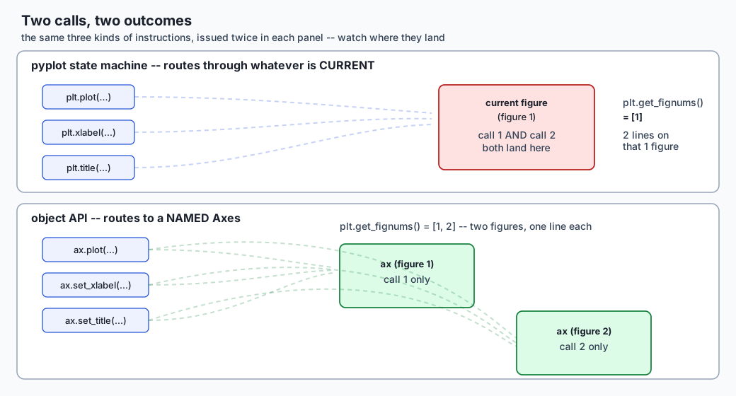
This lesson measured that exact failure for real. Calling a
plt.plot-based helper twice with different data left plt.get_fignums()
reporting [1] — one figure — holding two lines. Calling the equivalent
helper built with fig, ax = plt.subplots() instead, twice, left
plt.get_fignums() reporting [1, 2] — two figures, one line on each —
every time, with no discipline required to make it happen that way. The
second version cannot produce the first version’s bug, because it never
asks “what’s current?” It says exactly what it means: this axes, this
line.
The rule the rest of this course follows because of this: always
fig, ax = plt.subplots(), always call methods on ax. Every diagram,
every chart, every figure you will build from here through Day 133’s EDA
report and beyond uses the object API, and this lesson is where you learn
why that is not a style preference. It is the difference between a chart
that can only show what you told it to show, and a chart that can quietly
show something else because two pieces of code both assumed they had the
canvas to themselves.
matplotlib is not a special case in the AI practitioner’s toolkit — it is the layer every training curve, every confusion matrix, every evaluation plot in this course’s later sections gets drawn through, usually inside a helper function called once per experiment, once per epoch, or once per model comparison. A plotting helper written against the pyplot state machine and called from more than one place in a training or evaluation script does not fail loudly. It produces a report where two experiments’ loss curves are silently overlaid on one figure, or where the twentieth diagnostic plot in a long training run is the one that finally trips a memory warning nobody was watching for. Neither failure shows up as a wrong number — both show up as a chart that looks plausible and is not what anyone asked for, which is exactly the kind of mistake a testable, object-graph approach to charting catches before a reader ever has to notice it themselves.
The idea in plain language
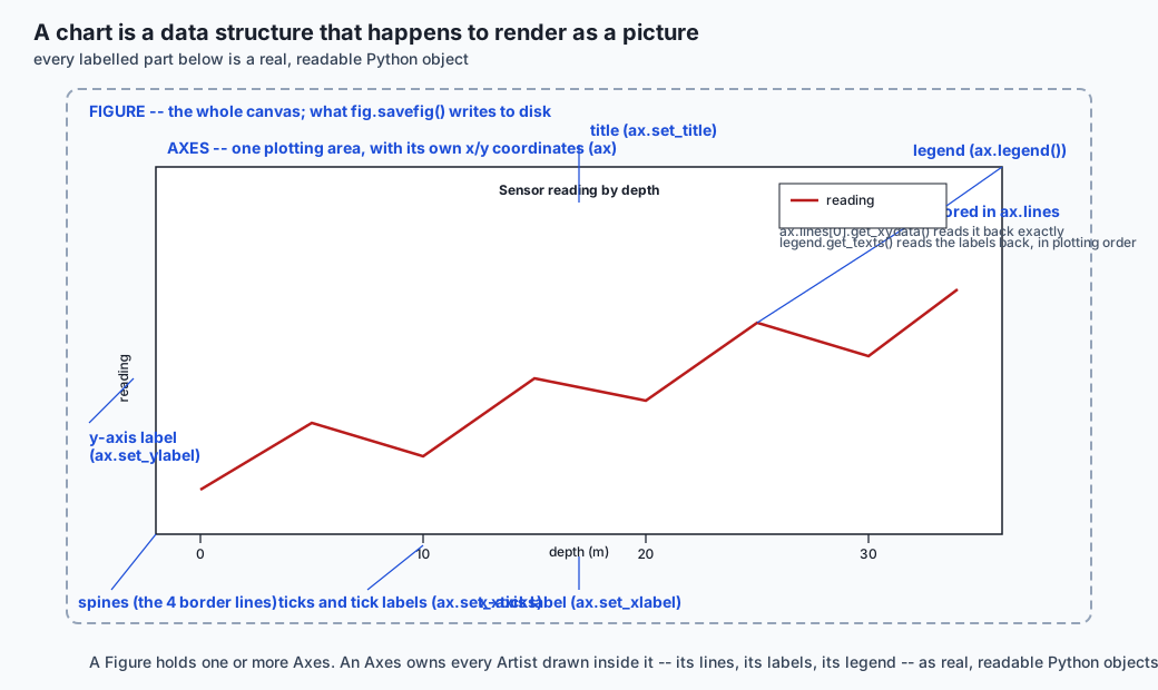
matplotlib gives you three things stacked on top of each other, and almost every confusing tutorial online exists because it never tells you which one it is talking to. A Figure is the whole canvas — the thing you save to a file. An Axes is one plotting area on that canvas, with its own x and y coordinates, its own title, its own labels. An Artist is anything actually drawn — a line, a bar, a piece of text, a legend.
A Figure can hold several Axes (that is what a grid of subplots is). Each
Axes holds a list of Artists (that is what ax.lines is — a list of the
Line2D objects that ax.plot() created). Nothing here is metaphorical:
these are real Python objects, with real attributes, and you can read
them back after the fact. ax.get_xlabel() returns the exact string you
passed to ax.set_xlabel(). ax.lines[0].get_xydata() returns the exact
array you plotted. This is the single most useful fact in the whole
lesson — a chart, in matplotlib, is not a picture. It is a data structure
that happens to render as a picture, and a data structure can be
inspected, asserted on, and tested, the same way you’d test a dictionary
or a list.
matplotlib gives you two ways to build that data structure. The pyplot
state machine — plt.plot, plt.xlabel, plt.title — is a set of
convenience functions that always operate on “the current figure” and
“the current axes,” tracked as hidden global state inside the pyplot
module. It is genuinely convenient for a single, throwaway plot in a
notebook cell: three lines, no boilerplate, done. The object API —
fig, ax = plt.subplots(), then ax.plot, ax.set_xlabel, ax.set_title
— makes you name the figure and axes you’re drawing into, once, and then
every following call is a method on that specific object. It costs one
extra line up front. What it buys back is that the code can never be
ambiguous about where it is drawing, which is exactly the property that
breaks in the state machine the moment a plotting routine is called more
than once, or from inside a function, or from two different places in a
larger program — which describes essentially all real code, and none of
a notebook’s first three cells.
Historical background
matplotlib was created by John D. Hunter, a neurobiologist, starting
around 2002-2003, out of frustration with the plotting tools available in
the scientific Python ecosystem at the time — MATLAB was the dominant
environment for this kind of plotting in academic labs, and Hunter wanted
MATLAB-like plotting commands available from Python, without a MATLAB
licence. The name is a portmanteau of “MATLAB” and “plot library,” and
that MATLAB ancestry is exactly where the pyplot state machine comes
from: plt.plot, plt.xlabel, plt.title are deliberately modelled on
MATLAB’s own global-current-figure plotting commands, because that was
the interface working scientists already knew.
The object-oriented API — Figure, Axes, Artist as real, addressable
objects — was there from early on as the library’s actual underlying
architecture; pyplot was always a thin convenience layer built on top of
it, not a separate implementation. What has shifted over roughly two
decades of matplotlib’s life is the advice: early tutorials, written for
an audience coming from MATLAB, leaned almost entirely on the pyplot
functions, because that was the familiar shape. As matplotlib’s own
audience grew to include people who had never touched MATLAB, and as
programs built with it grew from single notebook cells into functions,
classes and long-running services, the object API’s explicitness stopped
being a nice-to-have and became the documented, endorsed way to write
anything beyond a single throwaway plot — which is precisely the guidance
matplotlib’s own “Figures and Axes interfaces” documentation states today.
Hunter died in 2012; the project is now maintained by a large open-source
community (the Matplotlib Development Team, NumFOCUS-sponsored) and
remains, more than twenty years on, the plotting library nearly every
other Python visualization tool either builds on directly (seaborn) or
positions itself as an alternative to (plotly, plotnine, Bokeh).
What it is — and what it is not
matplotlib is a 2-D (and limited 3-D) plotting library: a way to turn arrays of numbers into rendered charts, and to control every visual element of that rendering — colour, line width, tick spacing, font, DPI — in code. It is not a statistical analysis library (it does not compute a regression line or a confidence interval for you; seaborn and scipy do that, then hand matplotlib the numbers to draw), not a dashboard framework (no built-in interactivity, callbacks, or state management across user clicks — Plotly Dash and Streamlit exist for that), and not a data processing library (it plots whatever array you give it; pandas and NumPy are what produce that array).
It is also not, despite the pyplot interface’s appearance, a system that
requires you to think in terms of “the current plot.” That impression —
common among people who learned matplotlib from plt.plot-only
tutorials — is an artifact of which corner of the API got taught first,
not a description of what the library actually is underneath. Underneath,
every chart is a Figure containing Axes containing Artists, addressable
and inspectable as ordinary Python objects, whether or not the code that
built it ever used the word pyplot.
Why it was created and what problems it solves
Before matplotlib, plotting from Python meant either shelling out to a separate tool (Gnuplot, via a wrapper) or writing bespoke, ad hoc code against whatever graphics library happened to be available, with no common conventions across projects. matplotlib solved the problem of having a plotting library at all that felt native to Python and produced publication-quality output, and it did so specifically by copying an interface (MATLAB’s) that its target audience — scientists and engineers — already had years of muscle memory for.
The problem this lesson’s opening failure describes — two APIs, one familiar and fragile, one more verbose and robust — is a second-order consequence of that founding design choice, and it is worth naming precisely because it explains a design tension every plotting library eventually has to resolve: the interface that is easiest to teach (a short sequence of global function calls, no object management) is often not the interface that is safest to build programs out of (explicit objects, explicit method calls, no hidden global state). matplotlib chose not to force a resolution — it kept both, kept the convenient one as the default in its own quick-start documentation, and left it to the individual author to learn, usually the hard way, when the convenient one stops being safe. This lesson exists to shorten that learning curve to one paragraph and one measured example, rather than one production incident.
How it works
Start from the object you actually get back from plt.subplots():
import matplotlib
matplotlib.use("Agg")  # headless -- no window, ever
import matplotlib.pyplot as plt

fig, ax = plt.subplots(figsize=(6, 4))
ax.plot([0, 1, 2, 3], [0, 1, 4, 9])
ax.set_xlabel("x")
ax.set_ylabel("y")
ax.set_title("a parabola-ish thing")
fig is a Figure object. ax is an Axes object. ax.plot(...)
creates a Line2D Artist and appends it to ax.lines — after the call
above, len(ax.lines) == 1, and ax.lines[0].get_xydata() returns
exactly the two arrays you passed in, unchanged. ax.set_xlabel("x")
sets a Text artist’s string; ax.get_xlabel() reads it straight back.
None of this is inference or approximation — it is direct attribute
storage and retrieval, which is exactly why every claim in this lesson
gets checked by reading these objects back rather than by looking at a
rendered picture.
Saving the figure goes through fig.savefig(path, ...), and two
arguments control the output size precisely. figsize=(width, height) in
inches is set at plt.subplots() time (or with fig.set_size_inches
afterward); dpi (dots per inch) is passed to savefig itself, or set as
a Figure-level default. Multiply them and you get the output’s pixel
dimensions, exactly, as long as bbox_inches='tight' is not requested:
| figsize (inches) | dpi | saved pixel dimensions (measured) |
|---|---|---|
(6, 4) | 100 | 600 x 400 |
(6, 4) | 200 | 1200 x 800 |
(6, 4) | 50 | 300 x 200 |
Those three rows are not textbook numbers — they are read directly off
real PNG files this lesson’s lab saved, by parsing each file’s own IHDR
header bytes (a PNG’s width and height are stored as two big-endian
4-byte integers, 16 bytes into the file, after an 8-byte signature and a
4-byte chunk length). bbox_inches='tight' changes this: it crops the
saved canvas to the bounding box of whatever was actually drawn, which
means the final size is figsize * dpi minus whatever margin got
trimmed — often exactly what you want visually, never exactly predictable
from the two numbers alone.
Raster versus vector is a choice made at savefig time via the file
extension or an explicit format= argument. PNG (and JPEG) are raster:
the output is a fixed grid of pixel colours, good for anything
photograph-like or for embedding in a place that expects a bitmap. SVG
(and PDF) are vector: the output is a description of shapes and text,
resolution-independent, and — for SVG specifically — literally XML markup
you can open in a text editor. This lesson’s lab proved the practical
consequence directly: after saving one chart as both formats, the string
"depth (m)" (the axis label) was found as literal characters inside the
saved SVG file, and was not found anywhere in the saved PNG file’s bytes.
An SVG or PDF chart can be zoomed, printed at any size, or have its text
edited after the fact; a PNG chart is exactly as sharp as the pixels it
was rasterized into, forever.
Subplots are built with plt.subplots(nrows, ncols), which returns
(fig, axes) where axes is a genuine 2-D NumPy array of Axes objects
when either nrows or ncols exceeds 1 — shaped exactly (nrows, ncols). Measured directly: plt.subplots(2, 3) returns an axes array
of .shape == (2, 3), and setting axes[0, 0].set_xlabel(...) leaves
axes[0, 1].get_xlabel() as an empty string. Each cell is independent
because each cell is a genuinely separate Axes object; nothing shares
state between them unless you explicitly ask for it with sharex=True or
sharey=True. When subplots overlap or their labels collide, fig. tight_layout() (the older, simpler option) or constrained_layout=True
(passed to plt.subplots(), the newer and generally more robust option)
adjusts spacing automatically.
Labels, limits, ticks and scales are all set through methods on ax:
ax.set_xlabel, ax.set_title, ax.set_xlim, ax.set_xticks. Axis
limits autoscale to fit the plotted data by default — call ax.set_ylim
explicitly and that override sticks; autoscaling does not resume on its
own. ax.set_yscale('log') switches an axis to a logarithmic scale,
where equal steps represent equal ratios rather than equal differences
— useful for data spanning several orders of magnitude. It has one sharp
edge worth stating precisely, because it is easy to discover it the hard
way in a real chart: a log scale on data containing zero or negative
values does not raise an error. Measured directly on matplotlib 3.11.1:
plotting [0, 1, 4, 9, 16] and switching the y-axis to log left
ax.get_ylim() reporting roughly (0.87, 18.4) — a lower bound strictly
above zero — while ax.lines[0].get_xydata() still contained the
original (0, 0) point, untouched. The zero-valued point simply does not
get drawn, because there is no y-pixel log(0) maps to. No error, and in
this mixed-sign case, no warning either — matplotlib’s “Data has no
positive values, and therefore cannot be log-scaled” warning only fires
when every value in the series is non-positive. A chart with one silent
missing point, and nothing telling you it is missing, is a genuinely easy
way to misreport data.
Annotation goes through ax.text(x, y, "a note") for a plain label at
a data coordinate, and ax.annotate("a note", xy=(x, y), xytext=(x2, y2), arrowprops=dict(arrowstyle="->")) for a label connected to a specific
point by an arrow, with the label itself placed somewhere less crowded.
One well-placed annotation pointing at the interesting spike in a curve
usually communicates more, faster, than a legend forcing the reader to
match five colours to five labels in a separate box.
Legends follow the label-then-legend pattern: pass label= to every
plot call that should appear, then call ax.legend() once, after every
relevant artist exists. Measured directly: plotting a “measured” series
then a “predicted” series, each with its label set at plot time, then
calling ax.legend() once, produces a Legend whose
get_texts() reads back exactly ['measured', 'predicted'] — plotting
order, not alphabetical order, not label-string order.
rcParams and style sheets set defaults once instead of repeating them
on every call. matplotlib.rcParams['lines.linewidth'] = 2 (or the
equivalent plt.rc('lines', linewidth=2)) changes the default for every
subsequent plot in the process; plt.style.use('seaborn-v0_8') (or any
named or custom style sheet) swaps in a whole bundle of such defaults at
once — colours, fonts, grid visibility — which is how a report with a
dozen charts stays visually consistent without a dozen copies of the same
keyword arguments.
Figure lifecycle is the sharpest edge in the whole lesson, because it
produces a real, measured leak rather than a hypothetical one. Every
figure created through plt.figure() or plt.subplots() is retained in
a global registry — plt.get_fignums() lists it — until plt.close(fig)
or plt.close('all') explicitly removes it. There is no automatic
cleanup tied to a Python variable going out of scope; a function that
plots in a loop and returns without closing leaks one figure, every call.
Measured directly: opening 22 figures in a loop without closing any left
plt.get_fignums() reporting all 22 as open, and triggered exactly one
real RuntimeWarning, containing the text "More than 20 figures have been opened" — matplotlib’s own defence against exactly this pattern,
firing once the count passes its default threshold of 20
(rcParams['figure.max_open_warning']). Closing each figure individually
brought plt.get_fignums() back to an empty list. A long-running report
job or a training loop that plots a diagnostic chart every epoch without
closing it will not crash on epoch 21 — it will simply hold every figure
it has ever created in memory, indefinitely, until something notices the
process is slow or the machine is out of memory.
An everyday analogy
Think of a Figure as a picture frame you bought, and an Axes as a canvas you mounted inside it — you can mount several canvases in one frame (a subplot grid), and each canvas holds its own painting, its own caption card, its own frame-within-the-frame for its title.
The pyplot state machine is like handing instructions to an assistant who always works on “whatever canvas is on the easel right now.” Say “paint a red line” and they paint it on the easel canvas. Say “paint a blue line” five minutes later, with nothing said about switching canvases, and they paint it on the same easel canvas, because nobody told them to put up a new one — from their point of view, that is exactly what you asked for. The object API is like handing a signed, labelled instruction directly to the specific canvas you want painted: there is no “easel” to be ambiguous about, because the instruction names its target.
savefig is like photographing the framed picture: figsize is the
picture’s physical size, dpi is how many pixels the camera captures per
inch of picture, and multiplying them tells you exactly how big the photo
file will be — unless you ask the photographer to crop the photo to just
the painted area (bbox_inches='tight'), in which case the final size
depends on how much blank frame there was to crop away. A PNG is that
photograph: sharp at the size it was taken, blurry if you blow it up
further. An SVG is more like the original painting’s inventory record —
a description precise enough to repaint the exact same picture at any
size, with the caption card’s text still legible as text, not as a
smudge of paint.
Examples in practice
Every example below was captured from a real, headless matplotlib 3.11.1
run — matplotlib.use("Agg") set before pyplot is imported, no window
ever opened, and every figure closed with plt.close() when the example
is done with it.
The two-APIs bug, made and unmade. The pyplot version:
def draw_pyplot(x, y, label):
    plt.plot(x, y, label=label)
    plt.xlabel("x")
    plt.title("drawn with the pyplot state machine")
    plt.legend()

draw_pyplot([0, 1, 2, 3], [0, 1, 4, 9], "run A")
draw_pyplot([0, 1, 2, 3], [9, 4, 1, 0], "run B")
# plt.get_fignums() -> [1]   -- one figure
# len(plt.gcf().axes[0].lines) -> 2   -- both lines on it
The object version:
def draw_object(x, y, label):
    fig, ax = plt.subplots()
    ax.plot(x, y, label=label)
    ax.set_xlabel("x")
    ax.set_title("drawn with the object API")
    ax.legend()
    return fig, ax

fig_a, ax_a = draw_object([0, 1, 2, 3], [0, 1, 4, 9], "run A")
fig_b, ax_b = draw_object([0, 1, 2, 3], [9, 4, 1, 0], "run B")
# plt.get_fignums() -> [1, 2]   -- two figures
# len(ax_a.lines) -> 1, len(ax_b.lines) -> 1
Pixel arithmetic, checked against the file itself.
fig, ax = plt.subplots(figsize=(6, 4))
ax.plot([0, 1, 2], [0, 1, 0])
fig.savefig("a.png", dpi=100)   # -> 600 x 400, read from a.png's own header
fig.savefig("b.png", dpi=200)   # -> 1200 x 800
Testing a chart without ever looking at it. This is the day’s most practical habit, and it generalizes to every chart you will ever build in this course: assert on the object graph, never on pixels.
assert ax.get_xlabel() == "depth (m)"
assert ax.get_ylim() == (-5, 5)
assert len(ax.lines) == 2
assert ax.lines[0].get_xydata().tolist() == [[0.0, 2.0], [1.5, -1.0]]
assert ax.get_yscale() == "log"
No golden image, no pixel-diff tolerance, no test that breaks because a font changed between matplotlib versions. Each assertion checks exactly the claim a person reading the chart would care about, and each one comes back instantly and deterministically.
Implications: security, privacy, performance, scalability, and cost
Security. matplotlib reads and writes files (savefig, and rarely,
reading an image with imread) and evaluates no user-supplied code by
default. The one sharp edge: a MATPLOTLIBRC config file or a style
sheet loaded from an untrusted path is just a text file matplotlib
parses, not a security boundary — do not load style sheets from
user-supplied paths in a service that renders charts on someone else’s
behalf.
Privacy. Charts embed exactly the data you plot, and vector formats
embed it more legibly than raster ones. An SVG or PDF chart’s axis labels,
tick labels, and any ax.text annotation are literal searchable text in
the saved file — which is a feature for a report you intend readers to
copy numbers out of, and a real leak if the same chart is generated from
data that should not be that easy to extract (a screenshot of a
dashboard containing account numbers, say, saved as SVG rather than PNG).
Know which property you are relying on before you pick the format.
Performance. Headless rendering (the Agg backend, set via
matplotlib.use("Agg") before importing pyplot, or the MPLBACKEND=Agg
environment variable) is what makes matplotlib usable in a script, a
test suite, or a server process with no display attached — every chart in
this course’s labs is generated this way. Rendering itself is fast for
anything with a few thousand points or fewer; it slows down noticeably
past tens of thousands of points per Axes, at which point downsampling
before plotting (or a GPU-accelerated alternative outside this lesson’s
scope) matters more than any matplotlib-level tuning.
Scalability. The figure-lifecycle leak measured earlier in this
lesson is the scalability failure mode that actually shows up in
practice: a long-running process (a monitoring dashboard regenerating
charts on a schedule, a training script logging a diagnostic plot every
epoch) that never calls plt.close() accumulates one Figure object per
chart, forever, until memory pressure or the 20-figure warning is the
first sign anyone notices. The fix costs one line — plt.close(fig) right
after savefig, or a with block pattern that guarantees it — and is
easy to forget precisely because the first hundred iterations look fine.
Cost. matplotlib itself has no cost of any kind — free, open source, BSD-compatible licence, no tier, no account. The cost this lesson’s implications are really about is engineering time: the two-APIs bug and the figure leak are both silent, both easy to introduce, and both cheap to prevent once you know to look for them, which is the entire value proposition of spending a day on “fundamentals” that might otherwise look too basic to deserve one.
Alternatives: free, open source, and commercial
| Library | When to choose it | How it is called | One snippet | Free vs paid |
|---|---|---|---|---|
| matplotlib (ran) | The default for this course: full control over every visual element, the substrate other libraries build on, works everywhere from a script to a paper figure. | fig, ax = plt.subplots(); ax.plot(x, y) | fig.savefig("out.svg") | Fully free and open source (BSD-compatible licence); no paid tier of any kind. |
| seaborn (installed, ran — Day 129 covers it) | Statistical plots — distributions, categorical comparisons, regression fits — with far less code than the matplotlib equivalent, and sensible defaults for colour and style out of the box. | sns.lineplot(data=df, x="day", y="value", hue="group", ax=ax) — takes and returns a matplotlib Axes | sns.histplot(data=df, x="value", ax=ax) | Fully free and open source (BSD-3-Clause); no paid tier. |
| plotnine (docs only, not run here) | A grammar-of-graphics builder for Python, porting R’s ggplot2 model: charts are assembled by adding layers rather than calling imperative draw commands, which some analysts find clearer for faceted, multi-layer statistical charts. | (ggplot(df, aes(x="day", y="value")) + geom_line() + facet_wrap("group")) | same expression, + theme_minimal() added | Fully free and open source (BSD-2-Clause); no paid tier. |
| plotly (docs only, not run here) | Interactive, browser-rendered charts — hover tooltips, zoom, pan — for a notebook, a web app, or a Dash dashboard, where a static image is not enough. | px.line(df, x="day", y="value", color="group") (the plotly.express high-level interface) | fig.write_html("out.html") | Core library and Dash open-source framework are free (MIT-licensed); static-image export needs the separate kaleido package; Dash Enterprise (deployment, authentication, scaling for organizations) is a paid product layered on top of the free framework. |
matplotlib, seaborn and plotnine are all free and open source with no paid tier whatsoever. plotly’s charting library and open-source Dash framework are free; the only cost anywhere in this ecosystem is Plotly’s enterprise deployment product, which this lesson’s labs never touch. This lesson ran matplotlib and seaborn for real; plotnine and plotly are described from their public documentation only, and no output attributed to either is reproduced anywhere in this lesson or its lab.
Comparison with related concepts
| Concept | What it actually is | How it differs from matplotlib fundamentals |
|---|---|---|
| Chart type selection (Day 127) | Choosing which shape of chart honestly represents a given relationship or comparison. | A decision made before any matplotlib code is written; today’s lesson is about how to build whichever chart Day 127 says you need, correctly. |
| seaborn (Day 129) | A statistical-plotting layer built on top of matplotlib’s own Axes objects. | Every sns.* function still returns (or accepts) a matplotlib Axes — today’s object model is what seaborn’s convenience sits on top of, not a separate system. |
| Chart honesty (Day 132) | Choosing scales, baselines and framing that do not mislead — not truncating a bar chart’s y-axis, not hiding an inconvenient point. | Today’s set_yscale('log') silently dropping a zero-valued point is a mechanism Day 132’s honesty concerns can be caused by; today explains the mechanism, Day 132 covers the judgment calls around when a log scale is even the right choice. |
| Plotting versus computing | matplotlib turns arrays of numbers you already have into a rendered chart. It does not compute a mean, a regression, or a confidence interval for you. | pandas and NumPy (Weeks 15-18) or scipy compute the numbers; matplotlib (and seaborn, on top of it) draw them. Confusing “the chart looks wrong” with “the underlying statistic is wrong” is a common and costly mix-up. |
| Testing a chart | Asserting on the Figure/Axes/Artist object graph — labels, limits, line data, legend text, figure counts. | Different in kind from testing most other code: the object graph is the chart, so there is no separate “rendering correctness” question the way there is for, say, a PDF layout engine. |
When to use it — and when not to
Use matplotlib, through the object API, for essentially every chart this course produces: exploratory data analysis, a report figure that will be saved and shared, a diagnostic plot inside a training loop, a static architecture diagram. It is the right default because it is free, has no external dependency beyond itself, runs headless in a script or CI job exactly the way this lesson’s lab does, and its output is precise and reproducible down to the pixel.
Reach for something layered on top of it — seaborn — when the chart is
fundamentally statistical (a distribution, a categorical comparison, a
regression fit) and the matplotlib-only version of the same chart would
be a dozen lines of manual computation before a single ax.plot() call.
Reach outside matplotlib’s own family entirely — plotly, or a
JavaScript-based tool for a web page — when the chart genuinely needs
interactivity a static image cannot provide: hover tooltips over
thousands of points, a zoomable time series a reader will explore rather
than just read.
Do not reach for matplotlib’s pyplot state machine — plt.plot,
plt.xlabel — inside any function that might be called more than once,
or inside any codebase larger than a single notebook cell meant to be
read top to bottom exactly once. That is the one piece of “when not to
use it” this lesson insists on, because it is the one failure mode that
produces a chart which looks fine and is wrong.
Knowledge check
- Two calls to a
plt.plot-based helper function, with noplt.figure()call in between, produce how many figures — and why? - What two
savefigarguments determine a saved PNG’s exact pixel dimensions, and what breaks that exact prediction? - Why does
plt.subplots(2, 3)[1](the returned Axes array) have shape(2, 3)rather than being a flat list of six Axes? - What does
ax.set_yscale('log')actually do to a data point with value zero — measured, not assumed? - In what order do a legend’s entries appear, and what determines it?
- What is the concrete, file-level difference between what a saved SVG contains and what a saved PNG contains?
- What keeps a figure “alive” in matplotlib’s global registry, and what removes it?
- Why is asserting on
ax.get_xlabel()orax.lines[0].get_xydata()a more robust way to test a chart than comparing rendered pixel images?
Hands-on exercise
Work through starter/00_brief.md in this lesson’s lab,
labs/sections/math-statistics-and-data/day-128-matplotlib-fundamentals/.
Nine exercises, each a small function in starter/plotting.py: the two
APIs and their differing figure counts, an exact data round-trip through
a Line2D artist, savefig’s pixel arithmetic checked against a real
PNG’s own header bytes, labels and an explicit set_ylim that overrides
autoscaling, an independent (2, 3) grid of subplots, a log scale’s
silent treatment of a zero-valued point, the label-then-legend pattern,
the figure-lifecycle leak and matplotlib’s own warning past 20 open
figures, and the searchable-text-versus-opaque-pixels difference between
SVG and PNG. Every exercise runs headless and writes only to a temporary
directory that cleans itself up.
cd labs/sections/math-statistics-and-data/day-128-matplotlib-fundamentals
python3 -m venv .venv
.venv/bin/pip install -r requirements/requirements.txt
.venv/bin/pytest starter -q
Expected output
On an untouched checkout:
1 passed, 13 skippedOnce every function in starter/plotting.py is written correctly:
14 passedThe reference suite in examples/ — read after attempting the starter —
reports:
19 passedand the full harness ends with:
34 checks, 0 failure(s).Validate your work
.venv/bin/pytest starter -q -p no:cacheprovider
bash tests/run_tests.sh; echo "exit=$?"
A skip means a function has not been attempted yet (it still raises
NotImplementedError). A failure means the function runs but returns the
wrong thing, and the failure message shows both your value and the
expected one. run_tests.sh finishing with exit=0 and N checks, 0 failure(s). is the complete signal that every exercise, both suites, and
the disk-cleanliness check all agree the lab is done.
Troubleshooting
See troubleshooting.md in the lab directory for the full list. The two
most common snags: running a reference script from the lab’s root
directory instead of from inside examples/ (it imports plotting
relative to itself, so it must be run from beside it), and forgetting
that save_at_size_and_dpi must not pass bbox_inches='tight' — that
argument is exactly what breaks the exact pixel-arithmetic prediction
exercise 3 checks for.
Common mistakes
- Calling
plt.show()anywhere in the lab. Nothing here has a display to show to; every script and test forces the headlessAggbackend, andplt.show()is a no-op on it — harmless, but a sign the code was not written with a headless environment in mind. - Reading
ax.get_ylim()for the log-scale exercise without first callingfig.canvas.draw(). matplotlib recomputes an Axes’ limits from its scale lazily, on the next draw, not the instantset_yscaleis called — skip the forced draw and you may read back stale, pre-log limits. - Forgetting
label=on aplot()call and then wondering whyax.legend()produces an entry reading_line0or nothing useful at all — the label has to be supplied at plot time, not after. - Comparing two figures’ pixel bytes directly to “test” a chart, instead of asserting on the object graph. Two runs of the exact same plotting code can legitimately differ at the byte level (font hinting, timestamp metadata some backends embed) while being visually and structurally identical — the object-graph assertions this lesson teaches do not have that problem.
Practice assignment
Take any dataset you have used earlier in this course (a CSV from Week 18,
or invented data of your own) and build a two-panel figure with
fig, ax = plt.subplots(1, 2, figsize=(10, 4)): the left panel a line
chart with a proper x-label, y-label and title; the right panel the same
data’s cumulative sum, on a shared x-axis (sharex=True). Save the result
twice — once as PNG at 150 dpi, once as SVG — and write a short script
that asserts, without opening either file visually: both Axes have
non-empty titles, the left Axes has exactly one line whose data round-trips
exactly, the right Axes’ y-values are monotonically non-decreasing (a
property a cumulative sum should have), and the SVG file contains both
titles as searchable text while the PNG’s byte content does not.
Extension challenge
Build a small “figure budget” context manager: a with figure_budget():
block that records plt.get_fignums() on entry, and on exit, raises an
assertion error naming exactly which figure numbers were left open if the
count on exit exceeds the count on entry. Wrap it around a deliberately
leaky function (one that calls plt.subplots() in a loop without
closing) and confirm it catches the leak; then wrap it around a correctly
written function and confirm it passes silently. This is the same idea
production monitoring tools use for other kinds of resource leaks —
database connections, open file handles — applied to the one resource
this lesson showed you matplotlib will happily leak without complaint
until you are 21 figures in.
Quiz
Q1. A helper function calls plt.plot(x, y) and plt.xlabel("x") to draw a chart. It is called twice in a row, with different data, and nothing calls plt.figure() in between. What does plt.get_fignums() report afterward?
- A list of two figure numbers, one per call
- A list with exactly one figure number, holding both lines
- An empty list, since neither call created a named figure
- An error, because plt.plot cannot be called twice without plt.show() in between
Show answer
Answer: B. A list with exactly one figure number, holding both lines
Every plt.* call draws into whichever figure is currently "current" (plt.gcf()). Without an intervening plt.figure() or plt.subplots(), the second call finds the same current figure the first call left behind, and both lines land on it. This lesson measured exactly this: plt.get_fignums() == [1] with two lines on that one figure, which is the entire motivation for the object API.
Q2. What structurally prevents fig, ax = plt.subplots() from ever drawing into a different figure than the one just created, in a way the pyplot state machine cannot guarantee?
- plt.subplots() automatically calls plt.close() on any other open figures
- Every following instruction is a method call on the specific ax object returned, which has no notion of "current" to get confused about
- The object API only allows one figure to exist per Python process
- ax.plot() checks a global lock before drawing to prevent concurrent figures
Show answer
Answer: B. Every following instruction is a method call on the specific ax object returned, which has no notion of "current" to get confused about
The object API names its target explicitly: ax.plot(), ax.set_xlabel() and so on all operate on the specific Axes object in hand. There is no "currently active" figure or axes for a bug to route through by mistake -- the only way to draw into the wrong Axes is to be handed the wrong ax variable, which is a different and much rarer mistake than forgetting to call plt.figure().
Q3. A figure is created with figsize=(6, 4) and saved with fig.savefig(path, dpi=100) and no bbox_inches argument. What are the saved PNG's pixel dimensions?
- 600 x 400
- 6 x 4
- 100 x 100
- It depends on how much whitespace surrounds the plotted data
Show answer
Answer: A. 600 x 400
Pixel dimensions are figsize (in inches) times dpi, exactly, when the default bounding box is used: 6 inches x 100 dpi = 600 pixels wide, 4 inches x 100 dpi = 400 pixels tall. This lesson verified it by reading the saved PNG's own IHDR header bytes, not by trusting the arithmetic, and confirmed doubling dpi to 200 doubles both dimensions to exactly 1200 x 800.
Q4. Why does bbox_inches="tight" break the figsize-times-dpi pixel prediction?
- It has no effect on the saved file, only on the on-screen preview
- It doubles the dpi automatically to compensate for cropping
- It crops the saved output to the bounding box of what was actually drawn, so the final size depends on the content and its margins rather than only on figsize and dpi
- It only affects vector formats like SVG, never PNG
Show answer
Answer: C. It crops the saved output to the bounding box of what was actually drawn, so the final size depends on the content and its margins rather than only on figsize and dpi
bbox_inches="tight" is often what you want visually -- it trims empty margin around the plotted content -- but that means the saved size is figsize x dpi MINUS whatever got trimmed, which depends on the specific figure's content, labels and layout. Exact pixel arithmetic requires the default, untrimmed bounding box.
Q5. plt.subplots(2, 3) is called, and a label is set on axes[0, 0]. What is axes[0, 1].get_xlabel() afterward?
- The same label as axes[0, 0], since they share a row
- An empty string, because each Axes in the returned array is independent
- A TypeError, since axes cannot be indexed like a 2-D array
- The label of whichever Axes was created most recently
Show answer
Answer: B. An empty string, because each Axes in the returned array is independent
plt.subplots(nrows, ncols) returns a genuine (nrows, ncols) numpy array of independent Axes objects. Setting state on one entry -- a label, a title, a plotted line -- has no effect on any other entry. This lesson confirmed it directly: after labelling only axes[0, 0], every other cell in a 2x3 grid reported an empty string for get_xlabel().
Q6. A series [0, 1, 4, 9, 16] is plotted and ax.set_yscale("log") is applied, then the figure is redrawn. What actually happens to the point at (x=0, y=0), measured on matplotlib 3.11.1?
- matplotlib raises a ValueError, since log(0) is undefined
- The point is silently removed from ax.lines[0].get_xydata()
- matplotlib always prints a warning naming the offending zero value
- The point remains in the line's stored data, but the rendered y-limits narrow to exclude it, so it draws nothing and no error or warning fires for this mixed-sign case
Show answer
Answer: D. The point remains in the line's stored data, but the rendered y-limits narrow to exclude it, so it draws nothing and no error or warning fires for this mixed-sign case
Measured directly: after set_yscale("log") and a forced redraw, ax.get_ylim() came back as roughly (0.87, 18.4) -- a lower bound strictly above zero -- while ax.lines[0].get_xydata() still contained the original (0, 0) point untouched. matplotlib only emits its "no positive values" warning when EVERY value is non-positive; a mix draws nothing for the zero point and says nothing about it.
Q7. ax.plot(x, y1, label="B") is called, then ax.plot(x, y2, label="A") is called, then ax.legend(). What order do the legend entries appear in?
- Alphabetical: "A" then "B"
- Plotting order: "B" then "A"
- Reverse plotting order: "A" then "B", most recent first
- Undefined -- legend order is randomized each render
Show answer
Answer: B. Plotting order: "B" then "A"
A Legend's entries follow the order the labelled artists were created in, not the order of their label strings. This lesson's lab measured exactly this: [t.get_text() for t in legend.get_texts()] equals the labels in plotting order, which is why the label-then-legend pattern calls legend() only after every relevant plot() call.
Q8. A report-generation function calls fig, ax = plt.subplots() inside a loop that runs 25 times, without ever calling plt.close(fig). What happens, measured on matplotlib 3.11.1?
- Nothing -- matplotlib automatically closes figures once their variable goes out of scope
- The process crashes immediately after the 20th figure
- plt.get_fignums() grows to 25 entries, and a RuntimeWarning naming "More than 20 figures" fires once the count passes 20 -- the figures stay open and consume memory until plt.close() is called on each
- Each new call to plt.subplots() silently reuses and overwrites the previous figure
Show answer
Answer: C. plt.get_fignums() grows to 25 entries, and a RuntimeWarning naming "More than 20 figures" fires once the count passes 20 -- the figures stay open and consume memory until plt.close() is called on each
Every figure created through pyplot stays in a global registry until explicitly closed -- there is no automatic cleanup tied to a Python variable going out of scope. This lesson triggered the real warning: opening 22 figures without closing any produced exactly one RuntimeWarning containing "More than 20 figures," and plt.get_fignums() reported all 22 as open until plt.close("all") emptied the registry back to zero.
Q9. The same chart is saved once as reading.png and once as reading.svg. Searching each file's own bytes for the axis label text "depth (m)", what is found?
- The text is found inside the SVG file and not found anywhere inside the PNG file
- The text is found in both files, since both formats embed the original label as metadata
- The text is found in neither file -- labels are rendered into un-searchable glyph outlines in both formats
- The text is found only in the PNG, since SVG stores text as vector paths rather than characters
Show answer
Answer: A. The text is found inside the SVG file and not found anywhere inside the PNG file
SVG is XML markup -- a text label is written as a literal <text> element, searchable in any text editor. PNG is a fixed grid of pixel colour values -- the string that produced a label is nowhere in the file's bytes, only the pixels its glyphs were rasterized into. This lesson confirmed both directions directly: "depth (m)" was found inside the saved SVG's characters and absent from the saved PNG's bytes, which is the concrete, testable version of "vector output is better for anything that will be zoomed, printed, or edited later."
Glossary
- Figure
- The whole canvas matplotlib draws on -- the object you save to a file with savefig, and the top of the object model. A Figure holds one or more Axes; it owns nothing about what gets plotted, only where the Axes sit and at what overall size and resolution the canvas gets rendered.
- Axes
- A single set of x/y (or x/y/z) coordinates inside a Figure, and the object almost everything in this lesson is a method call on. An Axes owns its plotted Artists, its labels, its title, its limits, its ticks and its legend. Despite the name's similarity to "axis," one Axes typically has two axis objects (x and y) belonging to it -- the plural in "Axes" refers to this pairing, not to there being several of them.
- Artist
- matplotlib's base class for literally everything that gets drawn -- a Line2D from a plot() call, a Text from a label or title, a Rectangle from a bar, a Legend. An Axes' plotted content is a list of Artist objects, which is exactly what makes a chart testable: ax.lines is a list of Line2D artists, and each one's get_xydata() returns the numbers that produced it.
- pyplot state machine
- The plt.plot / plt.xlabel / plt.title style of calling matplotlib, where every function operates on whichever Figure and Axes are currently "current" (plt.gcf() and plt.gca()) rather than on an object you named yourself. Convenient for a single quick plot in a notebook; the source of the two-APIs bug the moment a drawing routine gets called more than once.
- object API
- The fig, ax = plt.subplots() style, where every following instruction is a method call on that specific ax. Every example in this course uses this style, because it makes it structurally impossible for one call to silently draw into a different figure than the one you meant.
- savefig
- The Figure method that writes a chart to a file, with the output format inferred from the extension (or set explicitly via format=). Its output size in pixels is figsize (inches) times dpi, exactly -- unless bbox_inches='tight' trims the canvas to the drawn content afterward, which breaks that exact prediction.
- dpi
- Dots per inch -- the resolution a Figure gets rendered at when saved to a raster format. Combined with figsize, dpi determines the output's pixel dimensions exactly: a 6x4 inch figure at 100 dpi saves at 600x400 pixels; at 200 dpi, 1200x800.
- bbox_inches
- A savefig argument controlling how much of the Figure's canvas gets written to the output file. The default writes the whole canvas at its declared figsize; 'tight' instead crops the output to the bounding box of everything actually drawn, which is often what you want visually but breaks the exact figsize-times-dpi pixel arithmetic, since the trimmed size depends on the content.
- subplots grid
- The array of Axes objects plt.subplots(nrows, ncols) returns when either dimension exceeds 1 -- a genuine 2-D numpy array shaped (nrows, ncols), not a flat list. Each entry is a fully independent Axes: setting a label on axes[0, 0] never touches axes[0, 1].
- autoscale
- matplotlib's default behaviour of choosing axis limits that fit the plotted data with a small margin, recomputed whenever new data is plotted. An explicit call to set_xlim or set_ylim overrides autoscaling for that axis; autoscaling does not resume unless autoscale() is called again explicitly.
- log scale
- An axis scale (set with set_yscale('log') or set_xscale('log')) where equal steps represent equal ratios rather than equal differences. It has no representation for zero or negative values -- matplotlib does not raise an error over this, it silently narrows the rendered range to exclude non-positive values, leaving the underlying data untouched but the affected points undrawn.
- label-then-legend pattern
- The convention of passing label= to every plot call that should appear in the legend, then calling ax.legend() once, after every relevant artist has been created. The legend's entries appear in plotting order, which is why the pattern names it "label-then" -- the labelling happens first, the single legend() call happens last.
- figure lifecycle
- The fact that every Figure created through pyplot (plt.figure(), plt.subplots()) is retained in a global registry until plt.close(fig) or plt.close('all') removes it -- it does not get garbage-collected just because the variable holding it goes out of scope. A function that plots in a loop and returns without closing leaks one figure per call; matplotlib issues its own RuntimeWarning once more than 20 figures are open at once (rcParams figure.max_open_warning).
- raster image
- An image format (PNG, JPEG) stored as a fixed grid of pixel colour values. Text and lines in a raster image are rendered into pixels at save time and cannot be searched, selected, or resized without quality loss -- the string that produced a label does not appear anywhere in the file's bytes.
- vector image
- An image format (SVG, PDF, EPS) stored as a description of shapes, paths and text -- resolution-independent, and, for SVG, literally XML markup you can open in a text editor. A vector chart's axis label appears as a literal <text> element you can search for in the file; the file can be zoomed or printed at any size without pixel artifacts.
- rcParams
- matplotlib's global dictionary of default settings -- figure size, font size, line width, colour cycle, and hundreds more -- read from matplotlib.rcParams or set in bulk from a named style sheet with plt.style.use(). Setting defaults once through rcParams, rather than repeating the same keyword argument on every plot call across a report, is what keeps a multi-chart document visually consistent.
Sources and further reading
- Quick start guide — Matplotlib documentation — Matplotlib Development Team (accessed 2026-08-20)
- Introduction to Figures and Axes interfaces — Matplotlib documentation — Matplotlib Development Team (accessed 2026-08-20)
- matplotlib.pyplot.subplots — Matplotlib documentation — Matplotlib Development Team (accessed 2026-08-20)
- The Figure class — Matplotlib documentation — Matplotlib Development Team (accessed 2026-08-20)
- Customizing Matplotlib with style sheets and rcParams — Matplotlib documentation — Matplotlib Development Team (accessed 2026-08-20)
Kept in this browser, no account needed. Your progress page turns the whole record into one link you can bookmark or open on another device.