Math, Statistics, and Data › Data Visualization › Day 129
Day 129: Statistical Plots with seaborn
After this lesson you will be able to explain that a barplot draws a computed group mean with a bootstrapped confidence interval rather than any raw value, and demonstrate a case where that hides what mattered; tell an axes-level seaborn function (which draws into an Axes you own and returns it) from a figure-level function (which creates and owns its own Figure and returns a FacetGrid) by their return types; demonstrate that seaborn's default error bar is a random bootstrap and fix it with seed=; compare errorbar= options including 'sd', ('ci', 95), ('pi', 95) and 'se'; convert wide data to the long form seaborn's hue, col and row mappings require, using Day 124's melt; facet a plot with col=/row= and read how many Axes a facet grid produced; overlay raw points on an aggregated chart as the honest form for a small sample; use the Day 128 matplotlib object API as seaborn's escape hatch; and know that set_theme() is a global side effect on matplotlib's rcParams.
Hands-on lab for this lesson
Lab files on GitHub: https://github.com/ai-roadmap-365/ai-roadmap-365.github.io/tree/main/labs/sections/math-statistics-and-data/day-129-statistical-plots-with-seaborn
- Get the hands-on files. Clone the labs repository once (you can reuse this clone for every lesson). This works on macOS, Linux, and Windows (PowerShell or WSL):
git clone https://github.com/ai-roadmap-365/ai-roadmap-365.github.io.git cd ai-roadmap-365.github.io - Open this lesson's lab. Move into the directory for this specific day. Every lab lives at the same predictable path — section / subsection / week / day:
cd labs/sections/math-statistics-and-data/day-129-statistical-plots-with-seaborn - Read the lab guide. Open `README.md` in that directory. It lists the exact commands, what each does, the expected output, and how to check your work — read it before running anything.
- Run it and check your work. Follow the README's "How to run" section: run the example first to see the finished result, then complete the numbered exercises in `starter/`, then run the tests. The tests pass (exit 0) only when your work is correct.
bash tests/run_tests.sh # or the test command named in the lab README
You can also open the lab as a local page (works offline, shows the file tree and expected output).
Learning objectives
By the end of this lesson you will be able to:
- Demonstrate that a barplot's bar heights are group means -- not any value present in the raw data -- and recover the individual observations a bar chart hides with a stripplot or swarmplot of the same column
- Distinguish axes-level seaborn functions (scatterplot, histplot, boxplot: draw into an Axes, return that Axes) from figure-level functions (relplot, displot, catplot, lmplot: create and own their own Figure, return a FacetGrid) by their return types, and explain why ax= works on one family and not the other
- Demonstrate that two unseeded barplot calls produce bootstrapped error bars of slightly different extent, and that a fixed seed= makes two runs identical
- Compare errorbar='sd', errorbar=('ci', 95), errorbar=('pi', 95) and errorbar='se' on the same data and state which are closed-form statistics versus bootstrapped resampling procedures
- Convert a wide DataFrame to seaborn's required long (tidy) form with melt, and explain why hue, col and row mappings read column names that only exist once the data is long
- Use hue, size, style and col=/row= faceting, and read exactly how many Axes a FacetGrid produced from the number of categories and from col_wrap
- Choose between boxplot, violinplot and stripplot/swarmplot for a given sample size, and state the honest recommendation of overlaying raw points on a box for a small sample
- Use the Day 128 matplotlib object API (ax.set_ylabel, ax.set_ylim, and similar) as the escape hatch after a seaborn call has already drawn, on both axes-level and figure-level results
- Explain that sns.set_theme() and its context/palette arguments mutate matplotlib's global rcParams as a side effect that persists for every plot drawn afterwards, seaborn or not, until explicitly reset
- State which of seaborn, matplotlib, plotnine and Altair/Vega-Lite is the better choice for a given plotting task, and which of the four were actually run to produce this lesson's output versus described from documentation
Prerequisites
- Day 117 -- sampling and the Central Limit Theorem, specifically the bootstrap resampling technique that reappears in this lesson, unannounced, as barplot's default error bar
- Day 124 -- merging and reshaping, specifically melt, the exact operation this lesson uses to turn wide data into the long form seaborn requires
- Day 127 -- why to visualize and how to choose a chart type; this lesson assumes that decision is already made and focuses on what seaborn actually computes and draws
- Day 128 -- matplotlib's object model (fig, ax = plt.subplots(), the Figure/Axes/Artist hierarchy, and testing by asserting on artists), which this lesson's escape hatch and every artist-level claim depend on directly
- A working python3 on your PATH; the lab creates its own virtual environment with seaborn 0.13.2 and matplotlib 3.11.1 pinned exactly
Why this matters
Run this on seaborn 0.13.2 and read the numbers before anything else. Four teams, four scores each. Team B’s scores are 90, 88, 92 and 10 — three of the four best individual scores anywhere in the table, dragged down by one bad day.
>>> team_scores.groupby('team')['score'].mean()
team
A    79.0
B    70.0
C    67.5
D    57.5
Name: score, dtype: float64
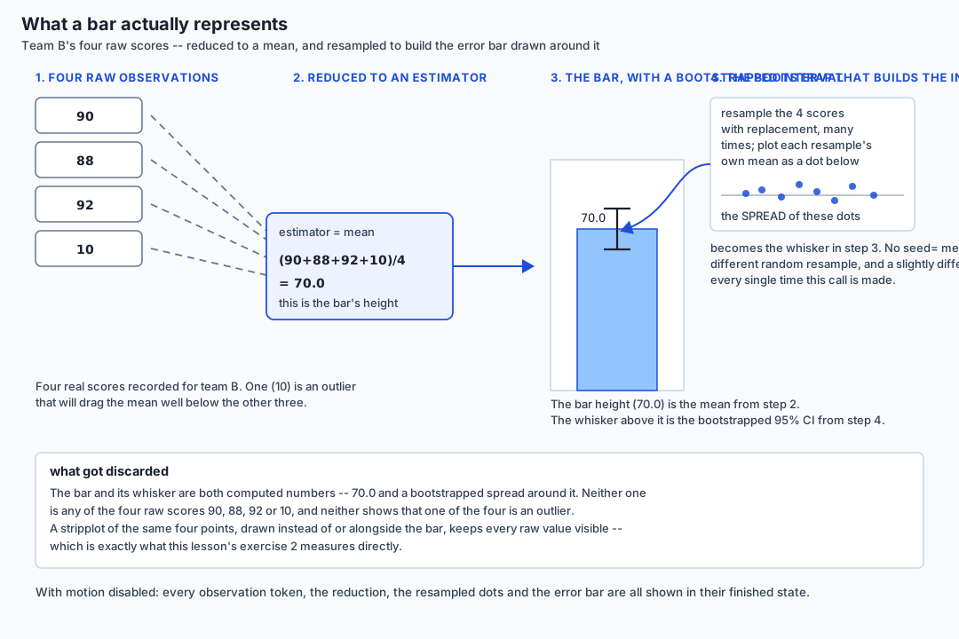
Draw a bar chart of that column and this is exactly what appears: four bars at 79.0, 70.0, 67.5 and 57.5. Team B’s bar sits below team A’s. Anyone skimming that chart concludes team B did worse than team A. Look at the raw numbers again: three of team B’s four scores — 90, 88, 92 — beat every single one of team A’s four scores. Team B’s typical performance was the best in the whole dataset. The bar chart is not wrong, exactly. It is complete, it is accurate, and it still hides the thing that mattered, because a bar chart of a mean is a chart of a computed number, not a chart of what actually happened.
>>> [round(p.get_height(), 4) for p in ax.patches]
[79.0, 70.0, 67.5, 57.5]
Every one of those four numbers is ax.patches[i].get_height() —
matplotlib’s real, measured bar height, read straight off the drawn
figure, not typed in by hand. None of the four equals any of team B’s own
four raw scores. That is not a coincidence to explain away; it is the
whole point. A bar chart shows an estimator — usually the mean — and
seaborn also draws, by default, a bootstrapped confidence interval
around that estimator: a random resampling procedure, the same technique
Day 117 built from first principles for the sampling distribution of the
mean, now showing up unannounced as the whisker on top of a bar. Draw the
same bar chart twice without fixing a seed and the whisker moves:
>>> run 1 (no seed): [(77.0, 81.0), (30.0, 91.0), (65.75, 69.25), (55.75, 59.25)]
>>> run 2 (no seed): [(77.0, 81.0), (30.0, 91.0), (65.75, 69.25), (55.75, 59.256)]
Look at team D’s interval in the two runs: (55.75, 59.25) versus
(55.75, 59.256). Same code, same data, two runs, two slightly different
pictures. That is not a bug. It is a random resampling procedure doing
exactly what it is defined to do, and it is the single sharpest fact in
this lesson: seaborn does statistics for you before it draws, and some
of that statistics is random. Everything below this line is about
knowing which statistic is on the page, on purpose, every time.
The idea in plain language
seaborn is a plotting library built on top of matplotlib that knows about statistics. Hand it a table and a couple of column names, and it will group your data, compute a summary (usually a mean), estimate how uncertain that summary is, and draw the result — bars, lines, boxes, scatter points, whatever the situation calls for — with sensible colors and labels applied automatically. That is an enormous amount of work seaborn does that you would otherwise write by hand in matplotlib: grouping, aggregating, resampling, positioning, legending, coloring.
The trade-off is exactly that: seaborn makes a statistical choice every
time you ask it to draw a summary chart, and the choice is invisible
unless you go looking for it. sns.barplot(data=df, x="team", y="score")
silently decided that “the mean” is the number worth showing, and that
“a bootstrapped 95% confidence interval” is the uncertainty worth
drawing around it. Both are reasonable defaults. Neither is the only
correct choice, and neither is a fact about your data — both are
decisions seaborn’s authors made on your behalf, and the four required
letters plt never told you they were being made.
Historical background
matplotlib, which underlies everything seaborn draws, was created by John
Hunter starting in 2003 to give Python a MATLAB-style plotting interface,
and has been the base layer of the Python scientific-visualization stack
ever since — Day 128 covered its object model directly. seaborn was
created by Michael Waskom, first released publicly around 2012-2013 while
he was doing neuroscience research, specifically to close a gap
matplotlib left open: matplotlib will draw whatever coordinates you give
it, but it has no opinion about statistics — no built-in notion of “the
mean of this group,” “the confidence interval around that mean,” or “one
small panel per category.” seaborn’s name itself nods to a character from
The West Wing (Sam Seaborn), a small detail with no bearing on the
library’s design, but its purpose was never in doubt: give scientists and
analysts a high-level interface where a single function call performs
the grouping, the estimation, and the drawing together, on tidy
(long-form) data, with a coherent default visual style. seaborn 0.13,
released in 2023, is the version this lesson runs, and it introduced the
current unified errorbar= parameter this lesson leans on heavily,
replacing several older, less consistent uncertainty arguments.
What it is — and what it is not
seaborn is a statistical visualization layer over matplotlib. Every
mark seaborn draws is, underneath, an ordinary matplotlib Patch,
Line2D, or PathCollection living on an ordinary matplotlib Axes —
Day 128’s object model applies to seaborn output exactly as it applies to
anything drawn by hand. seaborn adds three things matplotlib does not
have on its own: a preference for long-form (“tidy”) data as its input
shape, built-in statistical estimation (means, counts, regressions,
kernel density estimates) computed before drawing, and semantic mapping
— turning a column’s distinct values into color (hue), size (size),
marker shape (style), or a facet panel (col/row), all from one
function call.
seaborn is not a replacement for matplotlib, and it is not a
different rendering engine. There is no seaborn-specific coordinate
system, no seaborn-specific image format, no seaborn drawing surface
independent of matplotlib’s Figure. Every seaborn plot can, in
principle, be built by hand in matplotlib — seaborn exists so that you
usually do not have to. seaborn is also not a data-wrangling library: it
expects data already close to the shape it needs (long-form, one row per
observation) and Day 124’s melt is very often the step that gets a
table there. And seaborn’s statistical defaults are not neutral: a
barplot is a claim about the mean and its sampling variability, whether
the person who drew it meant to make that claim or not.
Why it was created and what problems it solves
Before seaborn, producing a chart like “average score per team, with 95%
confidence intervals, one small panel per region, colored by category”
in plain matplotlib meant writing the grouping code, the bootstrap or the
standard-error computation, the color-cycling logic, and the subplot grid
management by hand — every time, in every notebook, with every small
inconsistency between one script’s version and the next. seaborn solves
that by packaging the whole pipeline — group, estimate, map, draw — into
one function call operating on tidy data, with one line
(sns.set_theme()) to apply a consistent, publication-ready visual style
across an entire session.
The problem this lesson is built around is the flip side of that
convenience: the pipeline runs whether or not you asked it to, and it
runs silently. sns.barplot(...) does not print “I am about to compute
the mean of each group and bootstrap a 95% confidence interval around it
using a random seed you did not set.” It just draws a bar and a whisker.
Reading that chart correctly requires knowing what seaborn decided to
compute, which is exactly the skill this lesson spends its exercises
building.
How it works
Axes-level versus figure-level: the single most confusing thing in the library
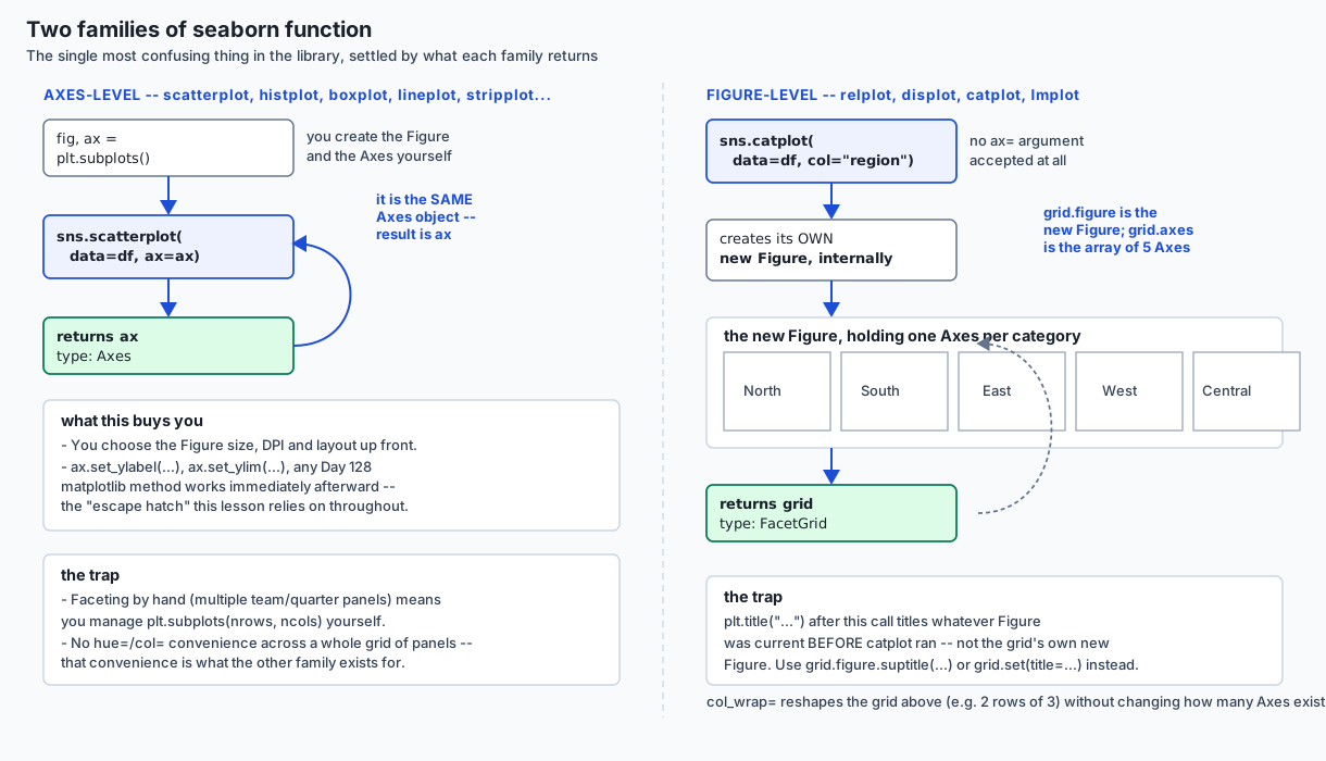
Every seaborn function belongs to one of two families, and the difference explains nearly every point of confusion newcomers hit.
Axes-level functions — scatterplot, histplot, boxplot,
lineplot, stripplot, and others — draw into a matplotlib Axes you
already own (passed with ax=, or created for you if you omit it) and
return that same Axes:
>>> fig, ax = plt.subplots()
>>> result = sns.scatterplot(data=team_scores, x="team", y="score", ax=ax)
>>> type(result)
<class 'matplotlib.axes._axes.Axes'>
>>> result is ax
True
Because the return value is a plain matplotlib Axes, every Day 128
object-model method — ax.set_ylabel(...), ax.set_ylim(...),
ax.set_xscale(...) — works on it immediately afterward. This is the
escape hatch this whole lesson depends on: seaborn draws the statistics,
matplotlib’s object API sets anything seaborn’s own arguments do not
expose.
Figure-level functions — relplot, displot, catplot, lmplot —
never accept ax= at all. They create and own a brand-new Figure
internally and return a FacetGrid wrapping it:
>>> grid = sns.relplot(data=team_scores, x="team", y="score")
>>> type(grid)
<class 'seaborn.axisgrid.FacetGrid'>
>>> type(grid.figure)
<class 'matplotlib.figure.Figure'>
This is exactly why plt.title("...") called right after a figure-level
function sometimes appears to do nothing: plt.title operates on
whichever Figure matplotlib currently considers “current,” and a
figure-level seaborn call just created a different one. The fix is to
call grid.figure.suptitle(...) or use the FacetGrid’s own .set(...)
method — operating on the object seaborn actually handed back, not on
matplotlib’s ambient global state.
| Axes-level | Figure-level | |
|---|---|---|
| Examples | scatterplot, histplot, boxplot, lineplot, stripplot, swarmplot, violinplot, heatmap | relplot, displot, catplot, lmplot |
Accepts ax= | Yes | No |
| Returns | matplotlib.axes.Axes | seaborn.axisgrid.FacetGrid |
| Owns the Figure | No — you created it | Yes — created internally |
Built-in faceting (col=/row=) | No | Yes |
plt.title(...) after the call | Titles your Figure, as expected | Titles the wrong (previously current) Figure |
The estimator, made explicit
sns.barplot’s default estimator is the mean. Every bar height is
literally group["y"].mean(), computed by seaborn before a single pixel
is drawn — the numbers at the top of this lesson prove it directly. Pass
estimator="median", or any callable, to change which statistic gets
drawn; the bar height changes, but the fact that a bar always shows a
computed statistic, never a raw value, does not.
The error bar, and the part that is random
Every statistical seaborn function that draws an estimator also accepts
errorbar=, controlling what interval surrounds it:
errorbar= value | What it draws | Random? |
|---|---|---|
'sd' | plus/minus one sample standard deviation | No — closed-form arithmetic |
'se' | plus/minus one standard error of the mean | No — closed-form arithmetic |
('ci', 95) | a bootstrapped 95% confidence interval | Yes — resamples the data |
('pi', 95) | a bootstrapped 95% prediction interval | Yes — resamples the data |
('ci', 95) is the default. “Bootstrapped” means seaborn resamples your
observed data with replacement, many times, recomputes the mean on
each resample, and reports the spread of those resampled means — Day
117’s bootstrap technique, arriving inside a plotting call. Because the
resamples are drawn from a random-number generator, two calls with no
seed= argument draw different resamples and can report slightly
different extents:
>>> run 1 (seed=42): [(76.5, 81.0), (30.0, 91.0), (65.75, 69.25), (55.75, 59.25)]
>>> run 2 (seed=42): [(76.5, 81.0), (30.0, 91.0), (65.75, 69.25), (55.75, 59.25)]
Fixing seed= (any integer, the same one both times) pins the random
generator’s starting state, and the two runs above are identical, digit
for digit. 'sd', by contrast, never touches a random generator at all
and is therefore identical on every run whether or not a seed is given —
compare its width against the bootstrapped confidence interval on the
same team A data:
>>> errorbar='sd' (seed=42): [(76.418, 81.582), (29.967, 110.033), (65.418, 69.582), (55.418, 59.582)]
>>> errorbar=('ci',95) (seed=42): [(76.5, 81.0), (30.0, 91.0), (65.75, 69.25), (55.75, 59.25)]
Team A’s 'sd' interval spans 76.418 to 81.582 — width 5.164. Its
('ci', 95) interval spans 76.5 to 81.0 — width 4.5. Different
statistics, different extents, on identical data. Neither is “more
correct” in the abstract; they answer different questions (“how spread
out is the data” versus “how uncertain is the mean”), and a chart that
does not say which one it is drawing is asking the reader to guess.
Long-form data is the interface
seaborn’s hue=, size=, style=, col= and row= arguments all
read column names. That only works if the data is long-form (tidy):
one row per observation, one column per variable. A wide table — one row
per group, a separate column per condition — has no single column to
name:
>>> wide_revenue
    region   q1   q2   q3   q4
0    North  120  125  130  128
1    South   95   98  101  105
2     East  110  108  115  118
3     West  130  128  135  140
4  Central   88   90   95   97

>>> sns.lineplot(data=wide_revenue, x="quarter", y="revenue", hue="region")
>>> ValueError: Could not interpret value `quarter` for `x`. An entry with this name does not appear in `data`.
There is no column literally named quarter or revenue in
wide_revenue — those are variables spread across four column names,
not values in a column. Day 124’s melt is exactly the fix: it turns
“one row per group, one column per condition” into “one row per
(group, condition) observation,” which is the shape hue=, col= and
row= require to exist at all.
>>> long_revenue = wide_revenue.melt(id_vars="region", var_name="quarter", value_name="revenue")
>>> long_revenue.head(8)
    region quarter  revenue
0    North      q1      120
1    South      q1       95
2     East      q1      110
3     West      q1      130
4  Central      q1       88
5    North      q2      125
6    South      q2       98
7     East      q2      108
>>> long_revenue.shape
(20, 3)

>>> ax = sns.lineplot(data=long_revenue, x="quarter", y="revenue", hue="region")
>>> ax.get_legend_handles_labels()[1]
['North', 'South', 'East', 'West', 'Central']
The same call that raised ValueError on the wide frame succeeds on the
long one and produces exactly one legend entry per region — five, for
five regions — because region is now a real column with a value on
every row, not a set of column names.
Faceting: one small panel per category
col= (and row=) split a figure-level call into one Axes per
category of the named column:
>>> g1 = sns.catplot(data=long_revenue, x="quarter", y="revenue", col="region", kind="bar")
>>> g1._nrow, g1._ncol, len(g1.axes.flat)
(1, 5, 5)

>>> g2 = sns.catplot(data=long_revenue, x="quarter", y="revenue", col="region", kind="bar", col_wrap=3)
>>> g2._nrow, g2._ncol, len(g2.axes.flat)
(2, 3, 5)
Five regions produce exactly five Axes either way — col_wrap=3 only
changes how those five are arranged (one row of five becomes two rows,
three and two), never how many exist. col_wrap is a layout argument,
not a filtering argument, and the distinction matters the moment a
report needs a specific number of panels checked against a specific
number of categories.
The escape hatch, confirmed directly
Because every seaborn Axes-level return value is a real matplotlib
Axes, a Day 128 object-model call made after seaborn has already drawn
sticks exactly as it would on a hand-built plot:
>>> ax.get_ylabel()  # right after sns.boxplot(..., ax=ax)
'score'
>>> ax.set_ylabel("Score (0-100 scale)")
>>> ax.get_ylabel()
'Score (0-100 scale)'
seaborn’s own default label — 'score', taken straight from the column
name — is not special or protected in any way. It is an ordinary
matplotlib label, on an ordinary matplotlib Axes, and any matplotlib
method overwrites it exactly as it would anywhere else.
Themes: a global side effect
sns.set_theme() (and its lower-level relatives, set_style() and
set_context()) do not return a themed copy of anything. They mutate
matplotlib’s global rcParams dictionary in place — the same dictionary
every matplotlib plot, seaborn or not, reads its defaults from:
>>> rcParams changed by sns.set_theme():
    axes.facecolor: 'white' -> '#EAEAF2'
    axes.grid: False -> True
    axes.edgecolor: 'black' -> 'white'
    grid.color: '#b0b0b0' -> 'white'
    axes.axisbelow: 'line' -> True
    xtick.bottom: True -> False
    ytick.left: True -> False
Seven keys, all changed by one function call with no arguments. Every
plot drawn afterward, in the same Python process, inherits this new
background color, grid visibility and tick behavior — including a plain
matplotlib.pyplot.plot() call that never imports seaborn at all. This
is a real, useful feature (one call sets a consistent look for an entire
notebook) and a real trap (a theme set early in a long session silently
outlives the cell that set it, and a colleague’s script run afterward in
the same process inherits it too). It is also fully reversible: capture
mpl.rcParams for the keys you care about before calling set_theme(),
and mpl.rcParams.update(...) restores them exactly.
Aggregation versus honesty: box, violin, strip, swarm
boxplot draws a five-number summary (median, quartiles, whiskers,
outlier points) per group. violinplot draws a smoothed density estimate
of the same distribution, wider where observations are denser.
stripplot and swarmplot draw every individual observation as a point
— stripplot jitters points to reduce overlap, swarmplot arranges them
so none overlap at all. All four are honest in the sense that none of
them lies about the data they were given. They differ in how much they
aggregate away, and for a genuinely small sample — team B’s four
scores are the running example — a box or a bar alone throws away the
one fact (a single outlier) that explains the whole picture. The
recommendation this lesson makes plainly: for small samples, overlay
raw points on an aggregated chart, not instead of it:
>>> after boxplot: patches = 4 collections = 0
>>> after stripplot: patches = 4 collections = 4
Four box patches, drawn first. Then a stripplot on the same Axes
adds four point collections — one per team — on top, without disturbing
the boxes already there. The reader gets the five-number summary and
every individual observation, in one picture.
An everyday analogy
A barplot with a bootstrapped confidence interval is a restaurant review score. “4.2 stars” is a real, computed number — an average of real reviews — and it is genuinely useful for a quick comparison against another restaurant’s “3.6 stars.” But “4.2 stars” was computed from individual reviews that ranged from “best meal of my life” to “sent it back,” and the star average cannot tell you which restaurant you are looking at without reading a review or two. The confidence interval is like the review count: “4.2 stars from 400 reviews” is a more trustworthy 4.2 than “4.2 stars from 4 reviews,” and if you recompute that interval from a fresh random sample of the same 400 reviews, you get a slightly different number every time — which is exactly what an unseeded bootstrap does. Reading only the star rating is fast and usually fine. Reading only the star rating when one bad review is dragging an otherwise-excellent kitchen’s average down is the barplot trap this lesson opened with.
Examples in practice
seaborn (BSD 3-Clause, free, fully open source) is the tool this
lesson ran directly, and every code block above is a real, captured run
on 0.13.2 — sns.barplot, sns.stripplot, sns.boxplot,
sns.lineplot, sns.catplot, sns.relplot and sns.set_theme() all
executed for real, not paraphrased from documentation. Choose seaborn
whenever the data is (or can become) long-form and the chart needs a
statistical estimate — means with intervals, distributions, regression
fits, faceted small multiples — drawn quickly with a coherent default
style.
matplotlib (PSF-derived, BSD-style license, free, fully open source)
is what every seaborn call draws with underneath, and it was run
directly too — every ax.patches, ax.lines, ax.collections and
rcParams inspection in this lesson reads real matplotlib objects. Reach
for matplotlib directly, without seaborn, when a chart needs pixel-level
custom layout, an unusual annotation, or when the statistic being drawn
is not one seaborn already computes — matplotlib has no opinion to get
in the way.
plotnine (BSD 3-Clause, free, fully open source) is a Python port of
R’s ggplot2 grammar-of-graphics, building charts by layering geometry,
statistics, scales and facets as composable objects
(ggplot(df) + aes(x=..., y=...) + geom_bar()) rather than through
seaborn’s single-function-per-chart-type interface. It was not
installed in this authoring environment, and no output attributed to
it is reproduced anywhere in this lesson or its lab — this description
comes from its public documentation only. Choose plotnine over seaborn
when a team already thinks in ggplot2’s grammar, or when a chart needs
grammar-of-graphics-style layering (multiple geometries stacked on one
set of scales) that seaborn’s fixed function signatures do not offer
directly.
Vega-Lite / Altair (BSD 3-Clause, free, fully open source) is a declarative, JSON-based grammar that renders as an interactive chart in a browser or notebook rather than a static image — hovering reveals data, panning and zooming work without extra code. It was also not installed in this authoring environment, and, again, no output attributed to it is reproduced here; this description is from documentation only. Choose Altair when the deliverable is an interactive dashboard or a notebook meant to be explored rather than a static figure for a document or a paper.
Every one of these four tools is free with no paid tier; none of this lesson’s coverage is gated behind a purchase.
Implications: security, privacy, performance, scalability, and cost
Security and privacy. seaborn and matplotlib both run entirely locally, offline once installed, and neither library transmits data anywhere. The lab in this lesson opens the network exactly once, to install its five pinned packages, and everything after that runs headless and offline.
Performance. seaborn’s statistical layer adds real computational cost
on top of matplotlib’s drawing: a bootstrapped confidence interval by
default resamples the data hundreds of times per group before drawing a
single bar, which is invisible on a sixteen-row toy table and can matter
on a table with millions of rows and dozens of groups. errorbar='sd' or
errorbar='se' are meaningfully cheaper than the bootstrapped options
precisely because they skip the resampling step entirely — a real
performance lever, not just a statistical one, on large data.
Scalability. Figure-level functions that facet with col=/row=
create one Axes per category; a categorical column with hundreds of
distinct values will happily create hundreds of tiny panels, which is
usually a sign the chart needs a different design (aggregation, a
different variable for faceting, or an interactive tool like Altair)
rather than more col_wrap.
Cost. Nothing in this lesson or its lab has a paid tier. seaborn, matplotlib, plotnine and Altair are all free and open source, and this lesson says plainly, in the Tools section above, which two were actually run and which two were described from documentation only.
Alternatives: free, open source, and commercial
Within Python, seaborn’s direct competitors for “quick statistical
charts from a DataFrame” are plotnine (grammar-of-graphics,
free/open source, described above) and pandas’ own .plot() accessor
(built on matplotlib directly, no statistical layer, free/open source,
part of pandas itself — good for a fast look at data with no need for
grouped estimation or faceting). For interactivity, Altair/Vega-Lite
(free/open source, described above) and Plotly (free/open source
core library, with a paid Dash Enterprise tier for production
dashboards) both render browser-based interactive charts instead of
static images. Outside Python entirely, commercial tools like Tableau
and Power BI solve a related but different problem — interactive
business-intelligence dashboards for non-programmers, both with free
trial or limited free tiers and substantial paid licensing for
organization-wide deployment — and are the right choice when the
audience needs to explore the data themselves in a point-and-click tool
rather than receive a chart someone else authored in code.
Comparison with related concepts
| Concept | What it actually is | How this lesson relates to it |
|---|---|---|
| matplotlib (Day 128) | The drawing engine — Figure, Axes, Artist | seaborn draws with it; every seaborn return value is a real matplotlib object |
groupby (Day 123) | Explicit split-apply-combine, computed by you | seaborn’s estimator= performs the same grouping and aggregation implicitly, inside a plotting call |
melt (Day 124) | Wide-to-long reshaping | The exact operation that produces the long-form data seaborn’s hue=/col=/row= require |
| Bootstrap / CLT (Day 117) | Resampling to estimate a statistic’s sampling distribution | seaborn’s default errorbar=('ci', 95) is this exact technique, running automatically and invisibly |
| Chart choice (Day 127) | Deciding which chart type answers a question | This lesson assumes that decision is made and covers what the chosen chart actually computes |
| Distributions/relationships (Day 130) | Histograms, KDE, scatter, correlation in depth | This lesson uses the minimum of each to demonstrate the API; Day 130 owns the statistical depth |
When to use it — and when not to
Use seaborn whenever a chart needs a statistical summary — a mean with an interval, a distribution, a regression fit, a faceted comparison across categories — drawn from long-form tabular data, and a consistent default style is welcome. Reach for the axes-level family when the chart needs to sit inside a layout you are managing yourself (a dashboard grid, a report with several plots side by side); reach for the figure-level family when the natural unit of the chart is already “one panel per category” and you are happy to let seaborn own the layout.
Do not reach for seaborn’s statistical functions when the chart’s job is
to show raw, unaggregated values and nothing else — a plain
ax.scatter(...) or ax.plot(...) in matplotlib is simpler and makes no
statistical claim that then needs to be understood and caveated. Do not
draw a barplot (or any estimator-plus-interval chart) on a sample small
enough that the estimate could be misleading without also showing, or at
least checking, the raw points — team B’s four scores are exactly that
case. And do not call sns.set_theme() inside a shared or long-running
process (a web service, a shared notebook kernel) without capturing and
restoring the previous rcParams, because the side effect outlives the
call that made it.
Knowledge check
Eight questions in quiz.yml check the two return types and when each
applies, the barplot trap and why team B’s bar sits below team A’s
despite better typical scores, the bootstrap’s randomness and how
seed= removes it, which errorbar= values are random versus
closed-form, why a wide frame raises ValueError for a hue= mapping
that a melted long frame accepts, what col_wrap= does and does not
change, why the escape hatch works at all, and why set_theme() is a
global side effect rather than a local one.
Hands-on exercise
The lab, labs/sections/math-statistics-and-data/day-129-statistical-plots-with-seaborn/,
has nine numbered exercises and sixteen tests, all headless via
matplotlib’s Agg backend, asserting on real return types and real
artist state — never on what a plot merely looks like.
- Confirm
sns.scatterplot(..., ax=ax)returns that sameax, andsns.relplot(...)returns aFacetGridowning its ownFigure. - Reproduce the barplot trap: bar heights equal group means, absent from each group’s own raw values; a stripplot recovers every raw point.
- Confirm two unseeded
barplotcalls disagree, and two seeded ones agree exactly. - Compare
errorbar='sd'againsterrorbar=('ci', 95)and confirm'sd'is seed-independent. - Confirm a wide frame raises
ValueErrorfor ahue=mapping a melted long frame accepts. - Confirm
col=produces oneAxesper category andcol_wrap=reshapes the grid without changing that count. - Confirm a label set with
ax.set_ylabelafter a seaborn call sticks. - Confirm
sns.set_theme()changes specificrcParamskeys and that restoring them is exact. - Confirm a boxplot-plus-stripplot overlay carries both box patches and
point collections on one
Axes.
Expected output
$ bash tests/run_tests.sh
...
17 checks, 0 failure(s)
pytest examples ends with 16 passed; pytest starter, on the
checked-in state, ends with 16 skipped. The full captures are in the
lab’s expected-output/ directory, with FIELDS.md stating plainly
which numbers are exact everywhere, which are specific to this
seaborn/matplotlib pin, and which (the unseeded bootstrap extents in
exercise 3) are expected to differ between runs by design.
Validate your work
Run bash tests/run_tests.sh from the lab directory and confirm it ends
with 17 checks, 0 failure(s) and exits 0. Run .venv/bin/pytest starter -v and confirm every one of the sixteen tests you have written
passes with no pytest.skip(...) lines remaining.
Troubleshooting
The lab’s troubleshooting.md covers the messages you are most likely to
see: ModuleNotFoundError because the .venv was never created, a
plotting window trying to open because matplotlib.use("Agg") ran too
late, pytest examples starter aborting with import file mismatch
because both directories define a module with the same name, and
exercise 2’s bar heights not matching because they were hardcoded
instead of recomputed from team_scores.groupby("team")["score"].mean().
Common mistakes
Treating a barplot’s height as a raw value instead of a computed mean;
calling plt.title(...) after a figure-level function and being
surprised it did nothing; comparing two unseeded bootstrap runs and
assuming a difference means something is broken; calling sns.set_theme()
in a shared session and never restoring the previous rcParams; and
asking a wide DataFrame for a hue= mapping by a column name that only
exists after melt.
Practice assignment
Using this lesson’s team_scores table (or a similar small,
hand-invented one of your own with at least one outlier-driven group),
produce, run, and describe in writing: a barplot with the default
bootstrapped confidence interval; the same chart with errorbar='sd'
instead, noting how the interval’s width changes; a stripplot of the
same data overlaid on a boxplot; and a short paragraph explaining, in
your own words, what each of the three charts would lead a reader to
believe about the group with the outlier, and which one you would put in
front of a decision-maker who has thirty seconds to look at it.
Extension challenge
Build a ten-group version of team_scores in which every group’s mean is
close together but exactly one group has an extreme outlier. Draw the
same group as a barplot, a boxplot, a violinplot, and a swarmplot,
and write one paragraph per chart type stating exactly what that chart
type shows about the outlier group that the others do not. Then repeat
exercise 3 from the lab (the unseeded-bootstrap comparison) on your new
ten-group table with errorbar=('pi', 95) (a prediction interval)
instead of the default confidence interval, and explain in one sentence
what a prediction interval claims that a confidence interval does not —
this is the same distinction the lab’s extension exercises invite you to
verify directly rather than take on faith.
AI thread
A barplot in a model evaluation report is a statistical claim, whether
or not the person who generated it meant to make one. “Average accuracy
by demographic group, with error bars” is one of the most common charts
in a fairness or performance report, and every one of the choices this
lesson covered — mean versus median, a 95% confidence interval versus a
standard deviation, bootstrapped versus closed-form, seeded versus not —
changes what the chart is actually asserting about how much that
accuracy number would move on a different sample of the same size. A
group with few evaluation examples (team B’s four scores, again) gets a
wide, honest interval if the chart is built correctly, and a
suspiciously narrow, false-confidence bar if someone reached for
errorbar='sd' on a tiny group without saying so, or worse, dropped the
error bar entirely because a stakeholder found it “distracting.” An
automatically generated report — from a script, a notebook template, or
an AI system summarizing model results — inherits this exact risk
without any human necessarily deciding to take it: seaborn’s defaults are
reasonable, but they are defaults, computed once and drawn silently, and
a reader who cannot tell a bootstrapped confidence interval from a
standard deviation from no interval at all is not equipped to know when
a chart is quietly overstating how much a number can be trusted. Knowing
which statistic is on the page — and knowing to ask, every time a report
lands in your inbox with a bar and a whisker on it — is not a minor
plotting-library detail. It is the difference between reading a chart and
being persuaded by one.
Quiz
Q1. A `sns.barplot(data=df, x="team", y="score")` draws four bars, one per team. What does the height of each bar represent?
- The mean of that team's scores, computed by seaborn before drawing
- The largest score recorded for that team
- The most recently recorded score for that team
- The count of rows belonging to that team
Show answer
Answer: A. The mean of that team's scores, computed by seaborn before drawing
`barplot`'s default estimator is the mean. The bar height is a computed statistic, not any single recorded value -- which is exactly the trap this lesson opens with: a team whose four scores are 90, 88, 92 and 10 gets a bar at 70.0, a number none of its four observations equals, and that bar can end up lower than a much more consistent team's, even though three of the four scores are the best in the whole dataset.
Q2. `sns.scatterplot(data=df, x="a", y="b", ax=ax)` and `sns.relplot(data=df, x="a", y="b")` are both called on the same data. What is the key difference in what each one returns?
- scatterplot returns None; relplot returns a DataFrame of computed statistics
- scatterplot returns the Axes it was given; relplot returns a FacetGrid that owns its own Figure
- Both return the same Axes object, just with different default styling
- relplot returns an Axes; scatterplot returns a FacetGrid
Show answer
Answer: B. scatterplot returns the Axes it was given; relplot returns a FacetGrid that owns its own Figure
scatterplot is axes-level: it draws into an Axes you already own (or creates one if you don't pass ax=) and returns that Axes. relplot is figure-level: it always creates and owns its own Figure, and returns a FacetGrid wrapping it -- which is why relplot does not accept ax= at all, and why plt.title() called after relplot appears to do nothing (it titles the wrong, now-current, Figure).
Q3. Two calls to `sns.barplot(data=df, x="team", y="score")` are made back to back, with no `seed=` argument passed to either. What should you expect about their error bars?
- Identical extents every time, because barplot caches its computation
- An exception on the second call, because seaborn refuses to redraw the same data twice
- Slightly different extents, because the default error bar is a random bootstrap resample
- Identical extents only if the data has fewer than five rows
Show answer
Answer: C. Slightly different extents, because the default error bar is a random bootstrap resample
seaborn's default error bar is a bootstrapped 95% confidence interval -- resampling the data with replacement many times and reporting the spread of the resulting means. Each call draws a fresh random sample unless a seed is fixed, so two unseeded calls on identical data can (and typically do) produce slightly different bar extents. Passing seed= to both calls makes them identical.
Q4. Which `errorbar=` value draws a fixed, non-random interval that does not change between two calls with different (or no) `seed=` values?
- ('ci', 95) (a bootstrapped 95% confidence interval)
- ('pi', 95) (a bootstrapped 95% prediction interval)
- The default value, whatever it happens to be
- 'sd' (one standard deviation)
Show answer
Answer: D. 'sd' (one standard deviation)
'sd' draws the sample standard deviation directly -- a closed-form arithmetic computation with no resampling step, so it is identical on every call regardless of any seed. ('ci', 95) and ('pi', 95) are both bootstrapped and therefore random unless seeded.
Q5. A DataFrame has one row per region with separate q1, q2, q3 and q4 columns. Calling `sns.lineplot(data=df, x="quarter", y="revenue", hue="region")` on this frame directly raises an error. Why?
- There is no column named "quarter" or "revenue" in this wide-form frame
- seaborn only accepts NumPy arrays, never pandas DataFrames
- hue= is not a valid argument to lineplot
- The DataFrame has too many rows for lineplot to handle
Show answer
Answer: A. There is no column named "quarter" or "revenue" in this wide-form frame
seaborn's long-form interface reads x=, y= and hue= as literal column names. A wide frame with q1..q4 columns has no column called "quarter" or "revenue" -- those variables only exist once the frame is melted into one row per (region, quarter) observation, exactly the operation Day 124's melt performs.
Q6. `sns.catplot(data=df, x="quarter", y="revenue", col="region", kind="bar")` is called on data with 5 distinct regions, then repeated with `col_wrap=3` added. What changes between the two calls?
- The number of Axes drawn changes from 5 to 6
- The number of Axes stays 5, but the grid reshapes from one row of 5 to two rows (3 and 2)
- Nothing changes; col_wrap has no effect on catplot
- col_wrap converts the figure-level plot into an axes-level plot
Show answer
Answer: B. The number of Axes stays 5, but the grid reshapes from one row of 5 to two rows (3 and 2)
col= always produces exactly one Axes per category -- 5 Axes for 5 regions, in both calls. col_wrap only changes how those 5 Axes are arranged: without it, one row of 5; with col_wrap=3, the grid becomes 2 rows (3 in the first, 2 in the second), same 5 Axes throughout.
Q7. After `sns.boxplot(data=df, x="team", y="score", ax=ax)` has drawn, you call `ax.set_ylabel("Score (0-100 scale)")`. What happens?
- Nothing -- seaborn locks the label and further calls to ax are ignored
- It raises an error, because boxplot returns a FacetGrid, not an Axes
- The label changes, because seaborn draws with matplotlib underneath and ax is a real matplotlib Axes
- It changes the label on every other Axes in the same Figure
Show answer
Answer: C. The label changes, because seaborn draws with matplotlib underneath and ax is a real matplotlib Axes
seaborn's axes-level functions draw into an ordinary matplotlib Axes and hand it back (or, if you passed ax=, mutate the one you gave them). Nothing about that Axes becomes special or locked -- any matplotlib Axes method, called afterward, behaves exactly as it would on a plot you built by hand. This is the escape hatch: seaborn for the statistics, matplotlib's object API for anything seaborn doesn't expose an argument for.
Q8. Calling `sns.set_theme()` early in a notebook, then later drawing a plain `matplotlib.pyplot.plot` call with no seaborn involved at all, still shows seaborn's grid and background styling. Why?
- matplotlib silently imports seaborn internally by default
- This only happens inside Jupyter notebooks, never in a script
- It is a bug that will be fixed in a future seaborn release
- set_theme() mutates matplotlib's global rcParams, which every subsequent plot inherits regardless of which library draws it
Show answer
Answer: D. set_theme() mutates matplotlib's global rcParams, which every subsequent plot inherits regardless of which library draws it
set_theme() (and its lower-level equivalents, set_style() and set_context()) work by updating matplotlib's rcParams dictionary -- the same global configuration every matplotlib plot reads its defaults from. That is a real, intentional, and easily-forgotten global side effect: once called, it affects every plot drawn afterward in the same process, seaborn or plain matplotlib, until the rcParams are explicitly reset.
Glossary
- axes-level function
- A seaborn plotting function (scatterplot, histplot, boxplot, lineplot, stripplot, and others) that draws into a single matplotlib Axes -- either one you pass with ax=, or a new one it creates -- and returns that Axes. Because the return value is an ordinary matplotlib Axes, every matplotlib Axes method (set_ylabel, set_xlim, and so on) works on it afterward.
- figure-level function
- A seaborn plotting function (relplot, displot, catplot, lmplot) that always creates and owns its own matplotlib Figure -- it does not accept ax= -- and returns a FacetGrid wrapping that Figure. Figure-level functions are how seaborn builds multi-panel facet grids; their return value is not a plain Axes, which is why matplotlib calls that expect an Axes (like some uses of plt.title) behave differently after one.
- FacetGrid
- The object every figure-level seaborn function returns. It owns a matplotlib Figure and an array of Axes (grid.axes), one per combination of the col= and row= categories requested, plus convenience methods for labeling and adjusting every panel at once.
- estimator
- The summary statistic a seaborn plotting function computes from raw observations before drawing -- by default the mean, for functions like barplot and pointplot. Passing estimator= changes which statistic (for example, "median" or a custom callable) is drawn instead.
- bootstrap (resampling)
- A method for estimating the sampling variability of a statistic by repeatedly resampling the observed data with replacement, recomputing the statistic on each resample, and reading the spread of the results -- the same technique Day 117 introduced for the sampling distribution of the mean. seaborn's default error bar on barplot and pointplot is a bootstrapped confidence interval, which is why it is random unless a seed is fixed.
- errorbar (parameter)
- The seaborn keyword controlling which interval a statistical plot draws around its estimator. Accepts 'sd' (one standard deviation, a closed-form statistic), 'se' (standard error), or a tuple like ('ci', 95) or ('pi', 95) for a bootstrapped confidence or prediction interval at the given percentage. Only the tuple forms depend on the random bootstrap and therefore on seed=.
- seed (in a seaborn call)
- An integer passed to functions that compute a bootstrapped error bar (for example sns.barplot(..., seed=42)), fixing the random number generator's starting state so the same call on the same data produces an identical interval on every run. Omitting it means two runs of the same call can produce slightly different bar extents.
- long-form (tidy) data
- A table shaped with one row per observation and one column per variable -- the shape seaborn's hue=, size=, style=, col= and row= arguments require, because each one names a column that must exist. Day 124's melt is the standard way to convert a wide table (one row per group, one column per condition) into long form.
- wide-form data
- A table shaped with one row per group and multiple columns representing different conditions or time points (for example, one column per quarter). seaborn's long-form interface cannot read a variable that is spread across several column names, which is why hue= and similar arguments fail on wide data until it is melted into long form.
- col= / row= (faceting)
- Arguments to seaborn's figure-level functions that split the data into one small multiple (facet) per category of the named column, arranging one Axes per category into a grid. col_wrap= reshapes how many facets appear per row without changing how many facets exist in total.
- strip plot / swarm plot
- Plots that draw every individual observation as a point along a categorical axis (stripplot jitters points randomly to reduce overlap; swarmplot arranges them so none overlap) rather than reducing each group to a single summary statistic -- the natural counterpart to a barplot or boxplot when the sample size is small enough that individual points matter.
- escape hatch (matplotlib object API)
- The practice of calling matplotlib Axes and Figure methods directly (ax.set_ylabel, ax.set_ylim, fig.suptitle, and similar, from Day 128's object model) after a seaborn call has already drawn, to set anything seaborn's own arguments do not expose. Works because seaborn's return value -- an Axes for axes-level functions, a FacetGrid wrapping a Figure for figure-level ones -- is always a real matplotlib object underneath.
- rcParams (global theme state)
- matplotlib's global dictionary of default plotting settings (colors, grid visibility, font family, and more). sns.set_theme() (and the lower-level set_style()/set_context()) work by mutating this dictionary directly, so the change persists for every plot drawn afterward in the same process -- seaborn or plain matplotlib -- until it is explicitly reset.
Sources and further reading
- Function overview — seaborn (Michael Waskom) (accessed 2026-08-20)
- Statistical estimation and error bars — seaborn (Michael Waskom) (accessed 2026-08-20)
- Data structures accepted by seaborn — seaborn (Michael Waskom) (accessed 2026-08-20)
- seaborn.barplot — seaborn (Michael Waskom) (accessed 2026-08-20)
- Introduction to Figure and Axes — Matplotlib Development Team (accessed 2026-08-20)
Kept in this browser, no account needed. Your progress page turns the whole record into one link you can bookmark or open on another device.