Math, Statistics, and Data › Data Visualization › Day 133
Day 133: Building an EDA Report
After this lesson you will be able to turn an exploration into an argument: state the one question a report answers and the decision it feeds, put the conclusion above the evidence rather than where you happened to finish, and write captions that carry a claim a reader could disagree with instead of labels that restate the axes. You will build a working report generator that refuses to add a figure with no stated question, refuses a caption with no number and no comparison, computes every number in its prose from the data so the text cannot drift away from the figures, detects an orphan figure, and demands that every reported estimate carry a 95% interval or an explicit note saying why none is available. You will apply a three-gate "so what" filter to twelve candidate figures and watch five survive -- keeping each discarded one as a single line of honest omission so the next reader does not repeat the dead end. You will make the whole document reproducible in Day 126's sense, byte-identical across two runs because its provenance is a fingerprint of the input rather than a timestamp of the run, and you will turn Days 127 and 132 into a build check that fails a red-against-green chart with unlabelled axes. You will also be able to say precisely what a crude claim-detecting heuristic can and cannot do, in both of its failure directions, and why the honest statement of its limits is worth more than a check that pretends to more.
Hands-on lab for this lesson
Lab files on GitHub: https://github.com/ai-roadmap-365/ai-roadmap-365.github.io/tree/main/labs/sections/math-statistics-and-data/day-133-building-an-eda-report
- Get the hands-on files. Clone the labs repository once (you can reuse this clone for every lesson). This works on macOS, Linux, and Windows (PowerShell or WSL):
git clone https://github.com/ai-roadmap-365/ai-roadmap-365.github.io.git cd ai-roadmap-365.github.io - Open this lesson's lab. Move into the directory for this specific day. Every lab lives at the same predictable path — section / subsection / week / day:
cd labs/sections/math-statistics-and-data/day-133-building-an-eda-report - Read the lab guide. Open `README.md` in that directory. It lists the exact commands, what each does, the expected output, and how to check your work — read it before running anything.
- Run it and check your work. Follow the README's "How to run" section: run the example first to see the finished result, then complete the numbered exercises in `starter/`, then run the tests. The tests pass (exit 0) only when your work is correct.
bash tests/run_tests.sh # or the test command named in the lab README
You can also open the lab as a local page (works offline, shows the file tree and expected output).
Learning objectives
By the end of this lesson you will be able to:
- State the one question a report answers and the decision it feeds, and explain why a figure whose question you cannot state does not belong in the report
- Write a caption that carries a claim rather than a label, and explain why "revenue by region" gives a reader nothing to disagree with
- Build a report generator that raises an error on a figure with no stated question and on a caption with no comparative or quantitative element
- Explain both failure directions of a crude claim-detecting heuristic -- it passes a false claim and refuses a real one -- and say exactly what such a check does buy you
- Generate prose whose numbers are computed from the data, and prove that changing one input value changes the rendered sentence
- Detect an orphan figure: an image written to disk that the text never refers to
- Require every reported estimate to carry a bootstrap interval or an explicit note saying why none is available, and treat that note as a finding rather than a gap
- Order a document for the reader -- conclusion above evidence, caveats findable rather than buried -- and build the conclusion out of the captions so the two cannot drift apart
- Make a report byte-identical across two runs by putting a fingerprint of the input where a timestamp would otherwise go, and state precisely what that guarantee covers for the figure files and what it does not
- Apply the "so what" test to every candidate figure, measure the survival rate, and keep each discarded one as a one-line null result
- Turn a colourblind-safe palette and labelled axes into a build check, and name the two accessibility failures such a check still cannot catch
- Choose among a plain Python Markdown generator, Jupyter with nbconvert, Quarto and pandas Styler for a given reporting job, stating which were actually run in this lesson and which were described from documentation only
Prerequisites
- Day 126 -- the reproducible cleaning pipeline, whose idempotence, contracts and manifest this day applies to prose rather than to data, and whose out-of-order-execution hazard explains why nbconvert needs its --execute flag
- Day 117 -- sampling and the standard error, and Day 118 -- hypothesis tests and confidence intervals; every interval quoted in this day's report is a percentile bootstrap
- Day 127 -- why we visualize and how to choose a chart type, including the perceptual ranking this day cites when a table beats a chart
- Day 128 -- matplotlib's Figure/Axes/Artist object model; the accessibility check reads colours straight off the artists
- Day 130 -- distributions and relationships, especially the discipline of plotting the shape before computing a coefficient
- Day 132 -- chart honesty and disclosure, which this day turns from a rule into a check that runs
- Week 18's pandas pipeline, referenced rather than re-derived: profiling, the damage report and the manifest
- A working python3 on your PATH; the lab needs the standard library plus matplotlib, seaborn, pandas, NumPy and pytest
Why this matters
Open a notebook you were sent last quarter. Forty cells. Thirty figures. Every chart is correct. The axes are labelled, the aggregations are right, the joins are clean, nothing in it is wrong. You scroll to the bottom, and you cannot say what was found.
That is not a failure of skill. Whoever made that notebook knew more about the data than you ever will. It is a failure of a different kind entirely: exploration was mistaken for communication. The notebook is a perfect record of a search, and a search has no conclusion — it has a trail. What you needed was an argument.
Here is the thing that makes this the week’s capstone rather than another charting lesson. Nothing you learned on Days 127 through 132 fixes it. You can pick the right chart type for every question, drive matplotlib’s object model with complete confidence, put a bootstrap interval on every estimate, choose bin widths that reveal rather than conceal, plot a time series without aliasing it, and refuse every dishonest axis — and still produce a document nobody can act on. Correct charts are the entry price. They are not the product.
The fix is not fewer charts, and it is not prettier charts. It is one rule, applied without exception:
Every chart must answer a stated question, and the answer must be written down next to it.
A figure whose question you cannot state is a figure that should not be
in the report. That sentence sounds like advice. Today you are going to
compile it into an exception. The lab builds a small report generator
that raises ReportError when you try to add a figure with no question,
refuses a caption that does not carry a claim, and produces
byte-identical Markdown on two runs so that the numbers in the prose can
never drift away from the numbers in the figures.
The concrete consequence is money and time, in that order. A report that states its findings gets a decision. A notebook that shows its work gets a meeting, and then another meeting, and then someone re-does the analysis because they could not tell whether yours answered their question. Every hour you spend making the report argue saves several hours of other people’s time — and it is the difference between an analysis that changes something and an analysis that gets archived.
The idea in plain language
An EDA report is an argument with evidence, not a gallery of charts.
Think about what an argument needs. It needs a claim — something a reasonable person could disagree with. It needs evidence for that claim, presented so the reader can check it. It needs an honest accounting of what the evidence does not support. And it needs to be arranged so the person reading it gets the point before they get the machinery.
A gallery needs none of that. A gallery needs only that each item be correct, and correctness is cheap once you know pandas.
The whole day rests on one small structural insight: the caption is where the argument lives. Consider two captions under the identical chart.
Figure 4: revenue by region
Figure 4: three regions grew, and the fourth fell by 12% after the March pricing change
The first is a label. It tells you what the axes are, which you could have read off the axes. There is nothing in it you could disagree with, which means there is nothing in it at all. The second is a claim. It says something specific, it commits the author, and — crucially — the chart either supports it or it does not, so a reader can check. If the chart shows four regions all rising, the second caption is caught immediately. The first caption can never be caught, because it never said anything.
This is the single most transferable habit in the lesson. It costs nothing, it works in a slide deck and an email and a pull request description as well as in a report, and it has a wonderful side effect: when you try to write a claim-carrying caption for a figure and find you cannot, you have just discovered that the figure does not belong.
Historical background
The phrase “exploratory data analysis” belongs to John W. Tukey, whose book Exploratory Data Analysis was published by Addison-Wesley in 1977. Tukey’s argument — radical at the time, when statistics meant confirming hypotheses you had specified in advance — was that looking at data openly, before you knew what you were testing, was a legitimate and necessary activity with its own techniques. The box plot you met on Day 130 comes from this tradition. So does the stem-and-leaf display, and the general habit of drawing before computing.
Tukey was arguing for exploration. He was not arguing that the trail of an exploration is what you hand to someone else, and the distinction got lost somewhere in the intervening decades — helped, honestly, by tooling that made the trail extremely easy to publish.
The second thread is literate programming, which Donald Knuth introduced in 1984: the idea that a program should be written as a document for humans, with the code embedded in the explanation rather than the other way round. That idea reached statistics through Sweave, published by Friedrich Leisch in 2002, which let an R analysis and its prose live in one file and be compiled together into a finished document. Yihui Xie’s knitr followed in 2012 and became R Markdown; Posit’s Quarto, released in 2022, generalised the same machinery beyond R.
The third thread is the notebook. Fernando Pérez started IPython in 2001; the browser-based IPython Notebook arrived in 2011, and the project was renamed Jupyter in 2014 when it grew beyond Python. The notebook is a superb exploration medium — and it is the single biggest reason the gallery problem is now everywhere, because a notebook makes shipping your exploration trail the path of least resistance.
Notice the shape of that history. Literate programming produced tools for writing a document that computes. Notebooks produced tools for computing while writing notes. They look similar and they are not the same activity, and today’s lesson is largely about not confusing them.
Edward Tufte’s The Visual Display of Quantitative Information (1983) sits alongside all of this and is worth naming because Day 132 drew on it: Tufte’s argument is about the integrity of individual graphics. Today’s is about the integrity of the document they sit in, which is a different and less-taught problem.
What it is — and what it is not
An EDA report is:
- a document with one stated question at the top and the decision that question feeds;
- a conclusion the reader reaches before the evidence;
- a small number of figures, each answering a stated question, each captioned with the claim it supports;
- every reported number carrying its uncertainty, in the sentence and not only in the error bar;
- an honest list of what you looked at and found nothing in;
- generated by code from a pinned input, so it can be rebuilt.
An EDA report is not:
- your notebook with the messy cells deleted;
- a chart per column;
- a “data dictionary with pictures”;
- a place to demonstrate technique;
- a document whose numbers were typed in by hand from an earlier run.
The last one deserves its own paragraph, because it is the most common and the least noticed. Somebody runs an analysis, reads “12.4%” off a chart, types “revenue fell 12.4%” into the prose, then re-runs the analysis three weeks later on updated data. The chart now says 9.1%. The sentence still says 12.4%. Nobody notices, because nobody reads a report by cross-checking every number against every chart. The document is now lying, and no individual person lied.
The remedy is Day 126’s, transplanted: the prose is generated from the same computed values as the figures, so the two cannot disagree. It is the same argument as a reproducible cleaning pipeline, applied to a different artefact.
Here is the distinction the whole day turns on, in one table.
| Exploration | The report | |
|---|---|---|
| Audience | You | Someone who will act on it |
| Breadth | Wide — try everything | Narrow — one question |
| Order | The order you thought of things | The order the reader needs |
| Charts | Fifty, most of them dead ends | Five, each earning its place |
| Captions | None; you know what you drew | The claim, stated |
| Wrong turns | Kept, they are cheap | Deleted — but one line survives |
| Uncertainty | In your head | In the sentence |
| Correctness bar | Good enough to keep going | Checkable by a stranger |
| Reproducible | Nice to have | The point |
Most of the charts you make should not survive into the report. That is not a criticism of your exploration; it is what exploration is for. The lab’s own candidate list has twelve figures in it and five come out — a survival rate of 41.7%, which is generous by the standards of real work.
Why it was created and what problems it solves
Four failures show up over and over, and the report structure exists to answer each of them.
The gallery. Thirty correct figures and no claim attached to any of them. The reader has to do the analyst’s job — look at each chart, work out what it might mean, and decide whether it matters. Almost nobody does. The structure’s answer: a caption that carries a claim, and a conclusion that is literally the list of those captions.
The buried lead. The analyst wrote the document in the order they discovered things: data loading, cleaning, first look, second look, seventeen dead ends, and then, in the last paragraph, the finding. The reader stops at paragraph three. The structure’s answer: the inverted pyramid — conclusion near the top, evidence beneath it, machinery at the bottom.
The drifting number. Covered above. The structure’s answer: generation from code, and provenance that is a fingerprint of the input rather than a note about when the document was made.
The confident assertion. “Conversion improved by 8%.” From how many observations? With what interval? Day 117 gave you the standard error and Day 118 gave you the interval; both of them tend to end up drawn as a grey band on a chart and then omitted from the sentence, which is the one place a decision-maker will actually read them. The structure’s answer: every reported estimate carries an interval or an explicit note saying why one is not available. Not “no interval, so say nothing” — an explicit note, because “we have one observation and cannot put an interval on it” is itself a finding.
There is a fifth, quieter failure that costs more than any of the others: the repeated dead end. You spend an afternoon checking whether the missing values cluster by month. They do not. You delete the chart, because it answers no question, which is correct. Six weeks later someone else spends the same afternoon on the same check. The structure’s answer is one line, under a heading like “what we looked at and found nothing in”. Delete the chart; keep the sentence.
How it works
The arc, as a structure you can reuse
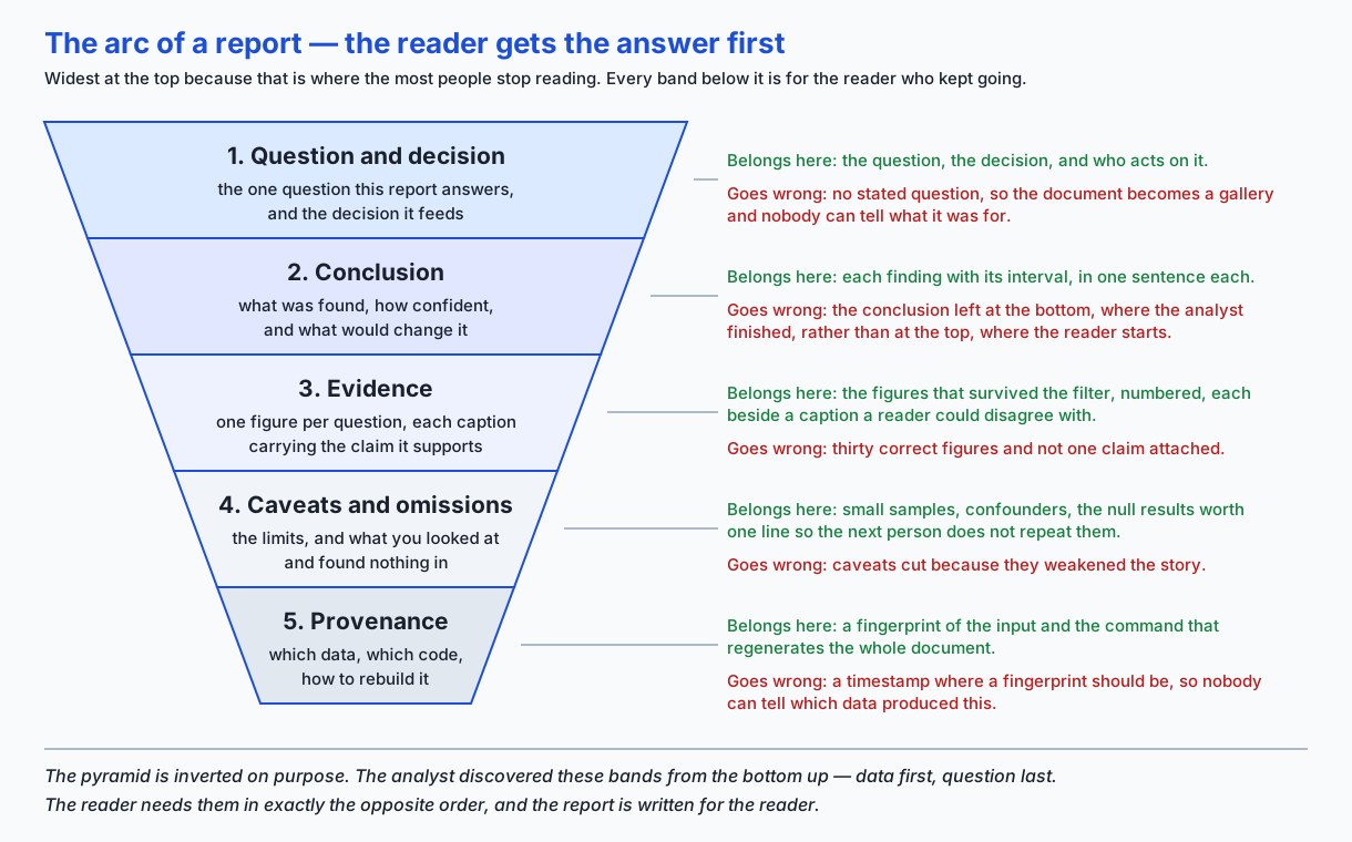
Read the pyramid from the top. Each band is for a smaller audience than the one above it, which is why the top band is the widest: more people will read the question than will read the provenance, and that is fine. What is not fine is putting the finding in the narrowest band.
The bands, and what actually goes in them:
Question and decision. One question, stated in a sentence. Then the decision it feeds, also in a sentence. If you cannot name a decision, you may still have a legitimate report — curiosity is allowed — but say so, because “this is background, nobody has to act on it” is useful information for a reader deciding how carefully to read.
Provenance and what the data is. Where it came from, how many rows, what a row means. This appears at the bottom of the rendered document but you write it first, because you cannot state a question about data you cannot describe.
Data quality, up front. Week 18 gave you profiling and the damage report. Do not re-derive it here; reference it. What matters for the report is that a reader learns about the gaps before they read a finding computed from the data with gaps in it. The lab’s first figure is the missing-value picture for exactly this reason: eight of 192 rows have no revenue, and every one of them is a partner row, which changes how every later figure has to be read.
Univariate views. One column at a time, only where it changes what you would do. The lab’s second figure earns its place by showing that revenue is two populations stacked on top of each other, not one — which means an average over that column describes nothing real.
Relationships. Two columns. Day 130’s warning applies: plot the shape before you compute a coefficient.
Segments. Where the interesting question usually lives. The lab’s fourth figure is the whole reason its report exists: three regions grew across the pricing change and one fell.
Anomalies. One point that is not like the others. The important part is not finding it; it is saying whether it is a level change or a single observation, because those imply completely different next actions.
Conclusion. What was found, how confident you are, and what would change your mind. That last clause is the one people drop, and it is the one that makes a report trustworthy: an author who can say what evidence would overturn their finding has thought about the finding.
Exploration and communication are two documents
You have already seen the table. The mechanism worth understanding is why shipping the first as the second feels so natural.
When you explore, every chart you draw is, at that moment, the most interesting thing in the world to you. You made it because you had a question, you looked at it, and it either answered the question or suggested a better one. The context in your head is what makes it meaningful. Then you send the file, and the context does not go with it.
This is why the “so what” test has to be applied deliberately rather than felt. For every section, ask: if I deleted this, would the decision change? Not “is it interesting” — everything you looked at is interesting to you. Not “is it correct” — it is, that is not the question. Would the decision change.
Most sections fail. Delete them. The lab makes this a mechanical step: a candidate figure with no stated question is filtered out before it is ever drawn, and the filter reports how many survived.
The caption carries the claim
The rule: a caption must say something a reader could disagree with.
Practically, that means a comparative or a quantitative element. Here is the same figure captioned four ways.
| Caption | Verdict |
|---|---|
| ”Figure 4: revenue by region” | A label. Restates the axes |
| ”Figure 4: revenue by region over time” | Still a label. More words, same content |
| ”Figure 4: the West’s revenue diverges from the other regions” | A claim. Weak, but checkable |
| ”Figure 4: three regions grew across the pricing change while the West fell 8.6%“ | A claim, with the size of the effect |
The last one is what you want. It states the direction, the size, and what it is relative to. A reader who thinks you are wrong knows exactly what to look at.
The lab implements a crude machine check for this — carries_claim
requires a digit, a percent sign, or one of a list of comparative words
— and it is worth being precise about what such a check buys you,
because it is easy to oversell.
It cannot tell whether the claim is true. carries_claim happily
passes “revenue doubled in every region” on data where revenue halved. It
has no access to the data at all.
It also has false negatives. Writing the lab’s own test turned one up immediately: “revenue tripled in all four regions” is a perfectly good claim, and the check refuses it, because “tripled” is not on the word list and “four” is spelled out. The test asserts that failure rather than patching it away by adding one more word, because the false negative is the more instructive half — you cannot enumerate the ways English states a comparison, and a check that pretends otherwise is worse than one whose limits are written down.
What the check does buy is narrow and genuinely worth having: it makes the absence of a claim impossible to ship by accident. You can still write a wrong caption. You can no longer write no caption and not notice.
Uncertainty belongs in the sentence
Day 117 gave you the standard error; Day 118 gave you the confidence interval. Both usually end up as a shaded band on a chart, and then the prose says “revenue fell 8.6%” with no band anywhere near it.
A finding without its uncertainty is an assertion. The lab’s Estimate
type will not let you report a number without either an interval or an
explicit note saying why none is available:
@dataclass(frozen=True)
class Estimate:
    label: str
    value: float
    unit: str = ""
    low: float | None = None
    high: float | None = None
    no_interval_note: str | None = None

    def has_uncertainty(self) -> bool:
        interval = self.low is not None and self.high is not None
        return interval or bool(self.no_interval_note)
The no_interval_note branch is not a loophole. It is the honest case.
The lab’s fifth figure reports that the East’s month 18 is 3.3 times the
region’s median month, and attaches: “a single observation has no
sampling interval; one point is one point.” That sentence is more useful
than a fabricated interval would have been, and more useful than
silence.
Two of the intervals in the lab’s generated report are worth reading critically. The West’s change is computed from six months either side of the pricing change, which is six observations per side. Its bootstrap interval runs from -11.6% to -5.1% — wide, and the report says so in its own caveats. That width is information. A report that quoted -8.6% alone would be claiming a precision it does not have.
Ordering for the reader, not for the analyst
You discovered things bottom-up: data, cleaning, exploration, finding. The reader needs them top-down: finding, evidence, caveats, data. So the rendered document puts the conclusion above the evidence, and the lab asserts it:
assert markdown.index("## Conclusion") < markdown.index("## Evidence")There is a stronger version of the same idea in the generator, and it is the neatest thing in the lab. The conclusion section is not a separate summary someone wrote. It is built by concatenating the panels’ captions:
for panel in self.panels:
    add(f"{panel.number}. {panel.finding.caption} (Figure {panel.number})")
Because the caption carries the claim, the list of captions is the conclusion. A separate summary can drift away from the figures. This one structurally cannot.
Caveats go after the evidence but before the provenance — findable, not buried. Burying them in an appendix is the polite form of deleting them, and readers have learned to notice.
Reproducibility: the report is built, not assembled
Day 126 taught idempotence for a cleaning pipeline: run it twice, get the same output. Apply it to prose.
The generator writes Markdown by joining strings in Python. It contains
no clock reading, no hostname, no unseeded random number. Provenance is a
sha256 fingerprint of the input frame, not a timestamp of the run:
def fingerprint(self, frame: pd.DataFrame) -> str:
    payload = frame.to_csv(index=False).encode("utf-8")
    return hashlib.sha256(payload).hexdigest()[:12]
That one decision is what makes two runs byte-identical, and it is also what makes the provenance useful. A timestamp tells you when someone ran something. A fingerprint tells you which data produced this document, and lets two people confirm they are holding the same input without either of them sending it.
The lab asserts byte-identity for the Markdown, and it asserts it for the figure PNGs too — but only across two runs on the same machine in the same session, which is where the guarantee actually holds. Both were measured here and both held. Do not extend the PNG claim across machines: matplotlib rasterises text through FreeType, and a different FreeType build or a different set of installed fonts legitimately produces different bytes from identical code. The Markdown contains no rendered glyphs, which is why its byte-identity is the stronger and more portable claim.
Honest omission
Every discarded candidate in the lab carries a dropped_because string,
and those strings are rendered into the report under “what we looked at
and found nothing in”. The chart is gone; the sentence survives.
Candidate(
    slug="cumulative-revenue",
    dropped_because=(
        "A cumulative revenue curve was drawn and discarded: a cumulative "
        "series rises whatever the underlying months do, so it answered no "
        "question the monthly series had not already answered"
    ),
),
This costs one line and saves the next reader an afternoon. It also protects you: a reader who wonders “did they check seasonality?” gets an answer instead of an assumption.
Accessibility and honesty as properties of the document
Days 127 and 132 gave you rules for individual charts. At report level they become build checks, which is the form in which rules actually get followed.
The lab’s check_axes reads colours straight off the matplotlib artists
— Day 128’s object model, put to work — and compares them against
seaborn.color_palette("colorblind") frozen as hex:
SAFE_PALETTE = (
    "#0173b2", "#de8f05", "#029e73", "#d55e00", "#cc78bc",
    "#ca9161", "#fbafe4", "#949494", "#ece133", "#56b4e9",
)
It also requires both axes to carry a label. Run it against a chart drawn
in red and green with unlabelled axes and it returns exactly four
problems: the unlabelled x axis, the unlabelled y axis, #ff0000, and
#008000. That was measured, not asserted from theory.
Two things this check does not do, and you should know both. It does not verify contrast ratios, and it does not stop you from encoding meaning by colour alone — a colourblind-safe palette still fails a reader who is looking at a monochrome printout. Redundant encoding, where colour and position or colour and marker shape both carry the distinction, is the real fix, and no check in this lab enforces it.
Day 132’s honesty rules land in the same place: if you truncated an axis, used a log scale, or jittered a position, say so in the caption. The rule you broke, disclosed where the reader is looking, is the whole mechanism.
Building the smallest version from scratch
Before the lab’s generator, here is the entire idea in twenty lines. This is a real, working report generator — it is just missing every check.
from pathlib import Path
import matplotlib
matplotlib.use("Agg")
import matplotlib.pyplot as plt
def tiny_report(outdir, figures, frame):
"""figures: a list of (slug, question, draw, caption) tuples."""
out = Path(outdir)
(out / "figures").mkdir(parents=True, exist_ok=True)
lines = ["# Report", ""]
for number, (slug, question, draw, caption) in enumerate(figures, start=1):
image = f"figures/{number:02d}-{slug}.png"
fig, ax = plt.subplots()
draw(ax, frame)
fig.savefig(out / image)
plt.close(fig)
lines += [f"## {question}", "", f"", "",
f"**Figure {number}.** {caption}", ""]
text = "\n".join(lines)
(out / "report.md").write_text(text, encoding="utf-8")
return textThat is the mechanism, complete. Figures out, Markdown out, links correct.
Now look at what it lets you do. It lets you pass an empty string as the question. It lets you caption a figure “revenue by region”. It lets you compute the caption by hand and type it in. It has no idea whether a number in your prose came from the frame. It cannot tell you that you wrote three figures and referenced two.
Every difference between this and the lab’s report.py is a check that
turns one of those into an error. That is the whole design: the generator
is not clever, it is unyielding. Report.add_panel is thirty lines and
two of them are raise.
The reason to build the tiny version first is that it makes the checks
legible as choices. Nothing in report.py is there because a framework
required it.
The pipeline, end to end
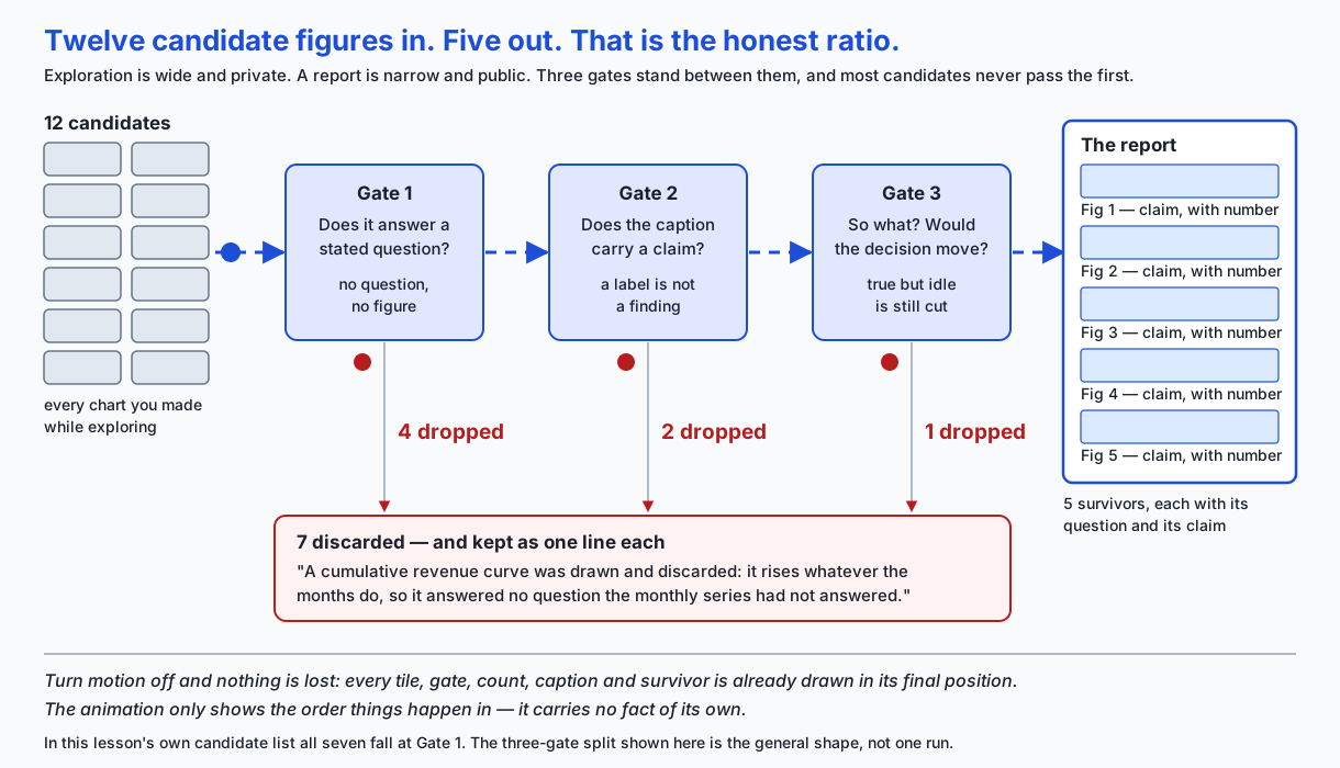
Three gates, in a deliberate order. Gate 1 is cheapest and catches the most: no stated question, no figure, and you have not spent time drawing it. Gate 2 catches figures that have a question but whose author could not turn the answer into a claim — which usually means the answer was “nothing interesting”, which is a null result and belongs in the omissions list. Gate 3 catches the true, well-captioned figure that nonetheless changes no decision.
In the lab’s own candidate list, all seven discarded figures fall at Gate 1, because that is how the candidates were written. In your own work the distribution will be different, and Gate 3 will catch more than you expect — it is the gate that removes your favourite chart.
An everyday analogy
A report is a closing argument. A notebook is the evidence locker.
Nobody stands in front of a jury and wheels in a trolley of unlabelled boxes. Counsel makes a claim, holds up one exhibit at a time, says what each one shows, admits what the evidence cannot establish, and asks for a specific verdict. The trolley still exists — it has to, and anyone may inspect it — but it is not the argument.
The mapping is unusually tight, which is why it is worth carrying through the whole day:
| In court | In the report |
|---|---|
| The charge | The question, and the decision it feeds |
| The verdict sought | The conclusion, at the top |
| An exhibit | A figure |
| What counsel says holding the exhibit up | The caption |
| ”The witness saw this from thirty metres, at night” | The interval on the estimate |
| Cross-examining your own case | The caveats section |
| Chain of custody | Provenance — the input fingerprint |
| Evidence examined and not entered | The one-line null results |
| The evidence locker | Your notebook |
Two things this analogy gets right that a softer one would not.
First, an exhibit with no statement attached is not evidence of anything. Holding up a photograph in silence proves nothing; the claim is what makes it evidence. That is the caption rule, exactly.
Second, chain of custody is not bureaucracy. It exists so that a reader
can ask “is this the thing you say it is?” and get an answer. A
sha256 fingerprint of the input frame does the same job, in one line,
for free.
Where the analogy breaks — and every analogy should be told where it breaks — is adversarial intent. Counsel is arguing for a side. You are not. You are arguing for whatever the data supports, which means the caveats section is not a tactical concession you make before opposing counsel does; it is the point. If you find yourself writing caveats defensively, you have taken the analogy one step too far.
Examples in practice
The lab generates a real report from a real (synthetic, deterministic) frame: 192 rows, four regions, two channels, twenty-four months. Here is its conclusion section, captured verbatim from the run — not retyped:
## Conclusion

1. 8 of 192 rows (4.2%) have no revenue, and 100% of those gaps are partner
   rows -- the missingness is a channel problem, not random loss (Figure 1)
2. Revenue is two populations rather than one: the median partner region-month
   is 45% of the median direct region-month, so any average taken across both
   channels describes a mixture nobody sells into (Figure 2)
3. Revenue rises about 174 USD per additional order and the straight-line fit
   accounts for 97.4% of the variation, so a region-month that missed its
   revenue missed its order count (Figure 3)
4. 3 regions grew across the pricing change while the West fell 8.6%, and the
   break lands in month 13 in that region only (Figure 4)
5. East month 18 is 3.3 times the region's median month while the months either
   side sit at 1.05 times it, so this is one observation and not a level
   change (Figure 5)

- share of rows with missing revenue: 4.2% (95% interval 1.6% to 7.3%)
- median partner region-month revenue: 16468 USD (95% interval 15826 to 17001)
- mean revenue per order: 180.1 USD (95% interval 178.4 to 181.8)
- West change across the pricing change (six months either side): -8.6%
  (95% interval -11.6% to -5.1%)
- East month 18 as a multiple of the region median: 3.3x (no interval: a single
  observation has no sampling interval; one point is one point)
Five findings. Every one of them is a claim. Every number carries an interval or an explicit statement that it cannot. And every one of those sentences is a caption from a figure further down the same document, so they cannot disagree with the figures.
Read finding 4 again, then read what the evidence section says beneath Figure 4:
Comparing the six months before month 13 with the six months after, the four
regions move North +12.5%, South +1.7%, East +47.5%, West -8.6%. The West is
the only one that changes direction, and it changes it at the month the price
moved. This is an association in observational data, not a controlled
comparison: nothing here rules out a third cause that happened to the West in
the same month. East's +47.5% is not what it looks like either: drop the single
month-18 observation and it falls to +8.0%, which is why Figure 5 exists.
That last sentence is the one worth studying. East’s +47.5% is real arithmetic and completely misleading, because a single tripled month sits inside the window. The generator computes both numbers from the same frame and prints both. Quoting +47.5% alone would have been exactly the Day 132 failure this week is about — technically true, structurally dishonest — and it would have been so easy that nobody would have noticed.
Notice also what is not in the report. Seven candidate figures were made and dropped, and they appear as this:
## What we looked at and found nothing in

- A cumulative revenue curve was drawn and discarded: a cumulative series rises
  whatever the underlying months do, so it answered no question the monthly
  series had not already answered
- Region-by-channel interaction was checked; the partner channel runs at the
  same share of direct in all four regions, so there is no interaction to report
- Calendar seasonality was checked by lining the two years up month against
  month; nothing stood out above the month-to-month noise
Three of seven shown. Seven charts became seven sentences, and the next person to open this dataset does not repeat any of them.
Implications: security, privacy, performance, scalability, and cost
Privacy is the big one, and it is specific to generated prose. A report that interpolates computed values into sentences will interpolate whatever is in the data. A caption that names the “top customer by revenue” prints a customer’s name into a document you are about to share with a wider audience than the data was ever cleared for. Charts are slightly safer by accident — a bar is anonymous until you label it — but a generated sentence is not. Before you point a generator at real data, read your caption templates and ask what each one can print.
The fingerprint is a control, not decoration. A sha256 of the input
lets two people confirm they hold the same data without either sending
it. It is not a secret and it does not need to be.
Performance is a non-issue at report scale and becomes one at pipeline
scale. Five figures at 600 by 350 pixels take under two seconds to
render. If a nightly job regenerates two hundred reports, the cost is
dominated by figure rendering, not by the analysis; figure.savefig with
a lower DPI and plt.close(fig) after every single figure are the two
things that matter. The lab closes every figure in a finally block for
exactly this reason — a long run that leaks figures will eventually
exhaust memory, and matplotlib warns about it long before it fails.
Scalability is about the reader, not the machine. A report with forty figures does not scale, no matter how fast it renders, because attention is the scarce resource. If you genuinely have forty findings, you have several reports.
Cost, in the sense that matters, is decision latency. Every ambiguity in a report costs a round trip: a question, a reply, a re-run. Three round trips is a week. The whole apparatus of stated questions and claim-carrying captions is there to make the first read sufficient.
One security note about generation itself. The lab’s generator builds
Markdown by joining Python strings. It never shells out, never evals,
and never renders through a template language, so it has no injection
surface. A generator that pipes user-controlled text through a shell
command or a template engine with autoescaping off does, and report
generators are exactly the kind of internal tool where nobody looks.
Alternatives: free, open source, and commercial
Four ways to produce this document. Only the first was run here; the rest are described from their documentation, and no output is reproduced from any of them.
A plain Python report generator writing Markdown — what this lab builds, and what was run.
When to choose it: when the report must be regenerated by a scheduled job or a CI run; when you want checks that can fail the build; when the output must diff cleanly in Git so a reviewer can see which sentence changed. This is the right default for anything that runs more than once.
How it is called: it is your own code. python -m analysis, or a
function call from a pipeline.
frame = data.monthly_sales()
markdown = analysis.build_report(frame).render("out", frame)
Cost: free, and no dependency beyond matplotlib and pandas. The cost is that you write the renderer, which for Markdown is a couple of hundred lines and a pleasant afternoon.
Jupyter with nbconvert — described from documentation, not run here.
When to choose it: when the exploration itself is the deliverable, or for a teaching document where the reader should see and re-run the code. Also the fastest path when a report is genuinely one-off.
How it is called:
jupyter nbconvert --to html --execute analysis.ipynbThe --execute flag matters more than it looks. Without it, nbconvert
exports the outputs currently stored in the notebook file, which are
whatever was there when it was last saved — possibly from a different
version of the data, possibly from cells run out of order. Day 126 named
this hazard: a notebook’s stored state is not a function of its code. A
notebook is an exploration medium that can be exported; it is not a
report format, and --execute is what turns the export into something
you can trust.
Cost: free and open source under a BSD licence. Hosted services that run notebooks for you are the paid layer, and they are paying for compute and collaboration, not for the format.
Quarto — described from documentation, not run here. quarto is not
installed on the machine this lesson was written on, and nothing here
reproduces its output.
When to choose it: when you want one source document to render to HTML, PDF and Word; when you want cross-references, figure numbering and citations handled for you; when a team is already writing in Markdown and wants the literate-programming workflow without building it. It is the direct descendant of Sweave, knitr and R Markdown, and it handles Python, R and Julia.
How it is called:
quarto render report.qmd --to htmlwith a .qmd file that is Markdown plus executable code chunks.
Cost: free and open source, MIT-licensed, maintained by Posit. Posit sells hosting and enterprise products around it; the tool itself is not the paid part.
pandas Styler for tables — installed as part of pandas, but it could not be run here.
This is worth reporting carefully, because the environment contradicted
what was expected. pandas 3.0.5 is installed on this machine, but the
.style accessor is optional and imports jinja2 to render its templates,
and jinja2 is not present:
>>> df.style
AttributeError: The '.style' accessor requires jinja2
So Styler is described here from the pandas documentation and no Styler output is reproduced anywhere in this lesson or its lab.
When to choose it: when a table is the right evidence and a chart is not — small comparisons, a handful of segments, anything where the reader wants to read exact values rather than compare lengths. Day 127’s perceptual ranking cuts both ways: position beats colour for comparison, but nothing beats a number when the reader needs the number.
How it would be called:
styled = (
    frame.style
    .format({"change": "{:+.1%}"})
    .background_gradient(cmap="cividis", subset=["change"])
)
html = styled.to_html()
cividis rather than a red-green gradient, for the same reason the lab
freezes a colourblind-safe palette.
Cost: free; it ships with pandas. pip install jinja2 is the missing
piece on a machine like this one.
| Tool | Best at | Regenerable in CI | Diffs cleanly | Cost | Run here |
|---|---|---|---|---|---|
| Plain Python to Markdown | Repeated, checkable reports | Yes | Yes, line by line | Free | Yes |
| Jupyter with nbconvert | Exploration as deliverable, teaching | Only with --execute | Poorly — JSON with embedded output | Free | No |
| Quarto | Multi-format publishing, cross-references | Yes | Yes | Free | No |
| pandas Styler | Tables where exact values matter | Yes | Produces HTML, so partly | Free | No — jinja2 missing |
Comparison with related concepts
An EDA report and a dashboard answer different questions. A report answers one question once, with an author who commits to a conclusion. A dashboard answers a standing question repeatedly, with no author and no conclusion — it shows the current value and leaves interpretation to the viewer. Turning a report into a dashboard strips the argument out; that is not a criticism of dashboards, it is what they are for.
An EDA report and a statistical analysis plan are near opposites in time. The plan is written before you see the data and commits you to what you will test, which is what makes the test’s p-value mean anything. The report is written after, and its findings are exploratory by construction. The honest report says so — the lab’s does, in its caveats — because an exploratory finding presented as a confirmatory one is a real and common form of dishonesty.
An EDA report and a notebook: the evidence locker and the closing argument. Both should exist. Only one gets sent.
An EDA report and a paper. A paper’s structure — abstract, introduction, method, results, discussion — is an inverted pyramid with extra formality, and its abstract is doing exactly what the conclusion section does here. The difference is that a paper is written for a reader who might replicate it, so its method section is long; a report is written for a reader who has to decide something this week, so its method section is a provenance line and a link.
When to use it — and when not to
Use this structure when someone has to decide something and you know what; when the analysis will be re-run on refreshed data; when more than one person will read it; when the finding is going to be quoted somewhere you will not be present to explain it.
Do not use it when you are still exploring — the structure will make you commit before you have anything to commit to, and the honest state of “I do not yet know” has no place in the pyramid; when the answer fits in a sentence, in which case send the sentence; when what is genuinely wanted is the raw data and your figures are in the way.
The failure mode worth naming: reporting too early. The report format is persuasive, and a persuasive document built on two days of exploration into unfamiliar data will persuade people of things you are not yet sure of. If you cannot write the caveats section honestly, you are not ready to write the conclusion.
The mirror failure: never reporting. Some analysts keep exploring because the next chart might change everything. The “so what” test cuts this too — if the decision would not change, stop exploring and write.
Knowledge check
Take the eight-question quiz for this day. It checks the parts people most often get half-right: what a caption has to do, what the claim check can and cannot detect, why the conclusion comes first, what makes two runs byte-identical, and why an explicit “no interval available” note is a stronger answer than silence.
Hands-on exercise
Build the report generator’s checks and prove each one catches what it claims to.
cd labs/sections/math-statistics-and-data/day-133-building-an-eda-report
python3 -m venv .venv
.venv/bin/pip install -r requirements/requirements.txt
.venv/bin/pytest starter -v
Nine exercises in starter/test_report.py, each currently a
pytest.skip whose message tells you exactly what to assert. Read
starter/00_brief.md first, then starter/report.py — the generator you
are testing — then starter/analysis.py, which holds the twelve
candidate figures.
The nine, in order: a figure must have a question; a caption must carry a claim; the numbers in the prose must come from the data; no figure may be orphaned; every estimate must carry an interval or an explicit note; two runs must be byte-identical; the conclusion must precede the evidence; the “so what” filter must drop what it says it drops; and every figure must pass the accessibility contract.
Run pytest starter and pytest examples as two separate commands.
Both directories contain a module named test_report.py, and a single
combined invocation aborts collection with an import file mismatch.
Section 5 of the harness runs the combined form on purpose and asserts
that it fails, so this is a checked behaviour rather than a warning you
have to take on trust.
Expected output
An untouched checkout:
sssssssss                                                                [100%]
9 skipped
The reference answers:
.........                                                                [100%]
9 passed
The full harness ends with:
7. Offline, and nothing left behind
  ok: no URLs inside examples/ or starter/
  ok: no image files anywhere inside the lab
  ok: no generated report.md left inside the lab
  ok: no __pycache__ or .pytest_cache left behind
  ok: no d133 temporary directory left in the system temp directory

-------------------------------------------------------------
42 checks, 0 failure(s)
Section 2 of that harness is the one to read. It does not inspect source code: it builds reports, renders them into temporary directories, and reads the documents back. It confirms that 12 candidates go in and 5 come out, that the Markdown is byte-identical across two runs, that the West figure in the prose moves from -8.6% to -54.3% when one input value changes, and that a red-against-green chart fails the accessibility contract with exactly four named problems.
Validate your work
bash tests/run_tests.shprints42 checks, 0 failure(s)and exits 0. Check the status withecho $?on the next line, with no pipe in between — a pipeline reports the last command’s status, and that has hidden a real failure in this repository before..venv/bin/pytest starter -qprints9 passedwhen you are done.- Open
expected-output/report-sample.mdand read it as a reader would, top to bottom. Stop after the conclusion. Do you know what was found and how firm it is? That is the test the document has to pass. - Change
WEST_PRICING_FACTORinstarter/data.pyfrom0.88to0.95, re-render, and confirm that every sentence quoting the West’s change moved. Then put it back.
Troubleshooting
import file mismatch — you ran pytest examples starter in one
command. Run them as two.
A window tries to open, or matplotlib complains about a display —
something imported pyplot before matplotlib.use("Agg") ran. Each
conftest.py sets the backend on its first lines for this reason; if you
added an import above it, move yours below. MPLBACKEND=Agg in front of
the command is a reliable belt.
version mismatch in section 1 — the harness compares installed
versions against requirements/requirements.txt. This matters here:
SAFE_PALETTE is seaborn 0.13.2’s colourblind palette frozen as hex, and
exercise 9 compares against it exactly.
Exercise 6 fails on the figure bytes — something non-deterministic
crept into a draw function: an unseeded random call, or a colour
picked from a set. Note that the assertion compares two runs on your
machine; it never claims your bytes match anyone else’s.
Exercise 3 passes but both numbers look the same — you rendered the
same frame twice. build_report(frame) and render(directory, frame)
must be given the same frame as each other, and the perturbed run must
be given perturbed() for both.
Common mistakes
Treating the caption check as a truth check. It is not, it cannot be, and the lab asserts both of its failure directions. It catches the absence of a claim. Nothing more.
Putting the interval on the chart and not in the sentence. The error bar is for the reader who studies the figure. The sentence is for the reader who reads the conclusion and stops, which is most of them.
Deleting a dead end without leaving the line. The chart goes; the sentence stays. One line, and the next person does not repeat your afternoon.
Writing the caption before running the analysis. If you know what the caption says before you have the number, the number is decoration. The generator’s captions are computed from the frame for exactly this reason.
Keeping a figure because it took a long time to make. Sunk cost is not a “so what”. Gate 3 exists to remove your favourite chart, and it will.
Practice assignment
Take a dataset you already know — anything with at least a few hundred
rows and one grouping column — and produce a report on it using the lab’s
generator, without modifying report.py.
Requirements:
- One stated question at the top, and the decision it feeds. If nobody has to act, say so explicitly.
- At least eight candidate figures in your list, of which at most
four may have questions. Write a
dropped_becauseline for every one you discard. - Every caption computed from the frame. No typed numbers anywhere.
- Every estimate carrying a bootstrap interval, or an explicit note saying why one is not available.
- All figures passing
accessibility_problemswith an empty list. - Two runs producing byte-identical
report.md.
Then do the part that actually teaches: give the rendered report to someone who has never seen the data, ask them to read only down to the end of the conclusion, and then ask them what you found and how sure you are. If they cannot answer, the fault is in the report, not the reader.
Extension challenge
Add a sixth check to the generator and prove it works.
Two suggestions, in increasing difficulty.
Every figure must be referenced before it appears. The conclusion mentions “(Figure 4)”; assert that no figure’s evidence section appears before its number is mentioned above. This is easy to state and slightly fiddly to implement, which makes it a good test of whether you understood the rendering order.
Every claim must name its figure’s variable. Parse the caption for a
column name from frame.columns and require at least one. This catches
the vague-claim failure — “performance improved” — that carries_claim
passes because “improved” is a comparative word. Note what you are
building: a second crude check that catches a different subset. Write
down what it misses, in the same spirit as the false negative the lab
already documents.
The harder and more valuable version: write the check that fails your own last report. Everyone has one. Find the specific thing that went wrong — a number that drifted, a figure nobody could interpret, a conclusion three pages down — and turn it into an assertion. A check that comes from a real failure is worth ten that came from a list.
AI thread
A model card and an evaluation report are this document with a different subject, and the same failure dominates both.
Open a typical model card. Architecture, parameter count, training data description, a table of benchmark scores, a section on limitations. Every number is correct. You reach the end and you cannot say whether the model is fit for your purpose — which is the only question you brought.
It is the gallery, exactly. Pages of metrics with no stated claim.
“MMLU: 71.2” is revenue by region: a label, restating an axis. What the
reader needs is the caption that carries the claim — something like “on
the eight-language subset this model trails the previous version by four
points, which matters if your traffic is not English” — and that sentence
is nowhere, because writing it requires committing to a judgement about
what the number means.
The literature that named this problem named it well. Margaret Mitchell and colleagues introduced model cards at the FAT* conference in 2019, and Timnit Gebru and colleagues introduced datasheets for datasets the year before. Both are, structurally, this lesson’s report: a stated intended use at the top, evidence beneath, limitations that are findable rather than buried, provenance at the bottom. Both are widely adopted in form and widely hollow in practice, and the hollowness has one cause — the sections get filled in with labels instead of claims.
Three things transfer directly.
The caption habit. Every metric in an evaluation report gets a sentence saying what it means for a decision. If you cannot write that sentence, the metric does not belong on the page; you measured it because it was easy to measure.
The interval. An accuracy of 71.2% on a 500-item benchmark has a standard error of roughly two points — Day 117’s arithmetic, unchanged. Two models reported as 71.2 and 72.8 are, on that evidence, the same model. Evaluation reports quote these numbers to one decimal place and omit the interval constantly, and the resulting leaderboard rankings are partly noise. Putting the interval in the sentence would end a surprising number of arguments.
The honest omission. “We evaluated on long-context retrieval and found no difference from the baseline” is one line, and it stops the next team spending a week on it. Nobody writes it, because null results feel like failure. They are not; they are the cheapest information you will ever hand anyone.
And the reproducibility point lands hardest here of all. An evaluation
report whose numbers were pasted in by hand from a run three weeks ago,
against a checkpoint that has since been retrained, is a document that
lies without anyone lying. Generating the report from the eval harness —
with the model checkpoint’s hash where a timestamp would otherwise be —
is the same fix as fingerprint() in today’s lab, applied to a stake
that is a good deal higher than four synthetic sales regions.
Quiz
Q1. A notebook contains thirty figures. Every axis is labelled, every aggregation is correct, and no chart misleads. A reader reaches the end unable to say what was found. What is the actual defect?
- The figures are too small to read at the resolution they were exported at
- There are too many figures; any document with more than ten charts is unreadable
- Exploration was shipped as communication -- the figures are correct but no claim is attached to any of them
- The charts use the wrong chart types for the questions being asked
Show answer
Answer: C. Exploration was shipped as communication -- the figures are correct but no claim is attached to any of them
Nothing in the notebook is wrong, which is exactly why the defect is easy to miss. The document is a complete record of a search, and a search has a trail rather than a conclusion. Reducing the count would not fix it either: five uncaptioned figures fail the same way three fewer times. The fix is that every figure must answer a stated question and the answer must be written down beside it.
Q2. Which of these captions carries a claim, in the sense this lesson means?
- "Figure 4: three regions grew across the pricing change while the West fell 8.6%"
- "Figure 4: revenue by region"
- "Figure 4: revenue by region over time"
- "Figure 4: monthly revenue, all four regions, direct channel only"
Show answer
Answer: A. "Figure 4: three regions grew across the pricing change while the West fell 8.6%"
A claim states something a reader could disagree with, so the chart can either support it or fail to. The other three restate the axes in progressively more words; a reader has no way to check them because they never assert anything. The strongest form names the direction, the size and what the size is relative to, which is what the first option does.
Q3. The lab's `carries_claim` check requires a digit, a percent sign, or one of a fixed list of comparative words. Which statement about it is accurate?
- It verifies that the caption is consistent with the data behind the figure
- It guarantees the caption is true, since only a true claim would contain a number
- It is complete for English, because the list of comparative words is exhaustive
- It detects only whether a claim was made; it passes false claims and refuses some real ones
Show answer
Answer: D. It detects only whether a claim was made; it passes false claims and refuses some real ones
Measured in this lab, both failure directions are real and both are asserted in its tests. It passes "revenue doubled in every region" on data where revenue halved, because it never reads the data. It also refuses "revenue tripled in all four regions", a perfectly good claim written with a word that is not on the list. What it genuinely buys is narrow and still worth having: it makes the ABSENCE of a claim impossible to ship by accident.
Q4. A report's provenance section records a `sha256` fingerprint of the input data instead of the date and time the report was generated. What does that buy?
- It compresses the input so the report file stays small
- Two runs over the same input produce byte-identical output, and a reader can confirm which data produced the document
- It proves the analysis is correct, because a hash cannot be forged
- It replaces the need for a caveats section, since the data is now documented
Show answer
Answer: B. Two runs over the same input produce byte-identical output, and a reader can confirm which data produced the document
A timestamp tells you when someone ran something, which is rarely the question. A fingerprint tells you WHICH data produced this document, and lets two people confirm they hold the same input without either sending it. It is also the reason the document is reproducible: a clock reading in the output would make every run differ from the last, so the byte-identity assertion in exercise 6 would be impossible.
Q5. An analysis reports that the East's revenue is 3.3 times its usual level, and the figure rests on a single month. What should the report say about uncertainty?
- State plainly that this is one observation and no sampling interval is available for it
- Bootstrap the single value to produce an interval, so the report is consistent
- Omit the number entirely, since a figure without an interval cannot be reported
- Quote the interval from a different, larger estimate in the same report as an approximation
Show answer
Answer: A. State plainly that this is one observation and no sampling interval is available for it
The explicit "no interval available, and here is why" note is not a loophole -- it is the honest case, and it is more useful to a reader than either a fabricated interval or silence. It also tells the reader what to do next: a single spike belongs with whoever can explain it, while a level change belongs in the forecast. Bootstrapping one point returns that point, which would dress a non-measurement up as a measurement.
Q6. Why does the lab build its conclusion section by concatenating the panels' captions rather than writing a separate summary?
- Because Markdown cannot represent a summary paragraph and a figure list in the same document
- To reduce the file size of the rendered report
- It is purely a convenience; a hand-written summary would be equally safe
- Because the caption already carries the claim, so a conclusion built from captions cannot drift away from the figures
Show answer
Answer: D. Because the caption already carries the claim, so a conclusion built from captions cannot drift away from the figures
A separately written summary is a second copy of the findings, and second copies drift -- someone updates the figure and not the summary, or the data refreshes and the summary does not. Building the conclusion out of the captions makes the drift structurally impossible, and it is only possible because the caption rule forced each caption to be a claim in the first place.
Q7. Exercise 6 asserts that two renders of the same input produce byte-identical PNG files. What is the honest scope of that assertion?
- PNG bytes are identical for any correct matplotlib install anywhere, since the code is deterministic
- It holds for two runs on the same machine in the same session; different machines can legitimately produce different bytes
- It holds only if the figures contain no text at all
- It is a weaker claim than the Markdown byte-identity, so the lab does not actually test it
Show answer
Answer: B. It holds for two runs on the same machine in the same session; different machines can legitimately produce different bytes
matplotlib rasterises text through FreeType, so a different FreeType build or a different set of installed fonts can produce different pixels from identical code. The lab does test the PNG bytes, and they matched here -- but only across two runs on one machine, which is where the guarantee holds. The Markdown byte-identity is the stronger and more portable claim precisely because Markdown contains no rendered glyphs.
Q8. You spend an afternoon checking whether missing values cluster by month. They do not. What belongs in the report?
- The chart, with a caption saying no pattern was found, so the reader can verify it
- Nothing at all -- a figure that answers no question fails the "so what" test and should leave no trace
- One line saying you checked and found nothing, with the chart deleted
- The chart moved to an appendix, where it does not interrupt the argument
Show answer
Answer: C. One line saying you checked and found nothing, with the chart deleted
Both halves matter. The chart fails the "so what" test and goes, because a reader has to interpret every figure you show them and this one changes no decision. The sentence stays, because otherwise the next person spends the same afternoon on the same check -- and because a reader wondering "did they look at that?" gets an answer instead of an assumption. Deleting the trace entirely is the one option that costs someone else real time.
Glossary
- EDA report
- A document that turns an exploratory analysis into an argument: one stated question, the decision it feeds, a conclusion placed above the evidence, a small number of figures each answering a stated question and captioned with the claim it supports, the caveats, and the provenance. It is not a cleaned-up notebook; a notebook records a search, and a search has a trail rather than a conclusion.
- claim-carrying caption
- A caption that states something a reader could disagree with, so the figure either supports it or fails to. "Revenue by region" is a label -- it restates the axes and asserts nothing. "Three regions grew while the West fell 8.6%" is a claim: it names a direction, a size and a comparison, and a reader who thinks it is wrong knows exactly where to look.
- the "so what" test
- The question asked of every section and every figure before it is allowed into a report: if this were deleted, would the decision change? Not "is it interesting" -- everything you looked at is interesting to you -- and not "is it correct", which is the entry price. Most sections fail, and failing is the normal outcome rather than a sign of poor work.
- honest omission
- A single line recording something you looked at and found nothing in, kept in the report after the chart itself has been deleted. It costs one line, stops the next reader repeating your dead end, and answers the question "did they check that?" with a fact instead of an assumption.
- orphan figure
- An image file written into a report's output directory that the report's text never links to. It is either a figure you meant to discuss and forgot, or a leftover from an earlier run that will mislead whoever opens the directory next. The lab detects one by comparing the image links in the rendered Markdown against the files actually on disk.
- point estimate
- A single computed number with no statement of how firm it is -- "revenue fell 8.6%". Reported alone it is an assertion rather than a finding, because a reader cannot tell whether it would survive a different sample. In this lesson's generator a point estimate must be accompanied by an interval or by an explicit note saying why no interval is available.
- percentile bootstrap interval
- An interval built by resampling the observed data with replacement many times, recomputing the statistic on each resample, and taking the 2.5th and 97.5th percentiles of the resulting distribution. Day 118's confidence interval obtained by simulation rather than by formula, which is what you reach for when the statistic has no tidy standard error -- a ratio of two window means, for instance.
- data fingerprint
- A short cryptographic hash of the input data, recorded in the report's provenance section in place of a timestamp. It answers "which data produced this document?", lets two people confirm they hold the same input without either sending it, and is the reason two runs of the generator produce byte-identical output.
- byte-identical output
- The property that two runs of a generator over the same input produce files that are equal byte for byte. Achieved by removing every clock reading, hostname and unseeded random draw from the output. For the Markdown in this lab it holds generally; for the figure PNGs it was measured across two runs on one machine only, because matplotlib rasterises text through FreeType and a different font stack can produce different pixels from identical code.
- candidate figure
- A chart made during exploration that has not yet earned a place in the report. In the lab it is a `Candidate` object carrying a slug, an optional question, and -- if it has no question -- a `dropped_because` line. Twelve go into the pipeline and five come out, a survival rate of 41.7%.
- accessibility contract
- A build check that a report's figures must pass rather than a guideline their author is asked to remember: every mark drawn in a colour from a colourblind-safe palette, and both axes labelled. It is deliberately incomplete -- it checks neither contrast ratios nor whether meaning is encoded by colour alone, and redundant encoding remains the real fix.
- inverted pyramid
- The ordering that puts the conclusion nearest the top and the machinery nearest the bottom, so each band is read by fewer people than the one above it. It is the exact reverse of the order in which the analyst discovered things, which is why it has to be imposed deliberately rather than falling out of how the work was done.
- literate programming
- Donald Knuth's 1984 idea that a program should be written as a document for humans with the code embedded in the explanation. It reached statistics through Sweave (Friedrich Leisch, 2002), then knitr (Yihui Xie, 2012) and R Markdown, and then Quarto (Posit, 2022) -- the lineage behind every tool that renders prose and computed output from one source.
- model card
- A short structured document describing a machine-learning model's intended use, evaluation and limitations, introduced by Margaret Mitchell and colleagues at the FAT* conference in 2019. Structurally it is this lesson's report with a different subject, and it fails the same way: pages of metrics with no stated claim, so a reader cannot tell whether the model is fit for their purpose.
Sources and further reading
- Table Visualization (pandas user guide) — pandas (NumFOCUS / pandas core team) (accessed 2026-08-20)
- nbconvert: Convert Notebooks to other formats — Project Jupyter (accessed 2026-08-20)
- Quarto guide — Posit, PBC (accessed 2026-08-20)
- Choosing colormaps in Matplotlib — Matplotlib Development Team (accessed 2026-08-20)
- Choosing color palettes — seaborn (Michael Waskom) (accessed 2026-08-20)
Kept in this browser, no account needed. Your progress page turns the whole record into one link you can bookmark or open on another device.