Math, Statistics, and Data › Data Visualization › Day 132
Day 132: Visual Storytelling and Chart Honesty
After this lesson you will be able to measure how much a chart overstates its own evidence, using Tufte's lie factor computed from the chart's rendered geometry rather than from the numbers that went in. You will watch two bars for 100 and 102 -- a two per cent difference -- redrawn on a y-axis starting at 99 until one is exactly three times the height of the other, a measured drawn ratio of 3.0000 for a lie factor of 2.9412, with no data changed. You will then learn the nuance almost every version of that warning omits: the same two numbers on the same truncated axis, drawn as a line, have a lie factor of exactly 1.0000 on every baseline tried, because a bar encodes value as length from the baseline while a line encodes change as displacement. You will discover that the standard warning about dual y-axes is false as usually stated -- scaling cannot change the correlation of the drawn traces at all, measured invariant to 3.12e-15 across 500 random pairs of axis limits -- and that what a dual axis really controls is worse: the sign is a free parameter (inverting one axis takes a real correlation of +0.913234 to a drawn -0.913234, exactly), and the same widening drives both an uncorrelated pair and a strongly correlated pair to overlapping curves, so overlap is evidence of nothing. You will watch a trend slope flip from -0.7305 to +0.7045 per week depending only on where a reader is allowed to start looking, watch two textbook bin rules draw one hump and two humps from the same 400 values, measure a radius-encoded bubble pair whose shown area ratio is the square of its data ratio, and measure two 3D bars drawn 17% and 110% away from a data ratio a flat chart gets exactly right. You will measure the legitimate craft too -- ordering, retrievable claim text, and the luminance gap of 0.0996 that makes the classic red/green palette collapse for a colour-deficient reader. And you will finish with a reusable review contract that passes an honest chart, fails a truncated one, and passes a chart that breaks a rule and discloses it -- because the professional act is not refusing to break the rule, it is the note in the caption.
Hands-on lab for this lesson
Lab files on GitHub: https://github.com/ai-roadmap-365/ai-roadmap-365.github.io/tree/main/labs/sections/math-statistics-and-data/day-132-visual-storytelling-and-chart-honesty
- Get the hands-on files. Clone the labs repository once (you can reuse this clone for every lesson). This works on macOS, Linux, and Windows (PowerShell or WSL):
git clone https://github.com/ai-roadmap-365/ai-roadmap-365.github.io.git cd ai-roadmap-365.github.io - Open this lesson's lab. Move into the directory for this specific day. Every lab lives at the same predictable path — section / subsection / week / day:
cd labs/sections/math-statistics-and-data/day-132-visual-storytelling-and-chart-honesty - Read the lab guide. Open `README.md` in that directory. It lists the exact commands, what each does, the expected output, and how to check your work — read it before running anything.
- Run it and check your work. Follow the README's "How to run" section: run the example first to see the finished result, then complete the numbered exercises in `starter/`, then run the tests. The tests pass (exit 0) only when your work is correct.
bash tests/run_tests.sh # or the test command named in the lab README
You can also open the lab as a local page (works offline, shows the file tree and expected output).
Learning objectives
By the end of this lesson you will be able to:
- Define Tufte's lie factor precisely and compute it from a chart's rendered geometry rather than from the values that were plotted
- Explain why a truncated axis destroys a bar chart's encoding and leaves a line chart's intact, and state the two-clause baseline rule that follows
- State precisely what a dual y-axis can and cannot do to an apparent relationship, including why scaling cannot change the drawn correlation and why overlapping curves carry no information
- Demonstrate that a trend's sign is chosen by the window, and name the defence: show the full series and mark the window
- Show that two citable bin rules can support opposite claims about modality from one sample, and explain why "I used a standard rule" is not a defence
- Explain why encoding a value as a radius squares every ratio, and state the relationship between the shown area ratio and the lie factor the right way round
- Measure how far 3D perspective moves a comparison that a flat chart reproduces exactly, and explain why the third dimension carries no data
- Treat ordering, annotation, contrast and removal as measurable craft, and explain why an unlabelled chart is unhelpful rather than neutral
- Treat accessibility as an honesty requirement, using luminance separation and redundant encoding rather than colour alone
- Apply a reusable review contract to your own charts, and explain why disclosing a deliberate rule break is professional while breaking it silently is not
Prerequisites
- Day 127 -- chart choice and the perceptual ranking, including radius encoding and the red/green collapse this lesson quantifies
- Day 128 -- the matplotlib object model and testing a chart by asserting on its artists, which every measurement here applies
- Day 130 -- bin width as a choice; this lesson supplies the consequences
- Day 131 -- time series, including what a chosen window does to a trend
- Day 116 -- Simpson's paradox, referenced here rather than re-derived
- Comfort with Python functions, NumPy arrays, and reading a stack trace
Why this matters
Here are two numbers: 100 and 102.
Draw them as bars with the y-axis starting at zero, and they look like what they are — two nearly identical quantities, one a whisker taller than the other. Now change one line of code so the axis starts at 99 instead. The bars are still drawn from the same two numbers. Nothing was edited, rounded, filtered, or excluded. But the second bar is now exactly three times the height of the first, and that is not an impression — it is a measurement, taken off the rendered geometry:
  zero baseline (matplotlib's default for a bar chart)
    drawn height ratio : 1.0200
    data ratio         : 1.0200
    lie factor         : 1.0000

  y axis set to (99, 103) -- one line of code, no data changed
    drawn height ratio : 3.0000
    data ratio         : 1.0200
    lie factor         : 2.9412
Every reader of that second chart walks away believing the difference is around three to one. It is two per cent. And the person most likely to believe it is the person who made it, because they saw the axis get tighter and thought now you can actually see the difference.
That sentence is the whole day. Most misleading charts are made by honest people. Nothing in this lesson is a trick a villain reaches for. Every distortion below is a default, a convenience, or a reasonable-looking choice that happens to change the conclusion — a tighter axis so the difference is visible, a second y-axis so two measures fit on one plot, a bubble made bigger because the number is bigger, a chart rendered in 3D because it looked flat. Each one is something you will do by accident before you ever do it on purpose.
Which means a gallery of villainy would be useless to you. What you need is an instrument: a way to check your own work, before you publish, that does not depend on your judgment being unclouded by wanting the result. By the end of today you will have one, and it is small enough to paste into any project.
For your AI work specifically, this lands harder than it looks. A model
report is a persuasion document whether or not its author intends that.
An accuracy comparison on a truncated axis makes a 1.5-point improvement
read as a breakthrough. A training curve with loss and accuracy on a dual
axis makes them appear to trade off cleanly when the relationship is an
artifact of two numbers you typed into set_ylim. The stakeholder reads
the picture, approves the model, and ships it. And the person who was
misled first, and worst, is you — because you have been looking at that
chart for a week.
The idea in plain language
A chart is a translation. Numbers go in; lengths, positions, areas and colours come out. The reader runs the translation backwards in their head, converting what they see back into what they think the numbers are.
A chart is honest when that round trip returns the numbers you started with. It is misleading when it does not — regardless of whether every value in it is correct, regardless of what you intended, and regardless of how carefully you labelled it.
That framing has a useful consequence. If honesty is about a round trip, you can measure it. Take the size of the effect the reader sees. Divide it by the size of the effect in the data. If the answer is 1, the translation is faithful. If it is 3, the reader is seeing something three times as strong as what you have.
That ratio is Edward Tufte’s lie factor, from The Visual Display of Quantitative Information (1983), and it is the measuring stick for the whole day:
lie factor = (size of effect shown in the graphic) / (size of effect in the data)Tufte’s rule of thumb is that anything outside roughly 0.95 to 1.05 is a distortion. The number is unitless — a ratio of two ratios — and it turns “this chart is misleading” from an opinion you can argue with into arithmetic you cannot.
The unkind but accurate reading of today: you are going to compute this number for five common chart choices, and four of the five will fail.
Historical background
The lie factor comes from Edward Tufte’s The Visual Display of Quantitative Information, published in 1983 by Graphics Press. Tufte, a political scientist and statistician then at Yale, wrote and self-published the book after publishers balked at the production quality he wanted. It became the reference text for the field, and the lie factor is its most portable idea precisely because it is arithmetic rather than taste.
Tufte was not the first to notice the problem. Darrell Huff’s How to Lie with Statistics (1954) devoted a chapter — “The Gee-Whiz Graph” — to the truncated axis, complete with the same demonstration this lesson opens with: a modest rise redrawn on a cropped axis until it looks like a crisis. Huff’s framing was journalistic and his examples were drawn from advertising, but the mechanism he described is exactly the one you measured a moment ago.
The other pillar under today is empirical rather than editorial. In 1984, William S. Cleveland and Robert McGill published “Graphical Perception: Theory, Experimentation, and Application to the Development of Graphical Methods” in the Journal of the American Statistical Association (volume 79, number 387, pages 531-554). Rather than assert which encodings communicate well, they ran experiments: subjects judged quantities from graphs, and the errors were measured. The resulting ordering of elementary perceptual tasks — position along a common scale being most accurate, then length, then angle and slope, then area, then volume and colour — is the ranking Day 127 introduced. Their conclusion was blunt: “radical surgery on these popular graphs is needed.”
The two traditions matter together. Tufte gives you a number for how badly a specific chart distorts. Cleveland and McGill tell you which encodings degrade before you even reach for a distortion. Today’s lab computes Tufte’s number over the failure modes Cleveland and McGill predicted.
What it is — and what it is not
Chart honesty is a property of the rendered picture, not of the underlying data. Every number in the truncated bar chart above is correct. The chart is still misleading. Correctness of the data is necessary and nowhere near sufficient.
It is not the same as neutrality, and neutrality is not the goal. This is the part that gets muddled most often. An unlabelled, unordered, uncommented chart is not a neutral presentation of facts — it is an unhelpful one. It has no claim, so the reader cannot disagree with it; it has no ordering, so the reader must do the work of finding the pattern; it has no annotation, so whatever the reader concludes is an accident. Storytelling is not the opposite of honesty. Refusing to tell a story just means the reader tells themselves one, and you have no idea which.
It is not a prohibition on breaking rules. A clipped outlier, a logarithmic axis, a non-zero baseline on a share price — all of these are legitimate, and sometimes necessary. Insisting a stock chart start at zero would hide everything the reader came for. What separates the professional from the misleading is not the choice. It is the note in the caption. Breaking a rule deliberately and disclosing it is craft. Breaking it in silence is not.
It is not something a linter can fully check. Today’s lab ends with a review contract that catches a missing claim. It cannot judge a wrong one, and no automated check can. A tool that pretended otherwise would be its own kind of dishonesty.
It is not about intent. This bears repeating because it is the point of the day. The lie factor does not have a term for what you meant.
Why it was created and what problems it solves
Two problems, and they are different.
The first is arbitration. Before the lie factor, an argument about whether a chart was misleading was an argument about taste, and the person who cared most usually lost to the person who was most senior. “That axis is unfair” is a matter of opinion. “That axis gives a lie factor of 2.94 on a two per cent difference” is not. A number ends the argument by making it checkable, which is the same service a unit test performs for a claim about code.
The second, and by far the more useful in practice, is self-review. You cannot see your own chart clearly. You have been staring at it, you know what it is supposed to show, and your eye fills in the conclusion you already hold. Every distortion in this lesson survives your own review precisely because you are the person least equipped to catch it. A number does not have that problem. A checklist run mechanically does not have that problem.
This is exactly the logic behind everything else in this course that gets written down and executed rather than eyeballed: the reproducible cleaning pipeline of Day 126, the assertions on artists of Day 128. A chart you have measured is a chart you can defend. A chart you have only looked at is a chart you hope is fine.
How it works
Here is the whole day in one picture — the same two numbers, drawn six ways, each labelled with what it was measured at.
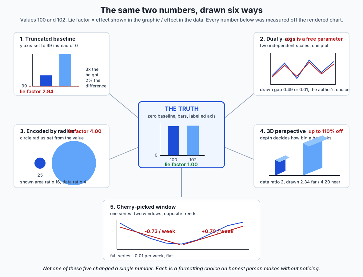
Take them one at a time.
Truncated axes, and the nuance that matters
The opening example moved a bar chart’s floor and tripled the apparent difference. So: always start at zero?
No — and getting this rule right is worth more than getting it loud. Watch what happens when the same two numbers, on the same truncated axis, are drawn as a line instead of bars:
Values 100 and 102, y axis (99, 103), two encodings.

  BAR -- encodes value as length from the baseline
    shown length ratio : 3.0000   (true ratio 1.0200)
    lie factor         : 2.9412

  LINE -- encodes change as vertical displacement
    shown change       : 2.0000   (true change 2.0000)
    lie factor         : 1.0000
The bar’s lie factor is 2.94. The line’s is exactly 1.00 — and it stays exactly 1.00 on every baseline the lab tries, including zero.
The reason is the encoding, and it is worth stating carefully because almost every version of this advice you will read online skips it.
A bar encodes value as length from the baseline. The bar’s length is the number. Move the baseline and you have changed what the length means while leaving it looking like it still means the same thing. The encoding is broken, full stop; there is no caption that repairs it.
A line encodes change as vertical displacement. A reader recovers the change by measuring how far the line rose and converting through the labelled axis — which is precisely what the lab does, and which returns the true change of 2.0 regardless of where the axis floor sits. The baseline is not part of a line’s encoding, so moving it costs nothing.
That gives a rule with two clauses instead of one:
- For bars, the baseline is load-bearing. It must be zero.
- For lines encoding change over time, a non-zero baseline is often legitimate and sometimes necessary — but the baseline must be visible and labelled, and the choice must serve the reader’s question rather than the author’s conclusion.
That second clause is where honesty actually lives. “Does this axis serve the reader’s question or my conclusion?” is a question only you can answer, and answering it honestly is the skill.
Here is the same slide, staged, with the drawn ratio growing while the truth sits still:
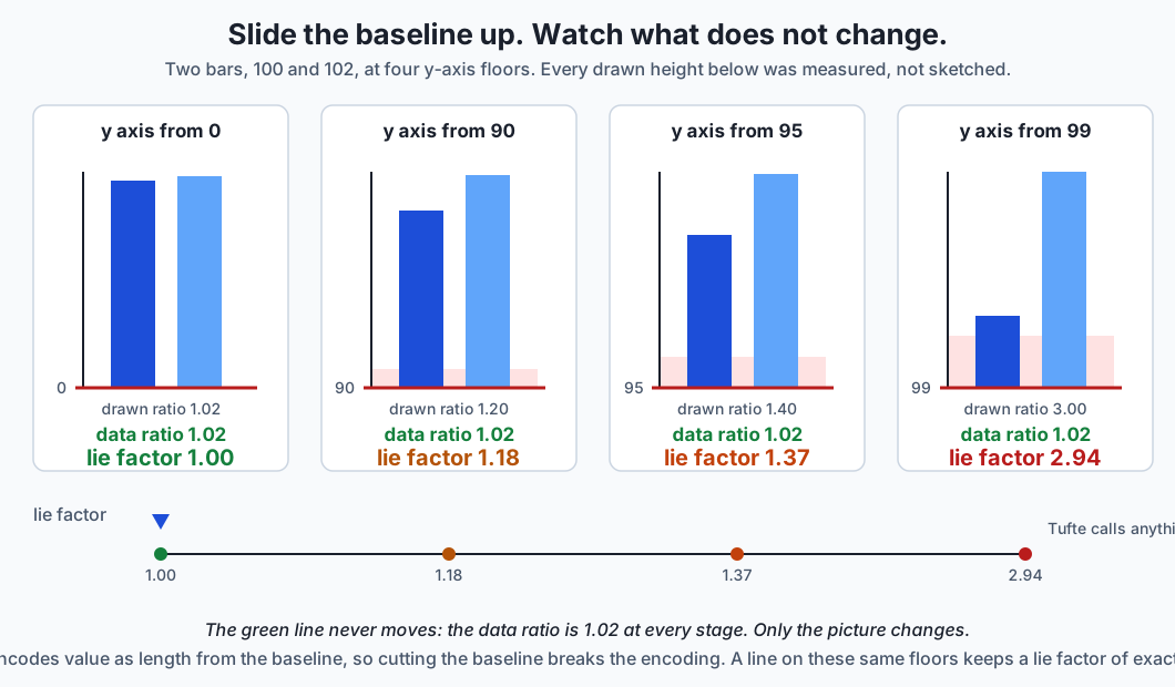
Dual y-axes, and what almost every warning about them gets wrong
Two series, two independently scaled axes, one plot. The standard warning is that this lets you make any two series look correlated by choosing the scalings.
Measured, that warning is false as stated — and the correction is worth far more than the warning.
Pearson correlation is invariant under positive affine transforms of each variable. A linear axis rescaling is exactly such a transform. So the correlation of the two drawn traces always equals the correlation of the data, no matter what limits you choose. The lab checks this across 500 random pairs of axis limits:
500 random pairs of axis limits, worst |drawn r - data r| = 3.12e-15Three parts in a quadrillion. That is not “approximately unchanged”; that is floating-point noise around an algebraic identity.
So what does a dual axis do? Two things, and both are worse than the folk version.
It makes the sign a free parameter. Inverting one axis — a single
checkbox in most tools, and set_ylim(high, low) in matplotlib — negates
the drawn correlation exactly. A genuinely, strongly correlated pair:
    a genuinely correlated pair, data r = +0.913234
    right axis inverted, drawn r = -0.913234
Same data. The chart now shows the opposite relationship, precisely.
And it makes visual coincidence a free parameter — which is what readers actually respond to. Nobody computes a correlation coefficient by eye. They look at whether the two curves sit on top of each other and move together. That impression is entirely the author’s choice:
  scaling                       drawn-trace gap   drawn-trace r
  parked in separate halves         0.4938        -0.001034
  each filling the frame            0.2261        -0.001034
  each axis widened 20x             0.0147        -0.001034
The gap is a root-mean-square vertical distance between the drawn curves, measured in fractions of the plot height. It moved by a factor of thirty-four. The correlation did not move at all.
And now the measurement that makes this decisive. Apply the same widening
to a pair with a real correlation of +0.913:
    a genuinely correlated pair, data r = +0.913234
    same 20x widening, gap = 0.0046
    uncorrelated pair,  gap = 0.0147
Both draw as overlapping curves. One pair is strongly correlated; the other has a correlation of negative one thousandth. The picture is the same either way, which means the picture carries no information about correlation at all. A reader who concludes “these move together” from overlapping curves on a dual axis has learned exactly nothing — and the author who drew it has usually learned nothing too, while feeling that they have.
That is the strongest thing you can say against dual axes, and it is stronger than the thing people usually say.
Cherry-picked windows
Day 131 established that a time series has a shape. Choosing where to start looking at it chooses the shape you see. Here is one series, three windows, three fitted slopes:
  window              from         to           slope per week
  full series         2025-01-06   2025-12-01   -0.0131
  first half only     2025-01-06   2025-06-16   -0.7305
  second half only    2025-06-23   2025-12-01   +0.7045
Three sentences, each of them true:
- “Declining at 0.73 a week.” True of the first half.
- “Growing at 0.70 a week.” True of the second half.
- “Essentially unchanged.” True of the whole thing.
The trend’s sign is chosen by the start date. No number was altered and no honest person needs to have lied; they just had to pick a window, which everyone must do.
The defence is not a rule about slopes. It is a rule about the picture: show the full series, and mark the window you are talking about inside it. A shaded region on a complete series lets the reader see both the claim and its context in one glance, and costs you one line of code.
Aggregation and binning as editorial choices
Day 130 established that bin width is a choice. Here is what the choice costs. The same 400 values, binned by two rules you could cite in a methods section:
  rule                bins   width   humps drawn   counts
  sturges              10   0.670       1          1   9  31  59  62  82  73  50  24   9
  fd                   14   0.479       2          1   2  10  21  36  53  39  58  66  39  37  22  13   3
Sturges’ rule draws one hump: the distribution is unimodal, centred near zero. The Freedman-Diaconis rule draws two: the distribution is bimodal, with two distinct groups. Both are standard. Four bins of difference is the entire distance between two opposite conclusions.
One honest caveat, which the lab discloses in its own source: this dataset was deliberately selected by scanning a grid of separations, spreads and seeds for a case where the two rules genuinely disagree. Most parameter settings do not disagree. The claim is that the disagreement is possible with two citable rules — which is enough to mean you cannot treat “I used a standard rule” as a defence — not that it is typical. That disclosure is the day’s own rule applied to the day’s own data, and leaving it out would have been the exact failure this lesson is about.
Aggregation carries the same hazard one level up. An average over the wrong grouping hides a subgroup, and can point the opposite way to every subgroup it contains. That is Simpson’s paradox, which Day 116 derived in full; the point here is only that choosing the grouping is choosing the conclusion, and a chart that shows only the aggregate has made that choice on the reader’s behalf without telling them.
Area and 3D
Day 127 named area encoding as a weak channel. Here is the arithmetic behind why:
  encode by area    drawn area ratio   4.00   lie factor  1.00
  encode by radius  drawn area ratio  16.00   lie factor  4.00
Two bubbles for 25 and 100 — a data ratio of 4. Set the radius from the value, which is what “make the circle four times as big” means to most people, and the drawn area comes out sixteen times larger, because area goes as the square of the radius.
State this precisely, because the sloppy version is easy to invert: the shown area ratio is the square of the data ratio, which makes the lie factor equal to the data ratio itself. Sixteen is four squared; the lie factor is sixteen over four, which is four. And notice what that implies — the distortion grows with the real difference, so the chart exaggerates most exactly where the reader is paying most attention.
matplotlib’s scatter takes s as marker area in points squared, so the
correct encoding is the one that looks like it is doing less work.
3D is the same failure with a camera attached. Two bars, heights 1 and 2:
  rendering                          drawn ratio   departure
  flat 2D bars                          2.000          0.0%
  3D, taller bar at the far depth       2.341         17.1%
  3D, taller bar at the near depth      4.204        110.2%
The flat chart is exact. Under perspective, the drawn size of a bar depends on where it stands, so moving the taller bar from the far depth to the near one takes the overstatement from 17% to 110% without touching a number. The third dimension carries no data — the bars already encoded everything in their heights — and it breaks the one comparison the chart exists to support. A 3D pie chart is the same argument with angles instead of lengths, and worse, because angle was already a weak channel before you tilted it.
(Those particular figures depend on the camera: matplotlib’s perspective
projection at focal_length=0.2 and the default view angle. A different
camera gives different numbers. What survives any camera is the shape of
the result.)
The legitimate craft
None of the above should crowd out the actual job, which is to communicate. Four things, all measurable:
Ordering. Sort the bars. When they are in value order, position encodes rank and the answer to “which is biggest?” is at a known end. The lab models this as the number of comparisons a reader must make: four for five alphabetically-ordered bars, zero for the same bars sorted. (That is an idealised model of reading effort, not a measurement of human readers, and the lab says so where it uses it. Its claim is the ordering of the two numbers, not their exact size.)
Annotation and a caption that states a claim. Put the conclusion on the chart, as text, where a reader can find it and argue with it. A chart that says “south is 39% higher than the next region” can be checked and contradicted. A chart titled “Regional results” cannot, which feels neutral and is really just unfinished.
Emphasis through contrast. One dark bar against pale ones directs the eye without hiding anything. It is the cheapest honest technique available and almost nobody uses it.
Removing what carries no information. Gridlines nobody reads, backgrounds, borders, a legend for a single series, a third dimension. Every mark that does not carry information competes with the marks that do.
Accessibility as an honesty issue
A chart a colour-deficient reader cannot decode is not communicating to them, however accurate its numbers are. That is the same failure as a truncated axis, arriving by a different route, and it should be treated with the same seriousness rather than as a courtesy.
The measurable part is luminance — the brightness channel, the one that survives every form of colour-vision deficiency, every greyscale printer and every washed-out projector:
  pair                              colours              luminance gap
  highlight vs muted (this chart)   #1d4ed8 / #cbd5e1   0.5505
  seaborn 'colorblind' first two    #0173b2 / #de8f05   0.1970
  classic red vs classic green      #d62728 / #2ca02c   0.0996
The classic red/green pair — still the default “good and bad” palette in
a great deal of business reporting — differs by less than a tenth. Those
two colours are separable by hue alone, and hue alone is exactly what
roughly one in twelve men of northern European descent does not fully
have. Seaborn’s colorblind palette roughly doubles the separation, and
deliberate emphasis reaches five times it.
One honest limit: luminance is one component of whether two colours can be told apart, not the whole of it. A full colour-deficiency simulation needs a proper colour-appearance model, which the lab does not implement and does not pretend to. The narrow claim it supports is enough: two colours with nearly equal luminance are separable by hue alone, and some of your readers do not have hue.
The general defence is redundant encoding — never let colour be the only channel carrying a distinction. Add a marker shape, a line style, a direct label. If the chart still works printed in black and white, it works for everyone.
An everyday analogy
Think of a chart as a witness giving testimony, and the lie factor as the transcript check.
A witness can say only true things and still leave a jury with a false impression. “I saw him near the building at nine” is true. It becomes something else when the twenty minutes he spent walking away are simply not mentioned, or when it is delivered in answer to a question about the fire. Nothing said is false. The picture assembled in the listener’s head is wrong anyway.
The distortions map onto this cleanly, and the mapping holds all the way down:
- The truncated axis is the witness who describes only the last twenty seconds. Every word accurate; the frame does the work.
- The dual axis is two witnesses describing unrelated events in the same breath, in a rhythm that makes them sound connected. Neither said anything false. The juxtaposition did the arguing.
- The cherry-picked window is answering “how has he been lately?” with a true account of one bad month.
- The binning choice is deciding whether “several times” means “a few times” or “repeatedly” — the same events, a summary word chosen, and the summary word is the testimony the jury remembers.
- 3D and area encoding are tone of voice: nothing in the content changed, but the delivery amplified it.
And here is where the analogy earns its keep. Courts do not solve this by banning framing, which is impossible, or by trusting that witnesses mean well, which is naive. They solve it with procedure: an oath that makes the standard explicit, cross-examination that lets the other side test the frame, and a record that can be checked afterwards.
Today’s three defences are exactly those three. The lie factor is the oath — a stated standard, applied the same way every time. Stating your claim in the caption is submitting to cross-examination: you have said something specific enough to be wrong about. And the review contract is the record — a check that runs mechanically, on your own work, when your own judgment is the least reliable instrument in the room.
Examples in practice
Building the measurement from scratch
The lab starts by building the lie factor from first principles, because the arithmetic is trivial and the measurement is where all the difficulty lives:
def lie_factor(shown_ratio, data_ratio):
    if data_ratio == 0:
        raise ZeroDivisionError("data_ratio must be non-zero to form a lie factor")
    return shown_ratio / data_ratio
That is the easy half. The hard half is shown_ratio, and getting it
honestly is the difference between a real check and a decorative one. It
would be trivial to compute the shown ratio from the input numbers — and
completely useless, because then the measurement can never disagree with
the data and will report 1.0 for every chart ever drawn.
So the shown ratio must come from the rendered geometry. This is Day 128’s technique applied to a new purpose: read the artists back:
def drawn_bar_heights(ax):
    to_axes = ax.transData + ax.transAxes.inverted()
    heights = []
    for patch in ax.patches:
        bbox = patch.get_bbox().transformed(to_axes)
        top = min(bbox.y1, 1.0)
        bottom = max(bbox.y0, 0.0)
        heights.append(max(top - bottom, 0.0))
    return heights
Three things are doing real work here. ax.transData + ax.transAxes.inverted()
composes matplotlib’s data-to-display and display-to-axes transforms,
giving a mapping straight from data coordinates into axes fractions —
0.0 at the bottom of the plotting box, 1.0 at the top. Each bar’s actual
bounding box goes through it. And the clipping to [0, 1] is what makes
the whole thing honest: a bar whose top is cut off by the axis limit
contributes only the part a reader can see.
That last detail is the difference between measuring the chart and measuring your intentions about the chart.
The same technique across every distortion
Once you can read geometry back, every other measurement in the day is a variation:
| Distortion | What gets read back | The measurement |
|---|---|---|
| Truncated bars | patch.get_bbox() through the axes transform | drawn height ratio 3.00 vs data ratio 1.02 |
| Truncated lines | ax.lines[0].get_xydata() and ax.get_ylim() | recovered change 2.00 vs true change 2.00 |
| Dual axes | both traces in axes fractions | drawn r identical to data r; gap from 0.49 to 0.01 |
| Radius encoding | ax.collections[0].get_sizes() (points squared, an area) | shown area ratio 16.00 for a data ratio of 4 |
| 3D perspective | corners through ax.get_proj(), shoelace area | drawn ratio 2.34 or 4.20 for a data ratio of 2 |
| Annotation | ax.get_title(), ax.texts | the claim is retrievable text or it is not there |
Not one of these compares rendered pixels against a stored reference image. Every one asserts on a shape, a value or a piece of artist state — the pattern Day 128 established, and the reason the whole suite is portable across machines and matplotlib versions.
The tool you actually keep
Everything above is diagnosis. This is the thing to take with you:
def review_chart(ax, caption):
    text = (caption or "").lower()
    low, _high = ax.get_ylim()
    failures = []

    if not text.strip():
        failures.append("caption is empty: the chart states no claim")
    elif not any(word in text for word in CLAIM_WORDS):
        failures.append("caption states no claim a reader could disagree with")

    if not ax.get_ylabel().strip():
        failures.append("the y axis has no label")

    if low != 0 and f"{low:g}" not in text:
        failures.append(f"the y axis starts at {low:g} and the caption does not say so")

    if low != 0 and not any(word in text for word in DISCLOSURE_WORDS):
        failures.append("a non-zero baseline is used without disclosure")

    return (not failures), failures
Four checks. Run over four charts, the verdicts are:
  HONEST -- zero baseline                    PASS
  TRUNCATED -- baseline moved, nothing said  FAIL
      - the y axis starts at 99 and the caption does not say so
      - a non-zero baseline is used without disclosure
  DISCLOSED -- a line on a non-zero baseline, declared    PASS
  BARE -- zero baseline, but no label and no claim        FAIL
      - caption states no claim a reader could disagree with
      - the y axis has no label
The third row is the point of the whole day. It uses a non-zero baseline — the exact thing the second row failed for — and it passes, because it is a line rather than bars and because the caption says what it did. The contract does not forbid breaking the rule. It forbids breaking it in silence.
The fourth row is the other half. That chart is perfectly accurate, drawn on a zero baseline, with no distortion of any kind. It fails anyway, because a chart with no claim and no label has not communicated anything. Accuracy is not the same as honesty, and neither one is the same as usefulness.
Implications: security, privacy, performance, scalability, and cost
Security. The relevant threat here is not an attacker; it is the chart in a decision pipeline. A dashboard tile with a truncated axis is a persistent misreading that fires every time someone glances at it, and alerting thresholds set from a distorted view inherit the distortion. Where a chart drives an automated action, the honest move is to make the decision from the number rather than from the picture, and use the picture only for humans.
Privacy. Two failure modes that look like nothing. First, small-group disclosure: a bar chart broken down finely enough that a group of one is visible discloses an individual, and no amount of aggregation language in the caption undoes a bar you can point at. Second, and easier to miss, axis limits leak. An axis running to a suspiciously precise maximum tells a reader the largest value in a dataset you did not intend to publish. Rounding the limit costs nothing.
Performance. Honest charts are usually cheaper to render, which is a pleasant coincidence rather than an argument. The one real cost is the defence against cherry-picking: showing the full series with a marked window means drawing the full series, and for a long series that means downsampling. Day 131’s warning applies — downsample by aggregation with a stated method, not by dropping points, or the defence introduces its own distortion.
Scalability. This is the real cost, and it is organisational. A
review contract that one person runs by hand does not survive contact
with a team. Making it stick means running it in the pipeline that
produces the charts, the same way tests and linters run. review_chart
is written to return (passed, failures) rather than raise, so it drops
into a build step and reports every problem at once instead of the first.
Cost. Nothing in this lesson costs money. matplotlib, seaborn, pandas and NumPy are free and open source. The expense is a habit: a minute per chart, and the willingness to redraw one that is more persuasive than it is entitled to be. The cost of not doing it is a decision made on a picture that overstated its evidence, which is the kind of cost that never shows up on a line item.
Alternatives: free, open source, and commercial
Chart honesty is a practice rather than a product, so the honest framing of this section is: here are the tools that draw charts, and here is how each one behaves on the specific hazards today identified.
matplotlib 3.11.1 — ran here
When to choose it. Whenever you need full control, reproducibility, and the ability to test the chart. It is the only option in this list where the chart is a Python object graph you can assert on.
How it is called, and what it does about honesty:
fig, ax = plt.subplots()
ax.bar(["A", "B"], [100, 102])
print(ax.get_ylim())        # (0.0, 107.1) -- zero-based, by default
Matplotlib autoscales a bar chart from zero. The distortion in this
lesson is something an author has to reach out and add with an explicit
set_ylim. That is a genuinely good default, and worth knowing because
not every tool shares it.
Its sharp edges are elsewhere. ax.twinx() gives you a dual axis with no
warning of any kind. And Day 128 measured a related one: set_yscale('log')
on a series containing a zero raises nothing, warns nothing, and silently
narrows the rendered range so the zero point falls outside the picture.
Free vs paid: entirely free, permissively licensed, no paid tier.
seaborn 0.13.2 — ran here
When to choose it. For statistical plots over a DataFrame, and — the part relevant today — for palettes that were designed rather than picked.
How it is called:
import seaborn as sns
sns.color_palette("colorblind")   # ['#0173b2', '#de8f05', ...]
Measured above: its first two colours separate by 0.1970 in luminance
against 0.0996 for the classic red/green pair. Using colorblind instead
of a default costs one argument.
Free vs paid: entirely free, permissively licensed, no paid tier.
A review checklist — practice, not software
When to choose it. Always, and it is not a product. The most effective honesty tool in this lesson is five questions asked out loud before publishing:
- What claim does this chart make? Write it down. If you cannot, the chart is not finished.
- What is the y-axis floor, and does it serve the reader’s question or my conclusion?
- What would this look like if I made the opposite argument from the same data? If that is easy, say why you chose this framing.
- What did I leave out — which window, which grouping, which subgroup?
- Does it survive being printed in black and white?
review_chart automates the checkable part of this, and the questions
that cannot be automated are the ones that matter most.
Commercial BI tools — described from documentation, not run here
No BI tool was installed or executed anywhere in this lesson or its lab, and no output from one is reproduced. What follows comes from published documentation, and where it contradicts the folklore, the documentation wins.
Tableau. Its “Edit Axes” documentation describes an Include zero check box, and states that when you clear it, “the axis range adjusts to show only the range of values in the data.” So the truncated baseline is available as a single click — but it is documented as the deviation, not the default. The widely repeated claim that BI tools truncate axes on their own is not supported for Tableau by its own documentation, and it would have been easy to repeat here without checking.
Power BI. Microsoft’s axis documentation confirms the dual-axis
hazard directly and in the tool’s favour least: “When you add a line
value to a combo chart, Power BI creates a secondary Y-axis.” That is the
distortion arriving without the author choosing it — exactly the
mechanism this lesson measured, delivered by a drag and drop. The same
page documents an Invert range slider for line, bar, column, area and
combo charts, which is the exact sign flip that turns +0.913 into
-0.913, available as one toggle. It also documents a Round range
setting, on by default, which produces cleaner labels like 0, 50, 100;
turning it off makes “axis values align more closely with your actual
data range.” And a note worth contrasting with matplotlib: Power BI’s
logarithmic scale “require[s] all values to be either positive or
negative,” and zero values “aren’t supported” — where matplotlib silently
drops them from view instead.
When to choose them. When the audience needs to explore interactively and self-serve, and when the organisation already runs on them. Their real advantage — that a non-technical colleague can build a chart in a minute — is also the honesty risk, because that colleague did not choose a secondary axis; the tool did.
Free vs paid. Both are commercial products with free entry tiers (Tableau Public, Power BI Desktop) and paid tiers for sharing and governance. No prices or tier limits are stated here, because pricing changes and this lesson does not reproduce anything it did not verify. Check the vendor’s current pricing page.
Comparison with related concepts
| Concept | What it asks | Where it lives | Relationship to today |
|---|---|---|---|
| Chart honesty (today) | Does the picture round-trip back to the data? | The rendered figure | The subject |
| Statistical correctness | Are the numbers right? | The analysis | Necessary, nowhere near sufficient — every chart today is numerically correct |
| Perceptual accuracy (Day 127) | Which encodings does the eye decode well? | The choice of chart type | Tells you which encodings degrade before you add a distortion |
| Data cleaning (Days 125-126) | Are the inputs trustworthy? | Upstream of the chart | A clean pipeline feeding a truncated axis still misleads |
| Accessibility | Can every reader decode it? | Colour, contrast, redundancy | A subset of honesty, not a courtesy alongside it |
| Data storytelling | What should the reader take away? | Ordering, annotation, emphasis | Not the opposite of honesty — an unlabelled chart is unhelpful, not neutral |
| Reproducibility (Day 126) | Can someone rebuild this exactly? | The pipeline | The mechanism that makes a chart checkable at all |
The row people get wrong is the second one. “Our numbers are correct” is offered constantly as a defence against a charge of misleading visualisation, and it is not a defence, because it answers a question nobody asked.
When to use it — and when not to
Run the full review when the chart will be seen by someone who cannot easily check it. A report to stakeholders, a slide in a review, a dashboard tile that will sit there for a year, anything in a paper or a post. These are exactly the charts where the reader has no access to the data and must trust the picture.
Run at least the caption check on every chart that leaves your machine. It takes seconds and catches the most common failure, which is not distortion at all — it is a chart that makes no claim and therefore communicates nothing.
Do not run any of it on exploratory charts. During analysis you draw dozens of charts a session, for yourself, and the whole value is speed. Truncate the axis, use a dual axis, use whatever helps you see the structure. You have the data open beside you. The rule to hold is narrower and easier: no exploratory chart is ever published as-is. Redraw it for the reader, then review it. Every distortion in this lesson has entered a report by being screenshotted out of a notebook.
Do not use the review contract as a substitute for judgment. It catches a missing claim. It cannot judge a wrong one, cannot tell you that you picked a convenient window, and cannot know whether your baseline serves the reader. Treat it as a linter: it catches the boring failures so you have attention left for the interesting ones.
And do not use “always start at zero” as a rule. You now know the distinction: it is load-bearing for bars, and often wrong for lines. Applying it as a slogan will make you draw a share-price chart on which nothing is visible, and being wrong in the safe direction is still being wrong.
Knowledge check
Before the quiz, check yourself on these. If you can answer all five without scrolling up, the day landed.
- Two bars for 100 and 102 with the y-axis starting at 99. What is the drawn height ratio, and what is the lie factor?
- The same two numbers, the same axis, drawn as a line. What is the lie factor, and why is it different?
- Can independently scaling two y-axes change the Pearson correlation of the two drawn traces? What can it change?
- A bubble’s radius is set proportional to its value. For a data ratio of 4, what is the shown area ratio, and what is the lie factor?
- Name the one thing that separates a professional non-zero baseline from a misleading one.
Hands-on exercise
Open the lab — “Charts That Cannot Lie To You” — and work through
starter/00_brief.md. You will write fourteen functions across nine
exercises. Everything that draws is already written; what you write is
the measurement.
Set it up:
cd labs/sections/math-statistics-and-data/day-132-visual-storytelling-and-chart-honesty
python3 -m venv .venv
.venv/bin/pip install -r requirements/requirements.txt
Then work in starter/honesty.py, checking yourself as you go:
cd starter
../.venv/bin/pytest . -q
Start with exercise 1 — lie_factor and drawn_bar_heights — because
every later exercise leans on the habit it builds: measure the chart, not
the inputs. If you can compute an answer without touching the figure, you
have measured the wrong thing.
Expected output
A fresh checkout reports skips, not failures:
ssssssssssssssssssssss                                                   [100%]
22 skipped in 0.45s
Each function you finish turns skips into passes, and a finished lab
reports 22 passed. The reference suite reports 42 passed, and the
full harness ends with:
59 checks, 0 failure(s).The headline measurements you will reproduce:
| Measurement | Value |
|---|---|
| Lie factor, zero-baseline bar pair | 1.0000 |
Drawn height ratio, ylim=(99, 103) | 3.0000 |
| Lie factor, truncated bar pair | 2.9412 |
| Lie factor, same numbers as a line, any baseline | 1.0000 |
| Data correlation of the dual-axis pair | -0.001034 |
| Drawn correlation, under every scaling tried | -0.001034 |
| Drawn correlation of a strong pair, one axis inverted | -0.913234 |
| Tracking gap: parked apart / widened 20x | 0.4938 / 0.0147 |
| Tracking gap, a genuinely correlated pair, same widening | 0.0046 |
| Trend slope, first half / second half | -0.7305 / +0.7045 |
| Humps drawn, Sturges / Freedman-Diaconis | 1 / 2 |
| Drawn area ratio, radius encoding of a 4x difference | 16.00 |
| Drawn ratio of two 3D bars, data ratio 2 | 2.341 far, 4.204 near |
| Luminance gap, red vs green / deliberate emphasis | 0.0996 / 0.5505 |
Validate your work
.venv/bin/pytest examples -q     # 42 passed
.venv/bin/pytest starter -q      # 22 skipped, or 22 passed when finished
bash tests/run_tests.sh          # 59 checks, 0 failure(s).
Run pytest examples and pytest starter as two separate commands.
Never combine them: both directories ship a module called honesty, and
collecting them together is unreliable in both directions.
Section 6 of the harness is worth reading. It proves the suite can go red
rather than merely claiming it: it replaces review_chart in memory with
a function that approves every chart and confirms script 09 exits
non-zero, then replaces lie_factor with one stuck at 1.0 and confirms
script 01 does too. A green suite proves nothing until you have watched
it fail.
Troubleshooting
ModuleNotFoundError: No module named 'matplotlib'— you ran the system Python. Every command is prefixed with.venv/bin/for exactly this reason.pytest starterreports 22 skipped — correct on an untouched checkout. The skip count is your progress bar.- A drawn number is close but not equal — check which one.
expected-output/FIELDS.mdsplits every captured value into exact everywhere, version-specific, and deliberately selected. The tracking gaps and the 3D ratios are the version-specific ones; a mismatch in the exact group is a real bug in your implementation. RuntimeWarning: More than 20 figures have been opened— something is creating figures without closing them. Every helper here wraps drawing intry: ... finally: plt.close(fig). Day 128 covers the lifecycle.
Common mistakes
- Computing the shown ratio from the input numbers. The single most common error, and it silently produces a measurement that can never disagree with the data. Read the artists.
- Forgetting
fig.canvas.draw()before measuring. Transforms are not finalised until the figure is drawn, and reading them early gives plausible nonsense rather than an exception. - Not clipping drawn heights to the visible box. A bar whose top is cut off must contribute only what the reader sees, or your measurement reports your intentions rather than the chart.
- Expecting the dual-axis exercise to show a manufactured
correlation. It cannot, and proving that is the exercise. If your
drawn correlation differs from the data correlation by more than
1e-12, yourpearsonor yourdrawn_tracehas a bug. - Getting exercise 6 backwards. The shown area ratio is the square of the data ratio; the lie factor is the data ratio itself.
- Asserting on the 3D numbers as if they were universal. They depend on the camera. Assert the departure exceeds a tolerance, which is the claim, rather than pinning a value that has no right to be portable.
Practice assignment
Take a chart you have already made — from an earlier day in this course, from work, from anywhere you have the underlying numbers — and put it through the full review.
- Write down its claim in one sentence before you look at it again. If you cannot, that is your first finding.
- Compute its lie factor. If it compares two quantities by length or
area, measure the drawn ratio off the rendered figure using
drawn_bar_heightsordrawn_area_ratio, and divide by the data ratio. - Run
review_charton it and record every failure it reports. - Answer the two questions the contract cannot. Did you choose the window, the grouping or the bin width — and would the opposite choice have supported the opposite conclusion? Try it and find out.
- Redraw it. Fix everything the contract found, sort what should be sorted, put the claim in the caption, and check it survives greyscale.
- Write two or three sentences on what changed and, more usefully, on whether the conclusion changed. That last part is the assignment.
The deliverable is the before-and-after pair plus that short note. If nothing changed, say so — a chart that passes is a real result, and reporting it honestly is the habit being built.
Extension challenge
Build a chart linter and put it in a pipeline.
The review contract checks one chart at a time, on demand, which means it gets run when you remember. Make it structural instead.
- Extend the contract with a rule the current version cannot express:
a bar chart whose y-axis floor is not zero should fail regardless of
what the caption says, because no disclosure repairs a broken
encoding, while a line chart on the same floor should pass with
disclosure. You will need to detect the chart type from the Axes, and
you will discover that is harder than it sounds —
len(ax.patches)tells you about bars but also about other patch artists. - Generalise the lie factor to a whole figure. The current measure takes two values. Compute the drawn ratio of every pair of bars against its data ratio and report the worst, so one chart yields one number you can threshold on.
- Make it a pytest fixture. Write a fixture that takes a figure and fails the test with every contract violation listed, so any project that generates charts can assert on them the way it asserts on anything else.
- Run it over a real directory of charts — an earlier day’s lab, or your own work — and report how many pass. Be honest about the number, including if it is embarrassing. Especially then.
The genuinely hard part is not the code; it is deciding what should be an error and what should be a warning. A rule strict enough to be useful will fail charts you consider fine, and every exception you carve out is a place a real distortion can enter later. Sit with that trade-off — it is the same one every linter in every language has had to make.
The AI thread
Model reports are persuasion documents whether or not their authors intend that, and the audience for them is usually a person who cannot check the numbers.
Take the two charts that appear in nearly every model write-up. The first is a bar chart comparing model accuracy against a baseline: 91.2% against 89.7%. Drawn from zero, it shows what it is — a real but modest improvement. Drawn with the axis starting at 89, as it will be if anyone decides the difference is hard to see, the new bar is over four times the height of the old one. Nobody falsified anything. The lie factor tells you what happened, and the stakeholder who approves the deployment never sees it.
The second is the training curve with loss on the left axis and accuracy
on the right. This is so standard that most plotting helpers produce it
by default, and Power BI’s own documentation confirms that adding a
second measure to a combo chart creates the secondary axis for you. As
you measured today, the apparent relationship between those two curves is
a free parameter: two numbers in set_ylim decide whether they appear to
mirror each other cleanly or diverge, and inverting one axis flips the
sign of the drawn relationship exactly. When you present that chart and
say “you can see loss and accuracy tracking nicely,” you are describing a
scaling choice, not a property of the run.
There is a specific reason this hits AI work harder than most fields. The metrics are unfamiliar to the audience, so they cannot sanity-check the magnitudes — nobody has an intuition for whether a 0.03 drop in validation loss is large. The differences are genuinely small, so the pressure to make them visible is constant and feels reasonable. The comparisons are high-stakes, deciding what ships and what gets funded. And the charts are produced by whoever is closest to the work and most invested in it looking good, which is exactly the reviewer least able to see the distortion.
The habit that follows is small and worth building now, before you have results you care about. Put the numbers next to the picture. State the effect size in the caption — “91.2% vs 89.7%, a 1.5-point improvement” — so the reader can check your chart against your own sentence. Draw comparisons on shared axes rather than dual ones. And when you break a rule because breaking it genuinely helps, write the note.
The reader you are protecting with that note is not a sceptic trying to catch you out. It is you, six months on, looking at your own chart and believing it.
Quiz
Q1. Two bars are drawn for the values 100 and 102 with the y-axis set to start at 99. Measured off the rendered bars, what is the drawn height ratio and the resulting lie factor?
- A drawn ratio of 1.02 and a lie factor of 1.00, because the data did not change
- A drawn ratio of 3.00 and a lie factor of 2.94
- A drawn ratio of 2.00 and a lie factor of 2.00
- It cannot be computed, because the axis no longer shows the full bars
Show answer
Answer: B. A drawn ratio of 3.00 and a lie factor of 2.94
The visible part of each bar runs from the axis floor to its value: 100 - 99 = 1 unit for the first, 102 - 99 = 3 for the second, so the drawn ratio is 3.00. The data ratio is 102/100 = 1.02, and the lie factor is 3.00 / 1.02 = 2.94. The point of measuring the drawn geometry rather than the inputs is exactly that the two answers differ -- if your measurement always returned 1.02 it could never detect a distortion.
Q2. Why does the same pair of numbers on the same non-zero baseline give a lie factor of exactly 1.00 when drawn as a line rather than as bars?
- Lines are drawn thinner, so the visual difference is less pronounced
- matplotlib silently corrects the axis limits for line plots but not for bar plots
- A line encodes change as vertical displacement, and a labelled linear axis converts that displacement back to the true change whatever the baseline is
- It does not; the line has the same lie factor of 2.94 and the lesson rounds it differently
Show answer
Answer: C. A line encodes change as vertical displacement, and a labelled linear axis converts that displacement back to the true change whatever the baseline is
This is the encoding distinction that makes the rule usable instead of a slogan. A bar's length from the baseline IS the value, so moving the baseline changes what the length means. A line's vertical displacement encodes the CHANGE, and the baseline plays no part in that -- a reader measures the rise as a fraction of the plotting box and multiplies by the labelled axis range, recovering 2.0 every time. Hence: zero baselines are load-bearing for bars, and often wrong for lines.
Q3. Can independently rescaling the two y-axes of a dual-axis chart change the Pearson correlation of the two drawn traces?
- No. Correlation is invariant under positive affine transforms, and axis rescaling is exactly such a transform
- Yes, and that is the standard reason dual axes are considered misleading
- Only when the two series have different units
- Only if the axes are set to different numbers of tick marks
Show answer
Answer: A. No. Correlation is invariant under positive affine transforms, and axis rescaling is exactly such a transform
The folk warning about dual axes is false as usually stated, and the correction is more useful than the warning. Measured across 500 random pairs of axis limits, the drawn correlation matched the data correlation to within 3.12e-15 -- floating-point noise around an algebraic identity. What a dual axis really controls is the SIGN, which inverting one axis negates exactly, and the visual impression: the gap between the drawn curves moved from 0.4938 to 0.0147 on unchanged data.
Q4. The lab widens both axes of a dual-axis chart twentyfold and measures the gap between the drawn curves for two different datasets: an uncorrelated pair (r = -0.001) and a strongly correlated pair (r = +0.913). What does it find, and why does it matter?
- The correlated pair overlaps and the uncorrelated one does not, confirming that overlap indicates correlation
- Neither pair overlaps, showing that widening an axis has no visual effect
- Both pairs draw as overlapping curves -- gaps of 0.0046 and 0.0147 -- so overlap carries no information about correlation at all
- The uncorrelated pair overlaps more closely, which reverses the usual advice
Show answer
Answer: C. Both pairs draw as overlapping curves -- gaps of 0.0046 and 0.0147 -- so overlap carries no information about correlation at all
This control is what turns the exercise from a demonstration into an argument. If only the uncorrelated pair could be made to overlap, overlap would still mean something. Because the same scaling drives BOTH to overlapping curves, the picture is identical for opposite data -- so a reader who concludes "these move together" from a dual-axis chart has learned nothing, and neither has the author who drew it.
Q5. A bubble chart sets each circle's RADIUS proportional to its value. For two values with a data ratio of 4, what are the shown area ratio and the lie factor?
- A shown area ratio of 4 and a lie factor of 16
- A shown area ratio of 16 and a lie factor of 4
- A shown area ratio of 16 and a lie factor of 16
- A shown area ratio of 2 and a lie factor of 0.5
Show answer
Answer: B. A shown area ratio of 16 and a lie factor of 4
Area goes as the square of the radius, so a radius ratio of 4 draws an area ratio of 4 squared, which is 16. The lie factor is the shown effect over the data effect: 16 / 4 = 4. Getting this the right way round matters -- the shown AREA RATIO is the square of the data ratio, which makes the LIE FACTOR equal the data ratio itself. And note what that implies: the distortion grows with the real difference, so the chart exaggerates most where the reader is looking hardest.
Q6. Two 3D bars with heights 1 and 2 are rendered under perspective. The drawn front-face area ratio is 2.34 with the taller bar at the far depth and 4.20 with it at the near depth, while flat 2D bars give exactly 2.000. What is the correct conclusion?
- The 3D renderer has a bug that a newer matplotlib release fixes
- 3D is acceptable as long as the taller bar is placed at the far depth, where the error is only 17%
- The third dimension carries no data and makes the drawn size depend on where a bar stands, breaking the comparison the chart exists to support
- The flat chart is the inaccurate one, since it ignores the depth information
Show answer
Answer: C. The third dimension carries no data and makes the drawn size depend on where a bar stands, breaking the comparison the chart exists to support
The bars already encoded everything in their heights; the depth axis carries nothing. What it adds is a dependence of drawn size on position, which is precisely the property a comparison chart must not have. The exact figures depend on the camera -- matplotlib's perspective projection at focal_length 0.2 and the default view angle -- and the lesson says so. What survives any camera is the shape of the finding, which is why the lab asserts that the departure exceeds a tolerance rather than pinning a value that has no right to be portable.
Q7. The review contract passes a line chart drawn on a y-axis starting at 99 whose caption reads "Group B is 2% higher than group A. Note: the y axis starts at 99, not zero." Why is that the right behaviour rather than a loophole?
- Because line charts are always exempt from baseline rules
- Because the contract only checks bar charts and skips everything else
- Because a 2% difference is below the threshold at which any distortion matters
- Because a non-zero baseline is legitimate for a line, and the caption discloses it -- the contract forbids breaking a rule silently, not breaking it
Show answer
Answer: D. Because a non-zero baseline is legitimate for a line, and the caption discloses it -- the contract forbids breaking a rule silently, not breaking it
This is the single most important row in the day. A clipped outlier, a log axis, a non-zero baseline on a share price -- all legitimate, and sometimes necessary. What separates the professional from the misleading is not the choice but the note in the caption. The contract encodes exactly that: it fails the truncated bar chart with the identical caption text minus the disclosure, and passes this one.
Q8. A chart is drawn from correct data on a zero baseline with no distortion of any kind, captioned "Results.", with no axis label. The review contract fails it. What is the reasoning?
- Accuracy is not the same as honesty, and neither is the same as usefulness -- a chart with no claim and no label has not communicated anything
- The contract has a false positive; a distortion-free chart should always pass
- Any caption shorter than a full sentence is rejected as a formatting error
- The chart is fine and the failure only appears because the lesson uses a strict setting
Show answer
Answer: A. Accuracy is not the same as honesty, and neither is the same as usefulness -- a chart with no claim and no label has not communicated anything
An unlabelled, unordered, uncommented chart is not a neutral presentation of facts -- it is an unhelpful one. It states no claim, so a reader cannot disagree with it; whatever they conclude is an accident. This is why storytelling is not the opposite of honesty. Refusing to tell a story just means the reader tells themselves one, and you have no idea which.
Glossary
- Lie factor
- Edward Tufte's measure of graphical distortion, from The Visual Display of Quantitative Information (1983): the size of the effect shown in the graphic divided by the size of the effect in the data. It is unitless -- a ratio of two ratios -- and equals 1.0 when the picture faithfully reproduces the data's effect. Tufte's rule of thumb treats anything outside roughly 0.95 to 1.05 as a distortion. Its value is that it turns "this chart is misleading" from an opinion into arithmetic.
- Truncated axis
- A value axis whose range does not begin at zero. For a bar chart this breaks the encoding outright, because a bar's length from the baseline is the value: two bars for 100 and 102 on an axis starting at 99 draw at a measured height ratio of 3.00 against a data ratio of 1.02. For a line chart encoding change it is often legitimate and sometimes necessary, provided the baseline is visible, labelled, and chosen to serve the reader's question rather than the author's conclusion.
- Baseline
- The lower limit of a value axis -- the level from which marks are measured. Whether it is load-bearing depends entirely on the mark: it is part of a bar's encoding and not part of a line's. This is why "always start at zero" is right for bars and wrong for lines, and why stating the rule without the distinction produces charts on which nothing is visible.
- Dual y-axis
- A chart with two independently scaled value axes, typically created with ax.twinx() in matplotlib and automatically by some BI tools when a second measure is added. Contrary to the usual warning, the scaling cannot change the Pearson correlation of the two drawn traces -- correlation is invariant under affine transforms. What it does control is the sign, which inverting one axis negates exactly, and how close the two curves sit, which is what readers actually respond to and which is entirely the author's choice.
- Tracking gap
- The root-mean-square vertical distance between two drawn curves, measured in fractions of the plot height. Zero means they lie exactly on top of one another. It is the quantity a dual-axis chart really manipulates, and the lab measures it running from 0.4938 to 0.0147 on unchanged data. Because the same small gap is achievable for an uncorrelated pair and a strongly correlated one, a small gap carries no information about correlation.
- Cherry-picked window
- A subrange of a time series chosen, deliberately or not, so that the trend within it supports a desired claim. The lesson's series has a fitted slope of -0.7305 per week over its first half, +0.7045 over its second, and -0.0131 over the whole -- three true statements about three windows, only one of which is a statement about the series. The defence is to show the full series and mark the window inside it.
- Bin width as an editorial choice
- The recognition that a histogram's bin width is selected rather than given, and that the selection can decide the conclusion. On the lesson's sample, Sturges' rule draws one hump and the Freedman-Diaconis rule draws two, supporting opposite statements about modality from the same 400 values. Both rules are citable, which is why "I used a standard rule" is not a defence.
- Radius versus area encoding
- The error of setting a circle's radius from a value when a reader decodes its area. Because area goes as the square of the radius, a data ratio of 4 draws an area ratio of 16 -- so the shown area ratio is the square of the data ratio, which makes the lie factor equal the data ratio itself. The distortion therefore grows with the real difference. matplotlib's scatter takes s as marker area in points squared, so the correct encoding is the one that appears to do less.
- Perspective distortion
- The effect of a 3D projection on a comparison the chart exists to support: under perspective the drawn size of a mark depends on its depth, so identical data drawn at different depths draws at different sizes. Measured here, two bars with a data ratio of 2.000 draw at 2.341 or 4.204 depending only on which one stands nearer, while flat bars reproduce 2.000 exactly. The third dimension in such a chart carries no data at all.
- Relative luminance
- The brightness of a colour as defined by WCAG: each sRGB channel is linearised, then weighted 0.2126, 0.7152 and 0.0722 and summed, giving a value from 0.0 for black to 1.0 for white. It is the channel that survives every form of colour-vision deficiency, every greyscale printer and every washed-out projector. It is one component of whether two colours can be distinguished, not the whole of it -- a full simulation needs a colour-appearance model.
- Redundant encoding
- Carrying a distinction on more than one visual channel at once -- colour plus marker shape, colour plus line style, colour plus a direct label -- so that a reader who cannot decode one channel still receives the information. The practical test is whether the chart still works printed in black and white.
- Caption contract
- The reusable review check this lesson builds: a caption stating a claim a reader could disagree with, a labelled y axis, a non-zero baseline named in the caption, and either a zero baseline or an explicit disclosure. It passes an honest chart, fails a truncated one, and passes a line on a non-zero baseline whose caption says so -- because it forbids breaking a rule in silence rather than forbidding the break.
- Graphical perception
- The empirical study of how accurately readers decode quantities from visual encodings, established by William S. Cleveland and Robert McGill in the Journal of the American Statistical Association (1984). Their experiments produced the ordering of elementary perceptual tasks -- position along a common scale, then length, then angle and slope, then area, then volume and colour -- that Day 127 introduced and that predicts which encodings fail before any distortion is added.
- Drawn geometry
- What a chart actually renders, as opposed to the values passed to the plotting call. Every measurement in this lesson reads it back through matplotlib's own transforms -- patch bounding boxes, line data pushed into axes fractions, collection sizes, projected 3D corners -- because a measurement computed from the inputs can never disagree with them and would report a lie factor of 1.0 for every chart ever drawn.
- Storytelling versus neutrality
- The distinction that an unlabelled, unordered, uncommented chart is not a neutral presentation of facts but an unhelpful one. It makes no claim, so a reader cannot disagree with it, and whatever they conclude is an accident. Ordering, annotation, emphasis through contrast and the removal of uninformative marks are craft in service of honesty, not opposed to it.
Sources and further reading
- matplotlib.axes.Axes.twinx — Matplotlib documentation — Matplotlib Development Team (accessed 2026-08-20)
- Axis scales — Matplotlib documentation — Matplotlib Development Team (accessed 2026-08-20)
- Graphical Perception: Theory, Experimentation, and Application to the Development of Graphical Methods (Cleveland and McGill, Journal of the American Statistical Association, 1984, volume 79, number 387, pages 531-554) — American Statistical Association, via JSTOR (accessed 2026-08-20)
- Choosing color palettes — seaborn documentation — Michael Waskom and the seaborn developers (accessed 2026-08-20)
- Choosing colormaps in Matplotlib — Matplotlib documentation — Matplotlib Development Team (accessed 2026-08-20)
Kept in this browser, no account needed. Your progress page turns the whole record into one link you can bookmark or open on another device.