Math, Statistics, and Data › Data Visualization › Day 130
Day 130: Distributions and Relationships
After this lesson you will be able to draw the same sample at several bin counts and show a genuinely bimodal distribution collapsing into one hump at a coarse count and dissolving into noise at a fine one, then recover its real structure with the Freedman-Diaconis rule and explain why that rule resists outliers where Sturges' and Scott's rules do not; treat a KDE's bandwidth as the exact same kind of decision as a histogram's bin width, and state plainly that a KDE of strictly positive data places real density below zero; construct two samples that share a five-number summary to a tight tolerance while one is unimodal and the other bimodal, proving directly that a boxplot cannot show what a histogram or an ECDF can; read a quantile straight off an ECDF with no bin width or bandwidth involved; demonstrate that a boxplot of a bimodal distribution is indistinguishable from a boxplot of a unimodal one with matching quartiles; quantify overplotting by counting how many of thousands of points collide onto the same screen pixel, and choose between alpha, hexbin and 2-D density as three different trades; show a strong non-linear relationship with near-zero Pearson AND Spearman correlation and explain why only fitting or plotting the actual shape reveals it; apply and disclose jitter as a deliberate, bounded distortion of plotted position; and read a log-scaled axis for skewed data while knowing exactly what it does to the visual weight of the tail and to a zero-valued point.
Hands-on lab for this lesson
Lab files on GitHub: https://github.com/ai-roadmap-365/ai-roadmap-365.github.io/tree/main/labs/sections/math-statistics-and-data/day-130-distributions-and-relationships
- Get the hands-on files. Clone the labs repository once (you can reuse this clone for every lesson). This works on macOS, Linux, and Windows (PowerShell or WSL):
git clone https://github.com/ai-roadmap-365/ai-roadmap-365.github.io.git cd ai-roadmap-365.github.io - Open this lesson's lab. Move into the directory for this specific day. Every lab lives at the same predictable path — section / subsection / week / day:
cd labs/sections/math-statistics-and-data/day-130-distributions-and-relationships - Read the lab guide. Open `README.md` in that directory. It lists the exact commands, what each does, the expected output, and how to check your work — read it before running anything.
- Run it and check your work. Follow the README's "How to run" section: run the example first to see the finished result, then complete the numbered exercises in `starter/`, then run the tests. The tests pass (exit 0) only when your work is correct.
bash tests/run_tests.sh # or the test command named in the lab README
You can also open the lab as a local page (works offline, shows the file tree and expected output).
Learning objectives
By the end of this lesson you will be able to:
- Demonstrate that the same 500-point bimodal sample shows one mode at a coarse bin count, two modes under Freedman-Diaconis, and more than ten spurious modes at a fine bin count -- and explain why the choice of bin width is the whole difference
- Compute bin counts from Sturges', Scott's and Freedman-Diaconis' rules on the same skewed sample with numpy.histogram_bin_edges, show all three disagree, and explain why the IQR-based rule resists outliers where the other two do not
- Treat a KDE's bandwidth (bw_adjust in seaborn) as the direct analogue of a histogram's bin width, and demonstrate the identical sample reporting two modes at one bandwidth and one at another
- State the KDE boundary problem precisely -- a Gaussian-kernel KDE of strictly positive data places real, non-zero density below zero -- and measure the fraction of density misplaced there on a real exponential sample
- Construct or explain two samples whose five-number summaries agree within a tight tolerance while their histograms show a different number of modes, and state exactly what a boxplot of either sample would never have revealed
- Read an ECDF directly: confirm it passes through every observation with no bin width or bandwidth involved, and that its median crossing matches numpy.median exactly
- Quantify overplotting by converting data coordinates to pixel coordinates and counting collisions, and choose between alpha, hexbin and a 2-D density estimate for a large scatter, stating what each trades away
- Demonstrate that Pearson correlation measures linear association only, construct a strong non-linear (and, in the sharpest case, non-monotonic) relationship where both Pearson AND Spearman are near zero, and explain why only fitting or plotting the shape reveals it
- Apply jitter to discrete data, quantify the maximum distortion it introduces, and state the disclosure a jittered chart owes its reader
- Read a log-scaled axis for right-skewed data, describe what it does to the visual weight of the tail, and connect Day 128's point that a log axis silently drops a zero-valued observation
- Build a small pair plot for a handful of variables, and explain concretely why the same approach stops working past roughly a dozen columns
- Choose among matplotlib, seaborn, pandas' .plot accessor and scipy.stats.gaussian_kde for a given distribution or relationship question, stating what was actually run in this lesson and what was described from documentation only
Prerequisites
- Day 116 -- descriptive statistics that don't lie, specifically Anscombe's quartet and the discipline of asking what a summary statistic discarded, which this day's five-number-summary demonstration extends directly
- Day 114 -- random variables and distributions, the mathematical foundation this day treats visually rather than re-deriving
- Day 127 -- why to visualize and how to choose a chart type
- Day 128 -- matplotlib's Figure/Axes/Artist object model and testing by asserting on artists, plus the fact that a log-scaled axis silently drops a zero-valued point, referenced rather than re-derived here
- Day 129 -- seaborn's axes-level and figure-level functions, kdeplot and ecdfplot among them, which this day uses without re-explaining the split
- A working python3 on your PATH; the lab needs the standard library plus seaborn, matplotlib, pandas and NumPy
Why this matters
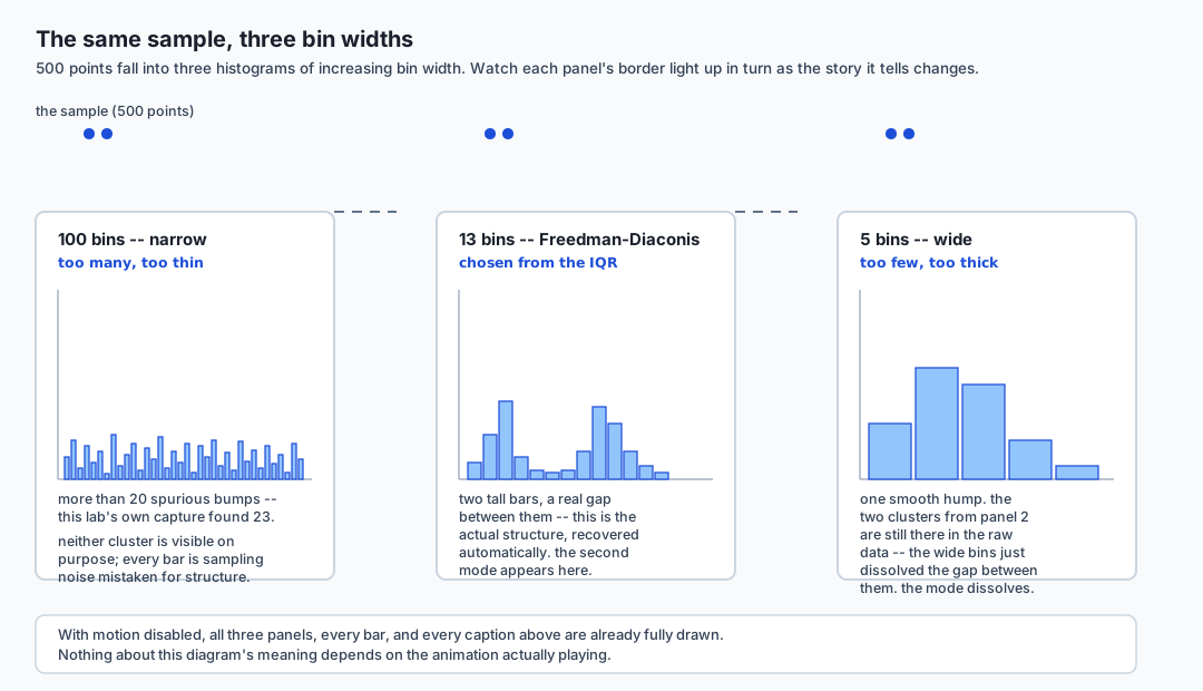
Here is a single, real experiment. Five hundred points, drawn once, never touched again. Histogram them at 5 bins and you see one smooth hump — a typical, boring, unimodal shape. Histogram the exact same 500 numbers at 100 bins and you see jagged noise, more than twenty spurious little peaks, nothing you would trust. Histogram them with a bin count chosen by a specific rule — Freedman-Diaconis, which this lesson explains — and two real, distinct clusters appear, cleanly separated, for the first time. Nothing about the data changed across those three pictures. The only thing that changed was a number nobody thinks of as a decision: how wide to make the bins.
That is the through-line of this entire lesson: a histogram is not the data. It is one picture of the data, and the bin width is a parameter you chose, whether you thought about it or not. The same fact is true, in a different costume, of a KDE (its bandwidth), a boxplot (its five-number summary, which is compatible with more shapes than you’d guess), a scatter plot with too many points (which becomes a silhouette long before you notice), and a correlation coefficient (which can be exactly zero on a relationship so strong that fitting a single curve explains 99% of the variance). Every one of these is a real, working tool. Every one of them also has a hidden knob, and the professional difference between someone who uses these tools well and someone who gets misled by their own charts is entirely about knowing where that knob is and what it does when you turn it.
This matters for AI work specifically, not just generally. A model that monitors a production feature for drift by checking its mean and standard deviation every day will not notice that feature quietly splitting into two populations with an unchanged mean — the exact failure this lesson’s centerpiece demonstration produces on purpose. A person (or a model) summarizing a dataset by fitting a straight line and reporting its correlation will miss a relationship a ten-year-old could see in the scatter plot. By the end of this lesson you will have built, from real code you ran, the specific pictures that catch both of those failures — and you will know exactly what each picture is still hiding from you, because every picture hides something.
The idea in plain language
Imagine you are looking at a pile of sand from an airplane, and someone asks you “how many hills are in this pile?” If you fly high enough, the whole pile looks like one smooth mound — you cannot see the ridges. If you fly low enough, every single grain looks like its own tiny bump, and you cannot see the real hills for the noise. Somewhere in between, at the right altitude, the real ridges become visible: not too smoothed out, not swamped by grain-level noise.
A histogram’s bin width is that altitude. Fly too high (bins too wide, too few of them) and two real clusters merge into one smooth hump. Fly too low (bins too narrow, too many of them) and every bin holds so few points that random noise looks like structure. A KDE’s bandwidth is the same altitude, measured a different way — a smoother, blurrier lens instead of a grid of boxes, but it has exactly the same failure mode at both extremes.
A boxplot is a different kind of simplification. It is not a photograph of the pile at any altitude — it is five numbers: how low the pile starts, where a quarter of it lies below, where half of it lies below, where three-quarters lies below, and how high it goes. Two piles can have the exact same five numbers and look completely different in between — one a single smooth mound, the other two distinct hills with a valley in the middle. The five numbers do not lie, and they are not useless; they just were never trying to tell you how many hills there were. That is a different question, and only a picture that shows the interior — a histogram, a KDE, an ECDF — can answer it.
A scatter plot with too many points has the opposite problem: it has too much ink, not too little. Once thousands of points land in a small region, they stop being individually visible dots and start being a uniform grey smear — you can no longer tell whether that smear is 200 points or 20,000. And a correlation coefficient is the boxplot’s cousin: a single number standing in for an entire relationship, honest about exactly one thing (how straight is it?) and silent about everything else, including whether the relationship is strong, just not straight.
Historical background
The histogram itself predates modern statistics by centuries — informal bar-style frequency displays of numeric data appear in scattered form through the 18th and 19th centuries — but the word and the systematic treatment come from Karl Pearson, who coined “histogram” in a series of lectures at University College London around 1891–1895, treating it as a specific statistical tool: a bar chart of frequency counts across equal-width intervals of a continuous variable, used to visualize a distribution’s shape rather than to compare discrete categories. Pearson was, not coincidentally, also the person who gave his name to the Pearson correlation coefficient this lesson covers later — both ideas come from the same late-19th-century project of turning “how does this data behave” into numbers and pictures that could be reasoned about formally rather than described in prose.
The bin-width problem — that a histogram’s shape depends on an arbitrary choice — was understood by working statisticians for decades before it had a rigorous mathematical answer. David Freedman and Persi Diaconis published their rule in 1981 (“On the histogram as a density estimator: L2 theory”), deriving a bin width from the interquartile range specifically because it gives a provably good approximation to the true density under weak assumptions, and because — as this lesson’s own lab demonstrates directly — it is far less thrown off by outliers and skew than a rule based on the standard deviation. David Scott’s rule (1979) and Herbert Sturges’ rule (1926) are the two older, simpler alternatives this lesson also runs and compares.
The kernel density estimate has a similarly layered history: Emanuel
Parzen and Murray Rosenblatt independently developed the mathematical
theory of kernel density estimation in 1962, giving a rigorous
foundation to what amounts to “sum up a small smooth bump at every
observation.” The KDE’s own hidden parameter — bandwidth — was studied
extensively through the 1980s and 1990s, including Silverman’s 1986
“rule of thumb,” one of several automatic bandwidth-selection heuristics
still cited today (and one this lesson describes but did not run, since
it lives in scipy.stats.gaussian_kde, not installed in this
environment).
The five-number summary and the boxplot come from John Tukey, who introduced both in his 1977 book Exploratory Data Analysis as part of a broader argument that a data analyst’s first job is to look — quickly, cheaply, and often by hand — before committing to any formal model. Tukey’s boxplot was deliberately designed to be drawable with a pencil from five numbers a person could compute by hand on paper; its blindness to interior shape is not a flaw introduced later — it is the direct, known cost of a design built for speed and simplicity over completeness, a trade Tukey stated explicitly at the time.
What it is — and what it is not
This lesson is about the honest reading of five picture types — the histogram, the KDE, the ECDF, the boxplot family, and the scatter plot — plus the correlation coefficient that so often stands in for looking at a scatter plot at all. It is not a chart-type catalogue like Day 127, which covered when to reach for a bar chart versus a line chart versus a scatter plot in the first place. This lesson assumes you already know which chart to draw, from Day 127, and already know matplotlib’s object model and seaborn’s axes-level and figure-level split, from Days 128 and 129. What this lesson adds is narrower and, this course would argue, more consequential: every one of these standard, familiar chart types has at least one parameter — a bin width, a bandwidth, a marker size — that the person drawing the chart chose, consciously or by accepting a library’s default, and that choice changes what story the chart tells.
This lesson is also not a statistics course on distributions in the mathematical sense — Day 114 already built that foundation, defining random variables and named distribution families precisely. This lesson treats those same ideas visually: given a sample of numbers, what picture should you draw to see its shape, and what does each picture you might draw actually show you versus quietly discard?
Why it was created and what problems it solves
Every technique in this lesson exists to answer a version of the same question: given a pile of numbers, what does its shape actually look like, and how confident should you be in that answer? A single summary statistic — a mean, a correlation coefficient, a five-number summary — answers a much narrower question extremely well, and answers the broader “what does it look like” question not at all. The problem these tools solve is the gap between “I computed a number” and “I understand the data,” and the entire lesson is organized around specific, concrete cases where that gap swallows something important: a second mode a mean cannot show, a boundary a KDE cannot respect, a relationship shape a correlation coefficient cannot detect, a density a scatter plot’s ink cannot represent once there is too much of it.
How it works
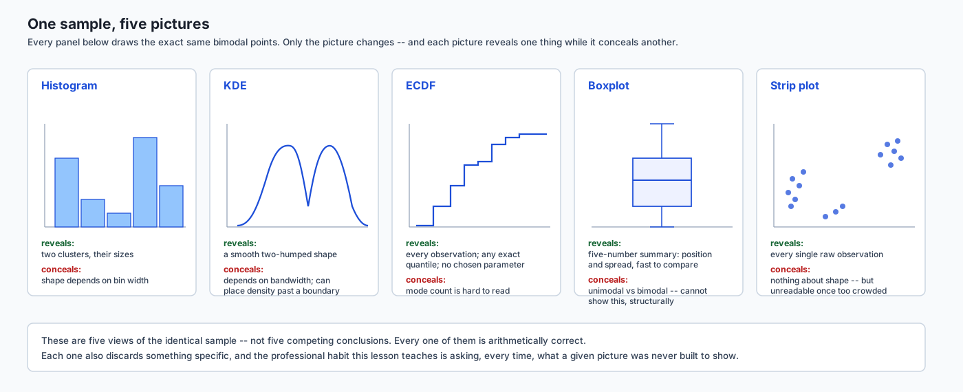
Before the mechanism-by-mechanism walkthrough below, here is the whole lesson in one picture: the same sample, drawn five different ways, each one labelled with exactly what it shows and exactly what it hides.
Histograms and the bin-width decision
A histogram sorts every observation into one of a fixed set of equal-width intervals (bins) and draws a bar whose height is the count of observations in that bin. The mechanism is completely deterministic given the data and the bin edges — the only freedom is choosing those edges, almost always expressed as a bin count or a bin width (the two determine each other, given the data’s range).
Run the same experiment this lesson opened with, in real code:
import numpy as np

rng = np.random.default_rng(42)
low_cluster = rng.normal(40, 8, 250)
high_cluster = rng.normal(54, 8, 250)
sample = np.concatenate([low_cluster, high_cluster])

counts_5, _ = np.histogram(sample, bins=5)
counts_100, _ = np.histogram(sample, bins=100)
counts_5 came out [56, 152, 147, 119, 26] — one wide, smooth-looking
hump, exactly one local maximum. counts_100 produced a jagged
sequence with 23 separate local peaks — most of the individual bins hold
0 to 5 points, so tiny sampling fluctuations look like real structure.
Neither picture shows the truth: the sample is a genuine mixture of two
clusters, means 40 and 54, standard deviation 8 each — close enough
together that 5 bins merges them, far enough apart that a well-chosen
bin count should reveal both.
numpy.histogram_bin_edges implements three named rules for choosing
bin width automatically, and this lesson ran all three on that exact
sample:
| Rule | Formula (informally) | Bins on this sample | What it is sensitive to |
|---|---|---|---|
| Sturges | roughly log2(n) + 1 | depends only on sample size | assumes roughly-normal data; ignores spread and skew entirely |
| Scott | proportional to std(x) * n^(-1/3) | depends on standard deviation | a few extreme values inflate the standard deviation and widen the bins |
| Freedman-Diaconis | proportional to IQR(x) * n^(-1/3) | depends on the interquartile range | robust — the IQR barely moves when outliers are added (Day 116) |
Freedman-Diaconis, on this exact bimodal sample, chose 13 bins and its resulting histogram showed exactly 2 local maxima — the real structure, recovered automatically, without a person eyeballing bin counts by trial and error. That is not a coincidence specific to this one sample: Freedman-Diaconis was derived specifically to be robust against the outliers and skew that break Scott’s and Sturges’ assumptions, because it is built from the IQR rather than the standard deviation — the same robustness property Day 116 established when it introduced the IQR as a spread measure that resists a single extreme value in a way the standard deviation does not.
To see the three rules genuinely disagree, this lesson ran them on a
different sample — a right-skewed, strictly positive draw
(numpy.random.default_rng(123).lognormal(mean=3.0, sigma=0.6, size=400)):
sturges=10 scott=14 fd=21Three different bin counts on the identical 400 points. There is no single “correct” answer among them — but Freedman-Diaconis’s larger count, on this skewed sample, reflects real fine structure the coarser rules smooth away, precisely because a right-skewed sample’s standard deviation is inflated by its long tail while its IQR is not.
Here is that same sequence — narrow, chosen, wide — as a single flow, watching the second mode appear and then dissolve as the bin width grows:
KDE, and its own hidden parameter
A kernel density estimate replaces “count how many points fall in this box” with “sum a small smooth bump centered at every observation.” The bump is almost always a Gaussian curve, and its width — the bandwidth — plays exactly the role a histogram’s bin width plays: too narrow, and every observation’s individual bump is visible as its own tiny wiggle in the final curve; too wide, and real separate modes blur into one smooth hill.
seaborn’s kdeplot exposes this as bw_adjust, a multiplier on its own
automatically chosen bandwidth. Run on the same bimodal sample from
above:
import seaborn as sns

fig, ax = plt.subplots()
sns.kdeplot(sample, ax=ax, bw_adjust=1.0)
x, y = ax.lines[0].get_data()
At bw_adjust=1.0 (seaborn’s own default choice), counting local
maxima in y gives 2 — the real two-cluster structure. At
bw_adjust=3.0 — three times wider, a plausible “just smooth it a
little more” choice a person might make without thinking twice — the
same curve on the same data shows exactly 1 mode. The KDE looks more
authoritative than the histogram it replaced, because it has no visible
bin edges and reads as a single continuous, confident line. It is
exactly as parameter-dependent as the histogram it replaced.
A second, separate problem: a KDE built from a Gaussian kernel has no
concept of a hard boundary in the data. If the data can only be
positive — a duration, a price, a count — the KDE curve does not know
that, and it happily places density below zero, because every one of
its component bumps is symmetric and a bump centered near zero has half
its mass reaching into negative territory. Measured directly on a real
exponential sample (numpy.random.default_rng(9).exponential(scale=5.0, size=400), minimum value about 0.021):
x range of the default KDE grid: -4.70 to 40.84
fraction of the curve's total area sitting below zero: 0.0954
Just over 9.5% of the KDE’s reported “probability” sits on values the data can never actually take. This is not a bug in seaborn or a rare edge case — it is a structural property of any symmetric-kernel KDE applied to boundary-constrained data, and it is worth stating plainly rather than hiding behind a smooth-looking curve: a KDE of strictly positive data is lying about what happens near zero, by a non-trivial, measurable amount.
ECDF as the honest alternative
An empirical cumulative distribution function has neither of these
hidden knobs. At any value x, it reports exactly the fraction of the
sample less than or equal to x — a step function, one small step at
every single observation, with nothing binned, grouped, or smoothed.
sns.ecdfplot(sample, ax=ax)
x, y = ax.lines[0].get_data()
Every sorted observation in the input sample appears as a step location
in x — checked directly, on a 301-point sample this lesson built with
an odd length precisely so the median is a single real observation
rather than an average of two neighbors. Finding where y first crosses
0.5 and reading the corresponding x value gave 0.026125, matching
numpy.median on the same sample to nine decimal places — the ECDF
really does let you read a quantile directly off the picture, with no
approximation involved.
The honest trade is that an ECDF is harder to read at a glance than a histogram or a KDE. A histogram’s shape (unimodal, bimodal, skewed) jumps out visually in a way a step function’s shape does not — most people are simply less practiced at reading a cumulative curve than a density curve, even though the cumulative curve is throwing away strictly less information. That is a real cost, not a reason to avoid the ECDF, but a reason it is under-used relative to how honest it is.
Box, violin, and strip/swarm — and the day’s centerpiece
A boxplot draws five numbers: the minimum, the first quartile (Q1), the median, the third quartile (Q3), and the maximum (with whiskers usually capped at 1.5 times the IQR beyond Q1 and Q3, and points beyond that flagged as outliers). This is Tukey’s five-number summary, designed deliberately to be computable and drawable by hand, quickly, from any sample.
Here is the demonstration this lesson is built around. Two samples were constructed — one genuinely bimodal, one genuinely unimodal — using two different piecewise-linear functions, engineered so that both samples’ five-number summaries land within 0.3 units of the same five target values: minimum 10, Q1 28, median 40, Q3 52, maximum 70. Measured directly:
bimodal  five-number summary: [10.21, 28.02, 40.00, 51.98, 69.79]
unimodal five-number summary: [10.17, 28.06, 40.00, 51.94, 69.83]
Those two rows agree with each other to within a few hundredths of a unit at every one of the five numbers. A boxplot of either sample would be, for all practical purposes, identical to a boxplot of the other. And yet, histogrammed at 15 bins:
bimodal  histogram: 2 local maxima (two real clusters)
unimodal histogram: 1 local maximum (one smooth hump)
The two samples are not subtly different in shape — one is bimodal and the other is not, by construction, and no boxplot could ever have told you that. This is the strongest single demonstration in this lesson because it removes every excuse: it is not that the boxplot’s summary is wrong — every one of those five numbers is computed correctly — it is that the five-number summary was never trying to answer the question “how many humps does this distribution have,” and treating it as though it had answered that question is the mistake.
A violin plot fixes this specific blindness by drawing a KDE (with its own bandwidth, and its own boundary problem if relevant) mirrored on both sides of the box — so it inherits the boxplot’s compact comparison across groups while restoring some shape information, at the cost of inheriting the KDE’s bandwidth sensitivity too. A strip plot or swarm plot goes further and shows every individual observation as a point, hiding nothing about shape at all, at the cost of becoming unreadable once a group has more than a few hundred points — which is exactly the overplotting problem covered next.
Scatter plots and overplotting
A scatter plot shows every point, individually, as long as there are few enough of them that each one occupies its own patch of screen. Once there are enough points, this stops being true, and the plot silently degrades from “a picture of individual observations” into “a picture of where ink happens to be densest” — without announcing the transition.
This lesson measured that transition directly, rather than describing it
abstractly. Twenty thousand points, drawn from a standard normal in both
dimensions, rendered at a deliberately small size (figsize=(3, 3), dpi=72) — a realistic size for a dashboard tile or a thumbnail, not a
contrived worst case:
positions = ax.transData.transform(np.column_stack([x, y]))
pixel_positions = np.round(positions).astype(int)
distinct_pixels = len(set(map(tuple, pixel_positions)))
distinct_pixels came out 6988, out of 20000 points plotted — about
35%. Nearly two-thirds of the points this scatter plot supposedly shows
individually are, at this render size, painted directly on top of
another point, invisibly.
Three fixes, each trading away something different:
- Alpha (transparency) makes overlapping points visually darker rather than indistinguishable, so density becomes readable at a glance — but a fully saturated region still looks the same whether it has 50 overlapping points or 5,000, once the alpha has maxed out.
- Hexbin abandons individual points entirely and tiles the plot area
with hexagons, coloring each by how many points fall inside. Run on
the same 20,000-point cloud, the densest hexagonal bin held
210points — a real, readable density peak recovered from data a raw scatter had rendered as a uniform grey smear. The trade is exact: you now know how dense, and you no longer know exactly where within that hexagon. - 2-D density estimates (the two-dimensional generalization of a KDE) give a smooth density surface instead of hexagonal bins, at the cost of inheriting a KDE’s bandwidth sensitivity in two dimensions simultaneously.
None of these three is strictly better than the others; each answers “I have too many points” by giving up a different piece of information — exact position, exact count, or smoothness — and the right choice depends on which of those three you can least afford to lose for the question you are actually asking.
Relationship strength versus shape
Day 116 established that Pearson correlation measures linear
association specifically, and is close to zero for a relationship of any
other shape, no matter how strong or how deterministic. This lesson
measured that directly on a symmetric parabola — x ranging on both
sides of zero, y = x^2 plus a small amount of noise:
pearson_r = frame["x"].corr(frame["y"], method="pearson")pearson_r came out -0.0044 — indistinguishable from zero, on a
relationship that is completely deterministic apart from a small amount
of added noise. This is the entire argument for looking at the scatter
plot, or fitting the actual shape, before trusting a single correlation
number: a quadratic fit (numpy.polyfit(x, y, 2)) on the same data
achieved an R-squared above 0.99.
Here is a fact this lesson’s own measurement turned up that goes further than the usual textbook version of this story. Spearman correlation — computed on the ranks of the two variables rather than their raw values — is often introduced as the fix for exactly this situation, because it detects any monotonic relationship (consistently increasing or consistently decreasing), not just a linear one. On this particular relationship, it does not help either:
rank_x = frame["x"].rank()
rank_y = frame["y"].rank()
spearman_r = rank_x.corr(rank_y, method="pearson")
spearman_r came out -0.0226 — also indistinguishable from zero.
This is not a mistake in the measurement; it is the correct behavior of
Spearman correlation applied honestly to a symmetric parabola. As x
increases from negative to positive, y first falls (while x is
negative) and then rises (while x is positive) — there is no
consistent direction to the relationship at all, so there is nothing
monotonic for a rank correlation to find. Only fitting the actual
quadratic shape, or looking at the scatter plot directly, reveals what
is going on. This is a stronger version of the lesson this section is
teaching, not a weaker one: even the “fixed” correlation measure can
have a blind spot, and the discipline that actually works, every time,
is looking at the picture before trusting any single number computed
from it.
Jitter for discrete data
When a variable only takes a small number of distinct values — a rating on a 1-to-5 scale, a count, a categorical code plotted as a number — a scatter plot of it draws every observation with the same value stacked in an exact vertical (or horizontal) line, hiding how many points are really there. Jitter adds a small amount of random noise to the plotted position only, spreading the stack out so individual points become distinguishable, without ever touching the underlying data.
Measured directly: 200 integers between 1 and 5, jittered with
numpy.random.default_rng(...).uniform(-0.15, 0.15, 200) added to the
plotted position —
max |jittered position - true value| = 0.1499...— never more than the stated width of 0.15, by construction of the
uniform distribution’s own bounds. And the original 200-integer array
was completely unchanged by building the jittered copy — jitter is
applied to a separate array used only for plotting, never in place.
Jitter is a genuinely useful, genuinely honest technique — but it is a disclosed distortion, not a neutral one. A reader who does not know a chart used jitter, or does not know the jitter width, can misread two nearby jittered points as meaningfully different values on a continuous scale, when the real, discrete data underneath might in fact be identical. The professional convention is simple: if you jitter, say so, and say by how much, in the caption.
Log scales for skewed data
A log-scaled axis makes equal visual distances represent equal multiplicative factors rather than equal additive amounts — each step of a fixed width represents a times-ten, or a doubling, rather than “plus five.” For right-skewed data — incomes, city populations, most durations — this compresses an extreme long tail that would otherwise crush every other observation into an unreadable cluster near the origin, and it makes proportional differences (a doubling from 10,000 to 20,000) visually comparable to proportional differences at a completely different scale (a doubling from 10 to 20), which a linear axis cannot do at all.
Day 128 already established the sharpest cost of this trade in detail:
a value of exactly zero has no position on a log axis, because log(0)
is undefined, and matplotlib silently drops that point from the plot
rather than raising an error. This lesson does not re-derive that
mechanism — it is worth remembering here specifically because
distribution work involves zero far more often than a casual user might
expect: a count of zero events, a duration of zero, a difference of
exactly zero between two matched observations. A log-scaled histogram or
scatter of a variable that can legitimately be zero needs an explicit
decision about what to do with those zero rows before the axis silently
makes that decision for you.
Pair plots
For a small set of variables — roughly a handful, up to about a dozen —
a pair plot (seaborn’s pairplot) draws every pairwise scatter plot in
a grid, with each variable’s own univariate distribution (usually a
histogram or KDE) on the diagonal. Run on three columns:
grid = sns.pairplot(df)grid came back as a seaborn.axisgrid.PairGrid with a 3-by-3 array of
Axes — nine panels for three variables, three of them the diagonal
univariate plots and six the pairwise scatters (mirrored above and below
the diagonal). This is a genuinely fast, genuinely useful first look at
a small dataset: every pairwise relationship, every marginal shape, in
one call.
The reason it stops working past roughly a dozen columns is arithmetic, not aesthetic: the number of panels grows with the square of the number of variables. Twelve columns produce 144 panels; twenty produce 400. Past a fairly small number of variables, each individual panel becomes too small to read, the whole grid takes too long to render, and a person looking at it cannot hold more than a handful of pairwise relationships in mind at once regardless of how the panels are laid out. The right response, once a dataset has more than a dozen or so variables worth checking pairwise, is not a bigger pair plot — it is picking specific pairs a domain question or a correlation matrix already flagged as interesting, and looking at those individually.
An everyday analogy
Carry one analogy through every section of this lesson: you are looking at a coastline from an airplane, and every technique here is a different altitude and a different instrument.
Fly too high with too few bins (or too wide a KDE bandwidth), and two separate bays merge into one smooth curve of coastline — real structure, gone. Fly too low with too many bins, and every wave crest looks like its own headland — noise mistaken for structure. Freedman-Diaconis is choosing the altitude that shows the actual bays, using a measurement (the IQR) that does not get thrown off by one unusually tall wave.
A boxplot, in this analogy, is not a photograph at any altitude — it is a report of exactly five facts: the westernmost point, a point a quarter of the way along, the midpoint, a point three-quarters of the way along, and the easternmost point. Two coastlines — one with two deep bays, one with a single gentle curve — can share all five of those facts exactly, because the report was never describing the shape between them. Only an actual photograph — a histogram, a KDE, an ECDF — shows you the bays.
A scatter plot is a photograph taken with too many boats on the water at once: past a certain density, you can no longer count individual boats, only see a cluster of hulls. Hexbin is switching from counting boats to reporting harbor traffic density per grid square — you lose the exact position of any one boat, and you gain a readable measure of where traffic is heaviest.
And a correlation coefficient is a compass bearing: it tells you, very precisely, whether the coastline is trending in a consistent direction overall. It says nothing about whether that coastline curves sharply, loops back on itself, or has a bay shaped like a parabola — a compass bearing of “due east” is completely compatible with a coastline that went south for a while and then came back. Only looking at the actual map — the scatter plot — tells you that.
Examples in practice
A/B test read from a boxplot alone. A product team compares two variants’ session-length distributions with side-by-side boxplots and sees near-identical five-number summaries. They conclude the variants perform the same. What the boxplots hid: variant B’s sessions were genuinely bimodal — many very short “bounce” sessions and many long engaged sessions, same median and same quartiles as variant A’s smooth, unimodal distribution of medium-length sessions. This lesson’s exercise 5 constructs exactly this scenario directly, quartile-matched by construction, and confirms the boxplot’s blindness is not a hypothetical risk — it is the literal, measured, structural property being demonstrated.
Choosing a bin count for a skewed cost distribution. An analyst histogramming per-transaction costs (right-skewed, a handful of very large transactions in a long tail) using the library default (Sturges, in NumPy and matplotlib) sees a chart dominated by a few nearly-empty bins stretching out to the largest value, with almost all the real data crushed into the first bin or two. Switching to Freedman-Diaconis, which uses the IQR rather than the standard deviation and is therefore not thrown by the long tail’s few extreme values, produces a chart with far more bins concentrated where the actual data lives — this lesson’s own measurement on a comparable skewed sample chose 21 Freedman-Diaconis bins against Sturges’ 10.
A dashboard scatter plot that looks fine until it doesn’t. A usage-analytics dashboard renders a scatter of active-users-per-day against latency for every user session, and it looks like a reasonable, sparse cloud of points at a few hundred sessions. As traffic grows to tens of thousands of sessions per day, the same chart — rendered at the same fixed dashboard-tile size — silently turns into a grey smear with no visible internal structure, because more than half the points now paint on top of each other. Nobody changed the chart’s code; the overplotting threshold was simply crossed, and this lesson’s own pixel-collision measurement (about 35% distinct pixels out of 20,000 points at a small render size) shows exactly how quickly that threshold arrives.
Implications: security, privacy, performance, scalability, and cost
Performance and scalability. A histogram or a boxplot computed over millions of rows is cheap — a single pass to bin or to compute quantiles. A KDE evaluated at many grid points, and especially a 2-D density estimate, is substantially more expensive, since every evaluation point sums a contribution from every observation (or a spatially-indexed approximation of that sum); this is part of why hexbin, which only requires a single binning pass like a histogram, is often the pragmatic choice for very large scatter data rather than a 2-D KDE. A pair plot’s cost grows with the square of the column count, both in rendering time and in the reader’s ability to absorb it — the concrete, arithmetic reason it stops being useful past roughly a dozen variables.
Cost of a wrong picture, not a wrong computation. Every failure mode in this lesson is a case where the underlying computation was correct and the resulting decision was still wrong, because the picture chosen to represent the computation discarded the fact that mattered. This is a more expensive class of error than a bug, because nothing crashes and nothing looks obviously broken — a boxplot with matching quartiles looks completely normal, right up until the two populations it was summarizing turn out to behave very differently downstream.
Privacy. A histogram, KDE, or scatter plot of individual-level data can leak information about specific people even when no name or identifier is shown, particularly at the tails: a single striking outlier point in a scatter plot, or a lone value far out in a histogram’s rightmost bin, can sometimes be re-identified by anyone who knows roughly what to look for, especially in a small dataset. Coarser bins, KDE smoothing, or hexbin aggregation each reduce this re-identification risk in exchange for the same shape-hiding trade-offs covered throughout this lesson — privacy and honesty pull in the same direction here, for once, both favoring some amount of aggregation.
Security. None of the tools in this lesson touch a network or a credential; the risk surface is entirely about correct interpretation rather than about running untrusted code or exposing a service.
Alternatives: free, open source, and commercial
| Tool | When to choose it | How it’s called | One concrete example | Free vs paid |
|---|---|---|---|---|
matplotlib (hist, hexbin) | Full control over bin edges, figure size, and every artist; the substrate seaborn itself draws on. Ran directly in this lesson. | ax.hist(x, bins=n), ax.hexbin(x, y, gridsize=n) | np.histogram(sample, bins=5) returned [56, 152, 147, 119, 26] | Free, open source (BSD-style) |
seaborn (kdeplot, ecdfplot, pairplot) | The statistical layer for distributions specifically — KDE, ECDF, and pair grids with sensible defaults, built on matplotlib. Ran directly in this lesson. | sns.kdeplot(x, bw_adjust=1.0), sns.ecdfplot(x), sns.pairplot(df) | bw_adjust=1.0 found 2 modes; bw_adjust=3.0 found 1, on the identical sample | Free, open source (BSD 3-Clause) |
pandas .plot accessor | The fastest path when the data is already a Series or DataFrame and the chart is a quick histogram or line, at the cost of less control than calling matplotlib directly. Ran directly in this lesson. | series.plot.hist(bins=20) | pd.Series(sample).plot.hist(bins=20) returns a matplotlib Axes, honestly the single fastest line of code in this entire lesson for a quick look | Free, open source (BSD 3-Clause) |
scipy.stats.gaussian_kde | The general-purpose KDE implementation reached for outside a plotting call specifically — for example, to evaluate a fitted density at arbitrary points for downstream computation, not just to draw it. Not installed in this environment; described from documentation only, no output reproduced. | kde = gaussian_kde(x); kde.evaluate(grid) | (not run here) | Free, open source (BSD 3-Clause) |
| plotnine / ggplot2-style grammar of graphics | A declarative, layered grammar (geoms, aesthetics, facets) for readers already comfortable with R’s ggplot2 conventions. Not installed in this environment; described from documentation only. | ggplot(df, aes(x="value")) + geom_histogram(bins=20) | (not run here) | Free, open source |
| Commercial BI tools (Tableau, Power BI, and similar) | Fast, no-code exploration for a non-programming audience, with built-in bin-width sliders that make the trade-off in this lesson directly interactive. Not installed or run here. | Point-and-click; bin count is typically a draggable control | (not run here) | Commercial, with free/limited tiers depending on vendor |
Comparison with related concepts
| Picture | Requires a chosen parameter? | Shows individual observations? | What it is blind to |
|---|---|---|---|
| Histogram | Yes — bin width | No (grouped into bins) | Fine structure smaller than the bin width; false structure at too-fine a width |
| KDE | Yes — bandwidth | No (smoothed) | Same trade-off as a histogram; also places density past a hard boundary |
| ECDF | No | Yes — every point is a step | Harder to read shape (modes) at a glance than a histogram or KDE |
| Boxplot | No (fixed five numbers) | No | Number of modes; presence of a valley; exact shape between the quartiles |
| Violin plot | Yes — inherits KDE bandwidth | No | Same KDE trade-offs, spent to restore some of the boxplot’s blindness |
| Strip / swarm plot | No | Yes — every point, individually | Becomes unreadable well before a scatter plot would, at moderate sample sizes |
| Scatter plot | No (until overplotted) | Yes, until overplotting begins | Density, once points start to overlap |
| Hexbin | Yes — grid size | No (aggregated by bin) | Exact position within a hexagon |
| Pearson correlation | No | No (one number) | Any non-linear relationship, however strong |
| Spearman correlation | No | No (one number) | Any non-monotonic relationship, however strong — including a symmetric parabola |
When to use it — and when not to
Use a histogram for a first, quick look at one variable’s shape, and immediately try more than one bin count, or reach for Freedman-Diaconis by default, rather than trusting whatever the library’s default rule happened to choose. Do not use a single histogram at a single bin count as the final word on whether a distribution has one mode or several — this lesson’s opening demonstration is the reason why.
Use a KDE when a smoother visual than a histogram is wanted for a presentation, or layered over a histogram for a sanity check that the two roughly agree — and always ask what bandwidth was used, the same way you would ask what bin width a histogram used. Do not use a KDE on data with a real hard boundary (durations, counts, prices) without either clipping the display to the valid range or explicitly stating that some density is misplaced past the boundary.
Use an ECDF whenever an exact quantile matters, or whenever you want a picture with zero hidden parameters to compare against a histogram or KDE of the same data as a check. Do not reach for it as the very first chart shown to an audience unfamiliar with reading cumulative curves — pair it with a more familiar picture the first time.
Use a boxplot for compact, fast comparison across many groups at once, where the question is genuinely about central tendency and spread. Do not use a boxplot, alone, to answer any question about shape — unimodal versus bimodal, symmetric versus skewed in the interior — a question this lesson demonstrated a boxplot is structurally unable to answer, however many groups you compare.
Use alpha, hexbin, or a 2-D density estimate the moment a scatter plot starts to look like a grey blob rather than distinguishable points — a threshold this lesson’s own pixel-collision measurement suggests arrives sooner than most people expect, even at a few thousand points on a modest-sized chart. Do not keep publishing an overplotted raw scatter just because it “used to look fine” at a smaller sample size.
Use Pearson correlation only when a linear summary is genuinely what is being asked for, and pair it with a look at the actual scatter plot before trusting it as evidence of “no relationship.” Do not report a correlation coefficient — Pearson or Spearman — as proof that two variables are unrelated without having looked at a picture of them together first; this lesson measured a case where both are near zero on a deterministic, R-squared-above-0.99 relationship.
Knowledge check
Review the eight-question quiz for this lesson (quiz.yml) before
moving on to the hands-on exercise. Each question is built directly from
a real, captured measurement in this lesson — not from a general
principle stated abstractly — and every explanation is written to teach
the underlying mechanism, not just restate the correct option.
Hands-on exercise
Work through the lab at
labs/sections/math-statistics-and-data/day-130-distributions-and-relationships/.
Nine numbered exercises, each proving one claim from this lesson by
running real NumPy, seaborn, matplotlib and pandas code and asserting on
computed values — bin counts, mode counts, five-number summaries, pixel
collision counts, correlation coefficients — never on how an image
looks. Exercise 5, the boxplot’s blind spot, is the lab’s centerpiece
and mirrors this lesson’s own centerpiece demonstration exactly.
Expected output
bash tests/run_tests.sh, run from the lab directory, ends with:
16 checks, 0 failure(s)and exits 0. pytest examples ends with 9 passed; pytest starter,
on the unmodified checkout, ends with 9 skipped — nine pytest.skip(…)
calls waiting to be replaced with real assertions.
Validate your work
cd labs/sections/math-statistics-and-data/day-130-distributions-and-relationships
python3 -m venv .venv
.venv/bin/pip install -r requirements/requirements.txt
.venv/bin/pytest starter -v
bash tests/run_tests.sh
An untouched checkout reports 9 skipped. As you replace each
pytest.skip(...) with real assertions in starter/test_distributions.py,
re-run pytest starter -v to check your progress one exercise at a
time; the harness’s final 16 checks, 0 failure(s) line is the
authoritative sign the whole lab is done.
Troubleshooting
The lab’s own troubleshooting.md covers every message you are likely
to see, including the ModuleNotFoundError: No module named 'scipy'
that pandas’ Series.corr(method="spearman") raises in this
environment — expected, and the exact situation exercise 8 asks you to
work around by computing Spearman directly from ranked columns instead.
Common mistakes
- Trusting a single bin count (especially a library’s silent default) as the final word on a distribution’s shape, rather than checking at least two very different bin counts and one automatic rule.
- Reading a boxplot as though it answered “how many modes does this distribution have” — it cannot, structurally, regardless of how carefully it was drawn.
- Reporting a correlation coefficient as evidence of “no relationship” without ever looking at the scatter plot the coefficient was computed from.
- Jittering a chart without disclosing the jitter width, leaving a reader to mistake plotted position for the true underlying value.
Practice assignment
Take any numeric column from a dataset you already have — or, if none is
available, generate a synthetic bimodal sample the same way this
lesson’s data.py does. Produce, and save as a short written report:
(1) histograms of that column at three different bin counts, including
one chosen by Freedman-Diaconis, with one sentence on how the visible
number of modes changes; (2) a KDE at two different bandwidths, with the
same one-sentence comparison; (3) a boxplot of the column, with an
honest sentence stating what the boxplot’s five numbers do and do not
tell you about the shape you saw in steps 1 and 2.
Extension challenge
Construct your own pair of samples that share a five-number summary to
within a tight tolerance (say, 0.5 units) while one is unimodal and the
other has three modes rather than two — extending this lesson’s
two-mode centerpiece by one more hump. State the piecewise construction
you used, confirm the five-number-summary match numerically, and
confirm the mode counts differ at a chosen bin count, exactly as this
lesson’s matched_quartile_pair function does for the two-mode case.
AI thread
A production system watching for data drift almost always starts with the cheapest possible check: has this feature’s mean, or its standard deviation, moved beyond some threshold since last week? This lesson’s centerpiece demonstration is exactly the failure mode that check cannot catch. Two samples — one unimodal, one bimodal — were constructed to share a five-number summary (which includes the median, a close cousin of the mean for roughly symmetric data) to within a few hundredths of a unit, while their actual shapes are structurally different: one smooth hump, two distinct clusters with a real valley between them. A feature that quietly splits into two populations — a model now serving two different customer segments with genuinely different behavior, a sensor reading that has started reporting in two different regimes — can do so without moving its mean or its standard deviation by any amount a threshold-based drift check would flag. A drift monitor built on a summary statistic, however carefully chosen the threshold, is reading a boxplot when the question that actually matters is a histogram question. Catching this kind of drift for real requires either a genuinely distributional check — comparing histograms or ECDFs across time windows, not just their summary statistics — or, at minimum, an occasional human look at the actual shape, on the same principle this entire lesson has been arguing for: a summary statistic and a picture of the underlying shape answer different questions, and a system that only ever computes the former is blind to exactly the kind of change this lesson demonstrated cannot be seen any other way.
Quiz
Q1. The same 500-point sample is histogrammed at 5 bins and at 100 bins. At 5 bins it shows one hump; at 100 bins it shows more than twenty spurious bumps. What changed about the underlying data between the two charts?
- Nothing -- the data is identical in both charts; only the bin width changed
- The sample was re-drawn with a different random seed for the second chart
- The 100-bin chart used a larger sample size than the 5-bin chart
- The 5-bin chart applied a smoothing filter the 100-bin chart did not
Show answer
Answer: A. Nothing -- the data is identical in both charts; only the bin width changed
Both charts draw the exact same 500 observations. A histogram's shape is a joint function of the data AND the bin width, and this lab's own capture shows the same sample recovering its real two-mode structure only at an intermediate, deliberately chosen bin count (Freedman-Diaconis, 13 bins on this draw) -- neither extreme shows the truth.
Q2. Freedman-Diaconis chooses bin width from a sample's interquartile range (IQR) rather than its standard deviation. Why does that make it more resistant to a skewed or outlier-heavy sample than Scott's rule?
- Freedman-Diaconis always produces exactly as many bins as Sturges' rule, avoiding the issue
- The IQR is a robust statistic (Day 116); a few extreme values barely move it, while they can substantially inflate the standard deviation Scott's rule depends on
- Freedman-Diaconis ignores the sample size entirely, so extreme values have no effect at all
- Scott's rule requires the data to be sorted first, which fails silently on skewed data
Show answer
Answer: B. The IQR is a robust statistic (Day 116); a few extreme values barely move it, while they can substantially inflate the standard deviation Scott's rule depends on
The standard deviation is sensitive to outliers because it squares deviations from the mean; a handful of extreme points can inflate it substantially and Scott's rule then chooses bins too wide to show real structure. The IQR only depends on the middle 50% of the data, so it barely moves when a few extreme values are added -- the same robustness property Day 116 established for the IQR as a spread measure.
Q3. A KDE looks like a single smooth, authoritative curve with no visible bin edges. What decision does it still depend on that is exactly analogous to a histogram's bin width?
- The color palette chosen for the plot
- Whether the y-axis is drawn on a linear or log scale
- Its bandwidth -- how wide a kernel is placed at each observation
- The number of observations in the sample
Show answer
Answer: C. Its bandwidth -- how wide a kernel is placed at each observation
A KDE's bandwidth controls exactly the same trade-off a histogram's bin width controls: too narrow and every bit of sampling noise looks like a real bump; too wide and a genuine second mode gets smoothed into invisibility. This lab's exercise 3 shows the identical bimodal sample reporting two modes at seaborn's default bandwidth and one mode at bw_adjust=3.0 -- same data, different answer.
Q4. A KDE is drawn over a sample of strictly positive values (durations, all greater than zero). What does a standard Gaussian-kernel KDE do at and below zero that a histogram of the same data would never do?
- It refuses to draw and raises an error
- It correctly clips the curve to exactly zero at x = 0
- It doubles the density near zero to compensate for the missing left side
- It places real, non-zero density below zero, on values the data can never actually take
Show answer
Answer: D. It places real, non-zero density below zero, on values the data can never actually take
A standard KDE has no built-in concept of a hard boundary -- it places a symmetric kernel at every observation, including ones close to zero, and half of that kernel's mass lands below zero regardless of whether the underlying quantity can ever be negative. This lab's exercise 4 measures that directly: on a real exponential sample, more than 9% of the KDE's total area sits at x < 0.
Q5. Two samples are constructed so their five-number summaries (min, Q1, median, Q3, max) agree to within a few tenths of a unit. What does this guarantee about the two samples' overall shape?
- Nothing -- a boxplot's five numbers are compatible with many different shapes, including one sample being clearly bimodal and the other clearly unimodal
- It guarantees both samples are unimodal, since a boxplot cannot represent more than one mode
- It guarantees both samples have the same number of observations
- It guarantees both samples were drawn from the same underlying distribution
Show answer
Answer: A. Nothing -- a boxplot's five numbers are compatible with many different shapes, including one sample being clearly bimodal and the other clearly unimodal
This is the day's centrepiece demonstration: two samples engineered to share a five-number summary within 0.3 units nonetheless show 2 modes and 1 mode respectively when histogrammed at the same bin count. A boxplot summarizes position (quartiles), not shape -- it is entirely blind to how many humps the underlying density actually has.
Q6. What makes an ECDF (empirical cumulative distribution function) different from both a histogram and a KDE in terms of the parameters it requires?
- It requires a bandwidth like a KDE, but no bin width
- It requires a bin width like a histogram, but no bandwidth
- It requires both a bin width and a bandwidth, chosen jointly
- It requires neither a bin width nor a bandwidth -- every observation is a step, and nothing is grouped, binned, or smoothed
Show answer
Answer: D. It requires neither a bin width nor a bandwidth -- every observation is a step, and nothing is grouped, binned, or smoothed
An ECDF plots, at every value x, the exact fraction of the sample less than or equal to x -- a step function built directly from the sorted data with no grouping decision anywhere. This lab's exercise 6 confirms two direct consequences: every observation appears as a step, and the value where the curve crosses 0.5 matches numpy.median to nine decimal places.
Q7. A relationship between x and y is a symmetric parabola (y = x^2, x ranging on both sides of zero). What does this lesson's own captured measurement find about Pearson AND Spearman correlation on that relationship?
- Pearson is near zero but Spearman correctly reports a strong relationship
- Spearman is near zero but Pearson correctly reports a strong relationship
- Both are near zero -- a symmetric parabola has no linear component for Pearson and no monotonic component for Spearman either
- Both report a strong relationship, since both can detect any deterministic function of x
Show answer
Answer: C. Both are near zero -- a symmetric parabola has no linear component for Pearson and no monotonic component for Spearman either
This lesson's own measured run found both close to zero (Pearson about -0.004, Spearman about -0.023) on a genuinely deterministic y = x^2 + noise relationship with a fitted-quadratic R^2 above 0.99. A symmetric parabola rises on one side and falls on the other, so it has no consistent direction for a rank correlation to find either -- only fitting the actual shape, or looking at the scatter, reveals it. This is a sharper example than "Pearson misses it, Spearman catches it," and the honest, stronger version of the lesson's own argument for plotting before computing a coefficient.
Q8. Jitter adds small random noise to a variable's PLOTTED position so that repeated discrete values do not draw exactly on top of each other. What is the correct way to disclose this when publishing a jittered chart?
- No disclosure is needed -- jitter is a standard, universally understood convention
- State the jitter width in the caption, since a reader could otherwise read a jittered position as more precise than the underlying discrete value actually is
- Replace the axis labels with "approximate" to signal the distortion
- Jitter should never be disclosed, since disclosing it would undermine the chart's credibility
Show answer
Answer: B. State the jitter width in the caption, since a reader could otherwise read a jittered position as more precise than the underlying discrete value actually is
Jitter is a deliberate, useful distortion -- it is not the underlying data. A reader who does not know a jitter width might read two nearby jittered points as genuinely different values on a continuous scale, when the real data is discrete and the two points may in fact be identical. This lab's exercise 9 confirms the mechanism directly: every jittered point differs from its true value by no more than the stated jitter width, and the source array is completely unchanged by the operation.
Glossary
- bin width
- The chosen width of each interval a histogram sorts values into. Every histogram picks one -- whether the person drawing it thought about it or not -- and the same underlying data can look unimodal, bimodal, or like pure noise depending only on this choice. Sturges, Scott and Freedman-Diaconis (below) are three different rules for choosing it automatically.
- Sturges' rule
- A bin-count rule based only on the sample size n, choosing roughly log2(n) + 1 bins. It assumes the data is close to normally distributed and tends to under-bin skewed or heavy-tailed data, but is matplotlib's and NumPy's default because it is cheap and rarely produces an unreasonable-looking chart on well-behaved data.
- Scott's rule
- A bin-width rule based on the sample's standard deviation and size, choosing a width proportional to 3.49 * (standard deviation) * n^(-1/3). Like Sturges, it assumes roughly normal data, so a heavy outlier or a strongly skewed shape inflates the standard deviation and produces bins wider than the data's real structure would justify.
- Freedman-Diaconis rule
- A bin-width rule based on the interquartile range (IQR) rather than the standard deviation, choosing a width proportional to 2 * IQR * n^(-1/3). Because the IQR is a robust statistic (Day 116), this rule resists distortion by outliers and skew in a way Sturges' and Scott's rules do not, which is why it recovers structure the other two rules can wash out.
- kernel density estimate (KDE)
- A smooth curve estimating a distribution's probability density, built by placing a small bump (kernel, almost always Gaussian in practice) at every observation and summing them. A KDE looks more authoritative than a histogram because it has no visible bin edges, but it depends just as completely on a chosen parameter -- its bandwidth -- as a histogram depends on its bin width.
- bandwidth
- The width of the kernel placed at each observation in a KDE -- the direct analogue of a histogram's bin width. A narrow bandwidth shows every bump in the data, including noise; a wide bandwidth smooths real structure away, including a genuine second mode. seaborn exposes it as bw_adjust, a multiplier on its own automatically chosen bandwidth.
- KDE boundary problem
- The fact that a standard (Gaussian-kernel) KDE has no concept of a hard boundary in the data, so a KDE of a strictly positive quantity (a price, a duration, a count) places real, non-zero density on the impossible region below zero. The fraction of mass placed there depends on how close the data sits to the boundary and how wide the bandwidth is.
- empirical cumulative distribution function (ECDF)
- A step function that, at any value x, reports the fraction of the sample less than or equal to x. It requires no bin width and no bandwidth -- every observation is a step, and nothing is smoothed, grouped, or discarded. A quantile (including the median) can be read directly off it by finding where the curve crosses that fraction.
- five-number summary
- The minimum, first quartile (Q1), median, third quartile (Q3), and maximum of a sample -- the entire content a standard boxplot draws. Two samples can share an identical five-number summary while having completely different shapes; the five-number summary alone cannot tell a unimodal distribution from a bimodal one, or reveal outliers a whisker rule would otherwise flag.
- overplotting
- What happens to a scatter plot once there are enough points that many of them land on, or very near, the same pixel -- the plot stops showing individual observations and starts showing a silhouette of density with no indication of how many points are stacked at any location. Transparency (alpha), hexbin, and 2-D density estimates are three different fixes, each trading away something different.
- hexbin
- A 2-D histogram that tiles the plotting area with hexagons instead of squares and colors each one by how many points fall inside it, fixing overplotting by aggregating count instead of trying to make individual points visible. It answers "how dense is this region" rather than "where exactly are the points," which is a real trade, not a free upgrade.
- Pearson correlation
- A number from -1 to 1 measuring the strength of a LINEAR relationship between two variables (Day 116). It is close to zero for a strong relationship of any other shape -- including a perfectly deterministic parabola -- because Pearson correlation has no way to represent curvature, only a straight-line trend.
- Spearman correlation
- A correlation computed on the RANKS of two variables rather than their raw values, so it measures the strength of any MONOTONIC relationship (one that consistently increases, or consistently decreases), not just a linear one. It still misses a relationship that rises and then falls, such as a symmetric parabola, because that relationship is not monotonic either.
- jitter
- A small amount of random noise added to a variable's plotted position -- never to the underlying data -- so that discrete or repeated values do not draw exactly on top of each other. Jitter is a deliberate, disclosed distortion of position for the sake of visibility; the caption or a stated jitter width should say so, because an unlabelled jittered axis can be read as more precise than it is.
- log scale
- An axis on which equal visual distances represent equal multiplicative factors (each step is a times-ten, or a doubling) rather than equal additive amounts. It compresses a long right tail and makes proportional differences comparable across orders of magnitude, at the cost that zero and negative values have no position on the axis at all (Day 128).
Sources and further reading
- Visualizing distributions of data — seaborn (Michael Waskom) (accessed 2026-08-20)
- numpy.histogram_bin_edges — NumPy Developers (accessed 2026-08-20)
- seaborn.ecdfplot — seaborn (Michael Waskom) (accessed 2026-08-20)
- matplotlib.axes.Axes.hexbin — Matplotlib Development Team (accessed 2026-08-20)
- Chart visualization (pandas user guide) — pandas (NumFOCUS / pandas core team) (accessed 2026-08-20)
Kept in this browser, no account needed. Your progress page turns the whole record into one link you can bookmark or open on another device.