Math, Statistics, and Data › Data Visualization › Day 131
Day 131: Time Series Visualization
After this lesson you will be able to demonstrate that plotting a time series against its row index instead of its parsed DatetimeIndex silently erases a real gap in observations; choose between resample's mean, sum and last and state which question each answers on the same underlying data; construct or recognize aliasing, where downsampling below a signal's true frequency manufactures a specific, predictable, false pattern rather than merely losing detail; measure a trailing rolling window's lag against a centred window over the same peak; distinguish a physically missing row from an explicit NaN and know that only reindexing to the full period makes a gap visible as a gap; read a log axis as the test for constant-percentage growth; align two years of daily data by calendar date rather than ordinal day-of-year so a leap year does not silently shift every later comparison; choose between small multiples and an overlaid spaghetti chart past a stated series-count threshold; and know that a daily resample across a Daylight Saving Time boundary produces a real 23-hour or 25-hour day.
Hands-on lab for this lesson
Lab files on GitHub: https://github.com/ai-roadmap-365/ai-roadmap-365.github.io/tree/main/labs/sections/math-statistics-and-data/day-131-time-series-visualization
- Get the hands-on files. Clone the labs repository once (you can reuse this clone for every lesson). This works on macOS, Linux, and Windows (PowerShell or WSL):
git clone https://github.com/ai-roadmap-365/ai-roadmap-365.github.io.git cd ai-roadmap-365.github.io - Open this lesson's lab. Move into the directory for this specific day. Every lab lives at the same predictable path — section / subsection / week / day:
cd labs/sections/math-statistics-and-data/day-131-time-series-visualization - Read the lab guide. Open `README.md` in that directory. It lists the exact commands, what each does, the expected output, and how to check your work — read it before running anything.
- Run it and check your work. Follow the README's "How to run" section: run the example first to see the finished result, then complete the numbered exercises in `starter/`, then run the tests. The tests pass (exit 0) only when your work is correct.
bash tests/run_tests.sh # or the test command named in the lab README
You can also open the lab as a local page (works offline, shows the file tree and expected output).
Learning objectives
By the end of this lesson you will be able to:
- Demonstrate that plotting a gapped time series against a plain row index makes a real multi-day outage completely invisible, while plotting the identical data against its parsed datetime reveals the gap as a measurable jump in x-position
- Resample the same daily series to monthly mean, sum and last, and state in one sentence which question each of the three different, equally true results actually answers
- Construct a signal with a known short period, downsample it below that frequency, and demonstrate that the result carries a specific, predictable spurious period rather than merely reduced detail -- and explain why a weekly-sampled daily cycle can manufacture a convincing multi-month false trend
- Measure a trailing rolling window's lag against the true peak it summarizes, and demonstrate that a centred window of the same size does not lag at all
- Distinguish a physically absent row from an explicit NaN value, know that matplotlib connects straight across the first but breaks its line at the second, and reindex to the full expected period before plotting so an absence is visible as an absence
- Read a log-scaled y-axis as the honest test for constant-percentage growth: a straight line means compounding, a curve means it is not -- and recall from Day 128 that a zero value silently vanishes on that same axis
- Align two years of daily data by calendar month and day rather than by raw ordinal day-of-year, and explain why the ordinal version silently misaligns every date following a leap year's Feb 29
- State a concrete threshold for switching from an overlaid spaghetti chart to small multiples, and facet a many-series frame into the correct number of individual panels
- Annotate a specific event directly on a time axis, and explain why a time series shown without that context invites a reader to invent their own explanation for what happened
- Explain that a daily resample of hourly data across a Daylight Saving Time boundary produces a real 23-hour or 25-hour day, and state the practical consequence for a per-hour rate computed with a hardcoded 24-hour divisor
Prerequisites
- Day 121 -- loading and inspecting data, specifically parse_dates, the exact mechanism that turns a plain string column into the DatetimeIndex every section of this lesson depends on
- Day 123 -- groupby and aggregation, the mechanics this lesson's resample calls extend directly from a fixed set of groups to groups defined by a time interval
- Day 127 -- why to visualize and how to choose a chart type; this lesson assumes that decision is already made and focuses on what a time axis specifically can get wrong
- Day 128 -- matplotlib's object model (fig, ax = plt.subplots(), the Figure/Axes/Artist hierarchy, testing by asserting on artists, and the fact that a log axis silently drops a zero), all of which this lesson's artist-level assertions and log-scale section depend on directly
- A working python3 on your PATH; the lab creates its own virtual environment with pandas 3.0.5 and matplotlib 3.11.1 pinned exactly
Why this matters
Here is a series with one real, physical fact buried in it: a sensor went
offline for two weeks. Forty-five daily readings survive — thirty-one
from January, fourteen more starting in the middle of February — with a
genuine fourteen-day hole between them. Plot it against a plain row
index, the way ax.plot(range(len(df)), df["value"]) naturally
tempts you to, and read the spacing back off the drawn line:
>>> index x-step values
{1.0}
Every step is exactly 1.0. Nothing in that picture says anything ever
went missing. The two points on either side of the real gap sit right
next to each other, drawn as though the fourteen days between them
simply never existed. Now plot the same forty-five values against the
parsed datetime column instead — one line changed, nothing else — and
read the spacing again:
>>> datetime x-step values (days)
{1.0, 15.0}
Forty-three ordinary one-day steps, and one that is fifteen: fourteen missing days plus the single day on either side of them. Same data, same code except for which column supplied the x-axis, and only the second version tells the truth about when the outage happened. Nothing was computed wrong in the first version. Nothing was hidden on purpose. A plain row index simply does not know what a day is, so it cannot show you that one went missing — and a huge amount of default plotting code, written by people who never stopped to check, quietly makes exactly this mistake.
That is the whole subject of this lesson in miniature. Time is not just another number you can put on an axis. It has structure — regular spacing, cycles, calendars, daylight saving, the difference between “nothing happened” and “we didn’t look” — and the commonest charting mistakes in this entire course are the ones that throw that structure away without anyone noticing. Every section below is one more way that happens: an aggregation that answers a different question than the one you meant to ask, a sampling interval that manufactures a pattern that was never there, a rolling average that reports a peak two weeks after it actually occurred, a missing observation drawn as though it were present, a leap year that silently shifts every later date out of alignment, and a calendar day that is honestly, measurably, not always twenty-four hours long.
The idea in plain language
A time series is a sequence of measurements tied to specific moments, and a chart of one is making an implicit promise: that the horizontal position of each point tells you when it happened, and that the picture as a whole represents time itself faithfully — evenly where time passed evenly, with a break where nothing was recorded, with cycles drawn at the frequency they actually occurred. Every technique in this lesson is really about keeping that one promise.
The trouble is that pandas and matplotlib will both happily let you
break it without complaint. A DatetimeIndex (built with parse_dates,
which Day 121 introduced) unlocks the machinery that keeps the promise —
date-string slicing, resample, rolling, axis formatting that
understands months — but nothing forces you to use it. You can plot
against a row index instead, and matplotlib will draw a perfectly
respectable-looking line with no error, no warning, nothing to tell you
that the x-axis is now lying about time. You can resample to a monthly
mean when the honest question was really about a monthly total, and get
a chart that is completely correct arithmetic and completely wrong for
the decision it’s about to inform. You can downsample a fast signal at
too coarse an interval and get back not a blurrier version of the truth
but a confident, wrong, entirely different pattern. None of these is a
bug. Each is a choice — pick the wrong one and the chart still
renders, still looks finished, and quietly tells the reader something
false about time.
Historical background
Time series analysis is one of the oldest branches of applied statistics — astronomers and economists were fitting trends and cycles to sequences of dated observations well over a century before anyone had a computer to plot them on. The specific failure modes this lesson covers, though, are not ancient statistical theory; they are consequences of how software represents time, and most of them only became common mistakes once dates turned into just another column type a library had to support.
Aliasing has the oldest pedigree of anything here: it comes from signal-processing theory in the mid-twentieth century, formalized in the Nyquist–Shannon sampling theorem, which states that a signal must be sampled at more than twice its highest frequency to be reconstructed without ambiguity. Long before anyone plotted a pandas Series, engineers knew that a wagon wheel filmed at the wrong frame rate appears to spin backward for exactly this reason — the film samples the wheel’s rotation too slowly, and the eye reconstructs a false, slower (or reversed) rotation from the samples, precisely the aliasing this lesson’s exercise 3 reproduces with a plain cosine.
pandas’ own time series machinery — DatetimeIndex, resample,
rolling, timezone-aware timestamps — dates to the library’s earliest
years (2008 onward), built specifically because financial and
econometric data (Wes McKinney’s original use case at AQR Capital) is
almost entirely time-indexed, and irregular, gapped, and
timezone-sensitive in exactly the ways this lesson covers. The DST
handling this lesson’s ninth exercise relies on did not become fully
reliable until pandas’ tz-aware timestamp support matured well past its
1.0 release; earlier versions had known bugs around ambiguous and
nonexistent local times that this lesson’s approach — building
timestamps in UTC first, converting to a local zone afterward — was
specifically designed to sidestep, and remains the more defensive
pattern even now.
What it is — and what it is not
Time series visualization is the practice of plotting data whose observations are ordered by, and meaningfully spaced along, real calendar time — and doing so in a way that preserves the actual temporal structure of that data: its true spacing, its gaps, its cycles, its calendar irregularities.
It is not simply “any line chart where the x-axis happens to contain
dates.” A line chart of revenue by product category, ordered
alphabetically along the x-axis, is not a time series chart even if a
date happens to be printed somewhere on the page — nothing about the
axis represents elapsed time. Conversely, a chart whose x-axis literally
is range(len(df)) is not a time series chart either, even if every
row happens to correspond to a specific date, because the axis itself
carries no information about when those dates actually fell — this
lesson’s opening example is exactly that trap.
Time series visualization is also not synonymous with forecasting or trend analysis, both of which are legitimate things you might do with a time series but are separate disciplines with their own statistical machinery (ARIMA, exponential smoothing, and the rest, none of which this lesson covers). This lesson is entirely about the chart itself: getting the axis, the aggregation, the sampling interval, and the calendar right before any modeling question is even asked.
Why it was created and what problems it solves
Every technique in this lesson exists to solve one problem: a plotting library has no idea what a calendar is unless you tell it, and the default behaviour of “just plot the numbers I gave you, in the order I gave them” is silently wrong for time in at least six distinct ways — one per major section of this lesson.
resample exists because raw observations rarely arrive at the exact
granularity a question needs — you have daily sensor readings but want a
monthly summary — and because which summary (mean, sum, last) is not a
neutral technical choice but a decision about what question the chart
answers. rolling exists to smooth short-term noise while preserving
slower-moving signal, and its center= argument exists specifically
because the default trailing behaviour, while the only option usable in
a genuinely live, real-time setting, systematically misreports when
things happened. reindex exists to make an implicit assumption
explicit: that a period a sensor didn’t report is different from a
period where the reported value happened to be zero, and a chart should
be able to tell the difference. Calendar-aware alignment (matching by
month and day, not ordinal position) exists because a leap year adds a
real day to the calendar that a naive ordinal count does not account
for. And timezone-aware timestamps exist because political decisions
about clocks — Daylight Saving Time chief among them — mean that “a
calendar day” is not a fixed quantity of hours everywhere, all the time.
How it works
Building a real datetime index, and what it buys you
Everything in this lesson depends on one prerequisite: a real
DatetimeIndex, produced by parse_dates (Day 121) or pd.date_range,
not a plain string column or a RangeIndex. Once you have one, three
things become possible that were not possible before.
Date-string slicing. series.loc["2024-01"] returns every January
2024 row without you writing a single comparison — pandas parses the
string and matches it against the index directly. This lesson’s
exercise 2 uses exactly this to cross-check a resampled aggregate
against the raw rows that produced it.
resample. A DatetimeIndex-ed series can be grouped into fixed
time buckets — "MS" for calendar-month starts, "D" for daily, "h"
for hourly — and each bucket aggregated, exactly the way groupby (Day
123) groups by a category label, except the “label” here is a slice of
elapsed time rather than a value already present in a column.
Axis formatting that understands months. matplotlib.dates supplies
locators and formatters — MonthLocator, DateFormatter("%b %Y"), and
similar — that place and label ticks at genuine calendar boundaries
(the first of each month, say) rather than at arbitrary evenly-spaced
positions, which is the only way an axis can correctly show “one tick
per month” when months are not all the same length.
Resampling, and why the aggregation is a claim
Resampling ninety days of a fixed, hand-checkable series (value equal
to the day number, so January’s thirty-one raw values are simply 1
through 31) to three different monthly aggregates gives three
different, equally true numbers for the exact same underlying rows:
>>> daily_1to90.resample("MS").mean().iloc[0]   # January
16.0
>>> daily_1to90.resample("MS").sum().iloc[0]    # January
496.0
>>> daily_1to90.resample("MS").last().iloc[0]   # January
31.0
None of these three is “the” correct answer for January. 16.0 answers
“what was a typical day like.” 496.0 answers “how much total activity
happened.” 31.0 answers “what was the most recent reading by the end
of the month.” A chart captioned simply “monthly revenue” that is
secretly a .last() resample rather than a .sum() is telling the
reader the wrong thing about the business, using entirely correct
arithmetic, because the aggregation itself is where the actual claim
lives — the drawing is just the last, least important step.
Aliasing — the deep version of the same point
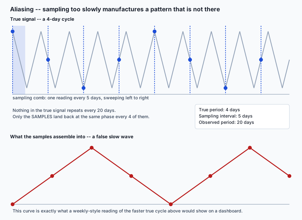
Resampling picks the wrong summary. Aliasing is what happens when the sampling interval itself is wrong, and it is not a smaller version of the same problem — it is qualitatively different and considerably more dangerous, because the result does not look degraded. It looks confident.
Construct a signal whose true period is four days —
numpy.cos(2 * pi * t / 4) — and sample it every fifth day instead of
every day. The full-resolution signal genuinely, verifiably repeats
every four days. The five-day-sampled version repeats — smoothly,
convincingly — every twenty days:
>>> true period (days)
4
>>> sampling interval (days)
5
>>> observed period in the downsampled series (days)
20
Twenty is not four slowed down. It is a completely different number, five times the true period, produced entirely by the arithmetic relationship between a four-day cycle and a five-day sampling comb: each sample lands a fifth of a cycle later in phase than the one before it, so it takes four samples — twenty real days — before the phase comes back around to where it started. This is the deep version of the point this whole lesson opened with: downsampling a real daily cycle to a weekly reading interval can produce a smooth, entirely convincing multi-month “trend” that corresponds to nothing at all in the underlying process, and unlike a resampling choice, there is no caption you can add to an aliased chart that makes it honest — the fix has to happen before you sample, or you have already lost the information needed to tell the false pattern from a real one.
Rolling windows, and the trailing lag
A rolling mean smooths a noisy series by averaging a sliding span of
consecutive observations. rolling(30), pandas’ default, is a
trailing window: at any given date, it only ever looks backward
over the preceding thirty observations, because that is the only
direction of time a genuinely live system can observe. Over a series
with a single sharp peak at a known date, that backward-only constraint
produces a measurable, predictable lag:
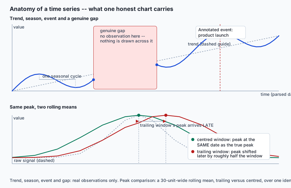
>>> true peak date
2024-04-10
>>> trailing (default) 30-day rolling mean peak date
2024-04-24    (14 days LATE)
>>> centred (center=True) 30-day rolling mean peak date
2024-04-10    (0 days offset)
Fourteen days — close to half the thirty-day window — is not a
coincidence or an edge case. A trailing window cannot report its own
maximum until the true peak has fully entered its backward-looking
span, which structurally happens roughly half a window-width after the
real event. rolling(30, center=True) removes the lag entirely by
looking both backward and forward around each point, at the direct cost
of being unusable in real time, since it needs observations that have
not happened yet relative to the date it is reporting on. This is not a
minor implementation detail. A trailing thirty-day accuracy chart on a
model-monitoring dashboard reports a real regression two weeks after it
actually started, every single time, by the geometry of the window
alone — a fact the AI thread below returns to directly.
Trend versus seasonality, kept practical
A year-over-year overlay — plotting several years of a seasonal series on one shared calendar axis — is the practical tool for separating a genuine trend from the seasonal cycle riding on top of it, but it only works if the years are aligned correctly. The naive approach, comparing by raw ordinal day-of-year, breaks silently across a leap year:
>>> Dec 31, 2024 (a leap year) -- ordinal day of year
366
>>> Dec 31, 2025 (not a leap year) -- ordinal day of year
365
Same calendar date, two different ordinal numbers, purely because 2024
has one more day (Feb 29) threaded in before it than 2025 does. Every
comparison drawn from “day 300 of this year versus day 300 of last year”
across that boundary compares two different calendar dates without
anyone choosing to. Aligning instead by the actual (month, day) pair —
ignoring the year — keeps Dec 31 lined up with Dec 31 correctly in both
years, and isolates Feb 29 as its own row that simply has no counterpart
in the non-leap year (a NaN, honestly, rather than a silent shift). The
practical rule this teaches generalizes beyond leap years: comparing
“December to November” within one series is usually a mistake too, for
the same underlying reason — a seasonal series’ honest comparison is
almost always to the same period a year ago, not to the adjacent
period, because adjacent periods differ by both trend and season at
once, and a year-ago comparison holds season fixed.
Log scale for growth
A log-scaled y-axis turns equal multiplicative changes into equal visual distances, which makes it the practical eye-test for constant percentage growth. A series growing by a fixed 5% every period has logged values that increase by exactly the same amount every step — a straight line, measured here as a log-difference standard deviation of essentially zero:
>>> log-difference std, constant 5%-per-period growth
3.0e-16   (floating-point noise around exactly zero)
>>> log-difference std, constant linear (+5 units per period) growth
9.5e-3    (measurably curved, not a straight line)
Constant linear growth — the same absolute increase every period — is not collinear in log space at all; its logged values curve, because the same absolute increase is a shrinking percentage of an ever-larger base. This is the practical difference between compounding and linear growth, readable by eye rather than by computing a growth rate directly. Day 128 already established the sharp edge of the same axis: a zero value has no logarithm and silently disappears from a log-scaled chart without any error — worth repeating here because it is exactly the kind of failure that looks like nothing went wrong.
Gaps and interpolation
matplotlib draws exactly the points it is given, connected in order,
with one specific exception: it breaks the line at an explicit NaN.
Those are two very different behaviours, and this lesson’s fifth
exercise measures both directly on the same twenty-row series:
>>> a physically missing row (dropped entirely, 19 of 20 rows remain)
line length: 19, contains NaN: False   -- drawn as ONE continuous segment
>>> the same gap as an explicit NaN (all 20 rows present)
line length: 20, contains NaN: True    -- the line genuinely BREAKS here
A dropped row and an explicit NaN describe the exact same missing
observation, and matplotlib treats them completely differently. The rule
this teaches is not “always fill missing values” — it is the opposite:
reindex to the full expected period before plotting, so a missing
observation becomes visible as a missing observation, rather than
being silently absorbed into a straight line connecting its two
neighbours as if nothing had happened. series.reindex(full_index)
performs exactly this conversion, turning an invisible absence into an
honest, visible one.
Spaghetti charts and small multiples
Overlaying many series on one set of axes — a spaghetti chart — degrades
fast: past roughly five or six overlaid lines, color and legend alone
stop being enough to tell one series from another, especially once two
lines cross. The practical fix is small multiples: one panel per series,
sharing axis scales so the panels stay directly comparable, arranged in
a grid (plt.subplots(n, 1, ...) or similar) rather than crowded onto
one shared plot. There is no single universally correct threshold, but
“can a reader follow one specific line from the legend to the chart in
under two seconds” is a practical test, and once the answer is no, small
multiples are the honest choice, not a stylistic preference.
Annotating events
A time series shown without its context invites a reader to invent one. A sudden change with no annotation gets explained by whatever story the reader already believes; the same change with a dashed vertical line and a two-word label — “product launch,” “outage begins,” “pricing changed” — gets explained by what actually happened. Annotating a known event directly on the time axis (a vertical line plus a short text label, as this lesson’s architecture diagram shows) costs almost nothing to add and removes an entire category of misreading.
Timezones and DST, honestly
A daily aggregation of hourly, timezone-aware data spans exactly one real Daylight Saving Time boundary of each kind per year, in any timezone that observes it, and the resulting day genuinely does not contain twenty-four hours:
>>> hourly America/New_York readings resampled to daily counts
2024-03-08 (ordinary day)  -> 24 hours
2024-03-10 (spring forward) -> 23 hours
2024-11-03 (fall back)      -> 25 hours
This is not a data-quality bug to filter out. Clocks in
America/New_York genuinely skip the local hour 2:00–3:00 AM on the
spring-forward date and genuinely repeat 1:00–2:00 AM on the fall-back
date, and any per-hour rate for that specific day computed with a
hardcoded /24 divisor is measurably wrong on exactly those two days a
year. The defensive pattern this lesson’s exercise 9 uses — building
timestamps in UTC first, converting to the local zone only afterward —
avoids ever constructing a local wall-clock time that does not exist
(the skipped hour) or is ambiguous (the repeated one), which is the
safest order of operations regardless of which timezone library or
language you are working in.
An everyday analogy
Picture a nurse checking a patient’s temperature. If she writes down a reading every hour on the hour, a fever that spikes and breaks between two of her checks never appears in the chart at all — not because nothing happened, but because nothing was sampled while it was happening. That is aliasing: the true event was faster than the checking interval, and the chart shows a false picture of steady health with nothing to warn anyone that a fast-moving fever could hide entirely between two adjacent dots.
Now picture a different nurse who is asked, at the end of a week, “how
was the patient’s temperature this week?” One honest answer is the
average temperature across the week (the “typical” value — a .mean()).
A different, equally honest answer is the highest temperature reached
(a different aggregate entirely — closer to a .max() than the .sum()
and .last() this lesson exercises directly, but the same underlying
point: which number you report is a decision about which question
you’re answering, not a neutral summary of “the data”). And if the
nurse simply forgot to check on Tuesday — no reading exists for that day
at all — writing down Monday’s number again for Tuesday (connecting
straight across the gap) tells a very different story than an honest
chart with a visible blank where Tuesday should be.
Examples in practice
Every number below is captured from a real run on pandas 3.0.5, matplotlib 3.11.1 and NumPy 2.5.2, in this lesson’s own lab.
The opening gap, in full. Forty-five daily rows: thirty-one from 2024-01-01 through 2024-01-31, then a genuine fourteen-day break, then fourteen more from 2024-02-15 through 2024-02-28.
>>> plotted against range(len(df))
x-step values: {1.0}
>>> plotted against the parsed date column
x-step values (days): {1.0, 15.0}   -- one wide step, forty-three ordinary ones
Resample as a claim. Ninety days, value equal to the day number.
>>> January 2024, three different monthly summaries
mean: 16.0    sum: 496.0    last: 31.0
Aliasing. A cosine with a true four-day period, sampled every fifth day.
>>> true period: 4 days   sampling interval: 5 days
>>> observed period in the downsampled series: 20 days
Trailing lag. A single triangular peak, 200 days, a 30-day rolling mean.
>>> true peak vs. trailing (default) rolling mean peak
offset: +14 days (late)
>>> true peak vs. centred rolling mean peak
offset: 0 days
Missing row versus NaN. Twenty daily rows, one value dropped versus
the same value set to NaN.
>>> physically missing row: 19 points plotted, no NaN, one continuous line
>>> explicit NaN: 20 points plotted, NaN present, line genuinely breaks
Log straightness. Sixty periods of 5%-per-period growth versus sixty periods of a fixed +5-units-per-period growth, both starting at 100.
>>> log-difference standard deviation
percentage growth: 3.0e-16 (a straight line)   linear growth: 9.5e-3 (a curve)
Leap-year alignment.
>>> Dec 31 ordinal day-of-year
2024 (leap): 366    2025 (not leap): 365
Small multiples. Six distinct series faceted into one panel each.
>>> figure Axes count: 6 lines per Axes: 1 (every one of them)DST honesty. Hourly America/New_York data resampled to daily
counts.
>>> 2024-03-08 (ordinary): 24 hours
>>> 2024-03-10 (spring forward): 23 hours
>>> 2024-11-03 (fall back): 25 hours
Implications: security, privacy, performance, scalability, and cost
Security and privacy. A time series axis is itself a disclosure surface. A finely time-stamped chart of, say, badge-in events for one individual can leak behavioural patterns (when someone is reliably away from a location) that a coarser or intentionally jittered time axis would not. This lesson’s own data is entirely invented literals — dates, a cosine, a triangular bump — precisely so nothing plotted here is real personal or operational data.
Performance. resample and rolling are both implemented in
pandas’ compiled core and scale to millions of rows comfortably; the
practical performance ceiling in this space is almost always the plot
itself, not the aggregation feeding it — a matplotlib line with a
million points renders slowly and exports a bloated file regardless of
how fast the resample that produced it ran, which is exactly the
motivation for downsampling for display (a legitimate use, done
carefully) as distinct from the aliasing failure this lesson warns
against (downsampling that silently changes the meaning of the
signal).
Scalability. Small multiples scale to dozens of series by adding panels, at a real cost: readability degrades once the grid no longer fits on one screen or printed page, at which point interactive tools (the next section) that let a reader select which series to see become the more scalable choice than a fixed static grid.
Cost. Every technique and every number in this lesson comes from free, open-source tooling — pandas, matplotlib, NumPy — with no paid tier anywhere in the chain, matching this lesson’s lab exactly.
Alternatives: free, open source, and commercial
pandas’ resample/rolling and the .plot accessor (ran, exactly
as shown throughout this lesson). Free, BSD 3-Clause, no paid tier. The
default choice for any time series work already in a DataFrame — reach
for it first, always.
matplotlib date locators and formatters (ran — matplotlib.dates
supplies the MonthLocator/DateFormatter machinery this lesson’s “how
it works” section describes). Free, PSF-derived/BSD-style license, no
paid tier. The layer underneath every static chart in this lesson and
this lab.
seaborn (not run in this lesson’s own lab — Days 129 and 130 already cover its statistical-plotting layer directly, and none of this lesson’s nine exercises needed anything seaborn adds on top of plain matplotlib). Free, BSD 3-Clause. Choose it when a statistical estimate (a mean with a confidence band) needs to ride on top of a time axis; every fact this lesson establishes about the axis itself applies underneath it exactly the same way.
Plotly (described from documentation only; not run here). Free, MIT
core library, with a paid Dash Enterprise tier for deployment
infrastructure — the open-source charting itself carries no cost. Choose
it for interactive zooming and panning on a genuinely long series (years
of daily or hourly data) in a notebook or a web page, where a static
image cannot let a reader scrub into a specific week. import plotly.express as px; px.line(df, x="date", y="value") is the one-line
entry point per its own documentation.
Bokeh (described from documentation only; not run here). Free, BSD 3-Clause, fully open source with no paid tier of any kind. A comparable choice to Plotly for browser-based interactive zooming on long series, with a lower-level API that trades some of Plotly’s convenience for more direct control over the rendered plot.
Comparison with related concepts
| Concept | What it actually is | Where this lesson touches it |
|---|---|---|
| Groupby (Day 123) | Aggregating rows by a fixed category label already present in a column | resample is groupby with the “category” replaced by a slice of elapsed time |
| Forecasting / ARIMA | Modeling and predicting future values of a series | Entirely out of scope here; this lesson is only about drawing the series correctly, never about extrapolating it |
| Smoothing (rolling mean) | Reducing short-term noise by averaging a local window | Covered directly, with the trailing-versus-centred distinction as the load-bearing fact |
| Signal-processing aliasing | The classical sampling-theorem failure from electrical engineering | The same phenomenon, reproduced here with a plain cosine and no signal-processing background required |
| Data cleaning (Day 125) | Fixing incorrect, duplicated or malformed values | Distinct from this lesson’s missing-row-versus-NaN section, which is about display, not correction — the underlying gap is real and should stay visible, not be filled in |
| Chart honesty / misleading scales (Day 132) | Deceptive axis truncation, dual axes, and similar | This lesson shows a genuine log axis; Day 132 covers when an axis choice crosses from a legitimate technique into deception |
When to use it — and when not to
Use a real DatetimeIndex and the techniques in this lesson whenever
observations are tied to specific moments and the timing of those
moments — their spacing, their gaps, their cycles — is itself part of
what the chart needs to communicate: sensor readings, financial series,
event logs, model-monitoring metrics, anything where “when” is not
incidental.
Do not reach for a DatetimeIndex (or resample/rolling) when the
x-axis is genuinely categorical rather than temporal — product names,
survey questions, geographic regions — even if a date happens to be
associated with each row elsewhere in the table; forcing a categorical
comparison through time series machinery buys nothing and can actively
mislead, implying a temporal relationship (adjacency, spacing) between
categories that has no real meaning. Do not resample purely to “clean
up” a chart’s visual density without first deciding which aggregation
answers the actual question being asked — that decision belongs to the
person asking the question, not to whichever default the plotting call
happened to use. And do not treat a downsampled or heavily smoothed
chart as safe for detecting fast-moving problems: this lesson’s
aliasing and trailing-lag sections both show, with real numbers, that
coarsening a time axis can hide or misdate exactly the events a
monitoring chart exists to catch.
Knowledge check
The eight questions in this lesson’s quiz cover: index-versus-datetime axis behaviour, resample aggregation choice, aliasing, trailing-window lag, missing-row-versus-NaN, leap-year alignment, log-scale growth detection, and Daylight Saving Time honesty. Work through them after the hands-on exercise below, once you have run the real numbers yourself rather than only read them here.
Hands-on exercise
Complete the lab at
labs/sections/math-statistics-and-data/day-131-time-series-visualization/.
Nine numbered exercises, seventeen tests, entirely headless via
matplotlib’s Agg backend, asserting on real x-positions, resample
outputs, rolling-window offsets and artist state — never on what a plot
merely looks like. Work through starter/00_brief.md and
starter/test_timeseries.py in order; read examples/ only after you
have tried each exercise yourself.
cd labs/sections/math-statistics-and-data/day-131-time-series-visualization
python3 -m venv .venv
.venv/bin/pip install -r requirements/requirements.txt
.venv/bin/pytest starter -v
Expected output
An untouched checkout reports:
17 skipped in 0.01sThe fully worked reference suite reports:
17 passed in 0.05sAnd the full harness:
17 checks, 0 failure(s)exiting 0.
Validate your work
bash tests/run_tests.sh
echo "exit code: $?"
Confirm the exit code is 0 and the final printed line reads
17 checks, 0 failure(s). Individually, confirm your own exercise 3
reports an observed spurious period of 20 days (not 4), your
exercise 4 reports a trailing offset between 10 and 20 days with a
centred offset of exactly 0, and your exercise 9 reports 23 hours
for 2024-03-10 and 25 for 2024-11-03.
Troubleshooting
Full list in troubleshooting.md. The two most common: running
pytest examples starter together aborts with import file mismatch
because both directories define a module with the same name — always run
them as two separate commands; and a ZoneInfoNotFoundError in exercise
9 means your platform has no installed IANA timezone database — install
the pure-Python fallback with .venv/bin/pip install tzdata.
Common mistakes
Hardcoding a captured number (the four resample values, the aliasing
period, the trailing offset) instead of computing it from the fixture
functions in data.py is the single most common way to pass an exercise
without actually proving the claim it is meant to prove — if the
underlying construction ever changes, a hardcoded assertion silently
stops testing anything real.
Practice assignment
Take any dataset you already have with a genuine date or timestamp
column (or build one honestly from something you track personally —
daily step counts, expenses, anything with real irregular gaps). Load
it with parse_dates, and produce three charts: one plotted against a
plain row index and one against the real datetime, side by side, to find
out whether your data has a hidden gap the index version would hide;
a resampled monthly chart using the aggregation that actually answers
your real question, captioned with which question that is; and a
trailing-versus-centred rolling mean over the same window size, with the
measured lag between their two peaks written down as a number, not just
eyeballed.
Extension challenge
Reproduce this lesson’s aliasing exercise with a real daily signal you can reason about — day-of-week retail traffic, say, which genuinely cycles every seven days — sampled at a coarser interval than seven days, and predict the spurious period before you compute it, using the same arithmetic this lesson’s “how it works” section walked through (true period, sampling interval, and the resulting phase drift per sample). Then verify your prediction against the actual downsampled series. Getting the prediction right before checking is the real test of whether you understand aliasing as a mechanism rather than as a fact you memorized.
AI thread
Model monitoring is time series visualization wearing a different name, and this lesson’s two sharpest measured facts are exactly the two ways a monitoring dashboard lies to the team relying on it. A trailing-window accuracy chart — the default, and the only kind usable in a genuinely live system — reports a real regression roughly half a window-width after it actually started, measured here as fourteen days late on a thirty-day window; a team watching that chart for an early warning is, by the geometry of the window alone, always looking at old news. And a dashboard that resamples per-prediction accuracy down to a weekly figure “to reduce noise” can hide a genuine daily failure entirely, for exactly the reason this lesson’s aliasing exercise demonstrates with a plain cosine: coarsening a sampling interval below the frequency of the thing you are trying to detect does not make the chart blurrier, it can make the chart confidently, convincingly wrong, showing a stable trend where the underlying process was actually breaking on a schedule the sampling interval was too coarse to see. Neither failure announces itself. Both render as a perfectly normal-looking line chart, which is the entire reason this lesson insists on checking the axis, the aggregation, and the sampling interval directly, in numbers, rather than trusting that a chart which looks finished is a chart that is telling the truth.
Quiz
Q1. A daily series has a real fourteen-day gap where a sensor was offline. It is plotted twice: once against `range(len(df))`, once against the parsed datetime column. What happens to the gap in each case?
- The index plot hides the gap completely; the datetime plot shows it as a wider step between two points
- Both plots show the gap clearly, since matplotlib always detects missing dates automatically
- The index plot shows the gap; the datetime plot hides it
- Neither plot can show a gap unless the missing rows are explicitly filled with NaN first
Show answer
Answer: A. The index plot hides the gap completely; the datetime plot shows it as a wider step between two points
Plotted against a plain row index, consecutive rows are always exactly one unit apart regardless of what dates they actually represent -- the fourteen-day gap is completely invisible. Plotted against the parsed datetime, the x-position of each point is its real calendar date, so the gap shows up as one measurably wider step among an otherwise uniform run of one-day steps. No NaN-filling is needed for the datetime axis to reveal it; the parsed dates alone are enough.
Q2. The same ninety-day series is resampled to monthly `.mean()`, `.sum()` and `.last()`. What should you expect about the three results for the same month?
- All three are always identical, since resample always applies the same underlying computation
- They are three different, equally true numbers, each answering a different question about that month
- Only `.sum()` and `.mean()` can differ; `.last()` always equals `.mean()` for a monotonic series
- Resampling to more than one aggregation at once is not supported by pandas
Show answer
Answer: B. They are three different, equally true numbers, each answering a different question about that month
Mean, sum and last are three different statistics computed from the same underlying rows, and each answers a different question: sum answers "how much total activity happened", mean answers "what was a typical value", and last answers "what was the most recent reading by month's end". Choosing an aggregation is a claim about which of those questions the chart is meant to answer, not a neutral technical step.
Q3. A signal with a true period of 4 days is sampled every 5 days. What does the resulting downsampled series show?
- A smoother, lower-resolution version of the same 4-day cycle
- A flat, constant series, since 5 does not evenly divide 4
- The same 4-day period, simply drawn with fewer points per cycle
- A false, longer period (20 days in this case) that exists nowhere in the true signal
Show answer
Answer: D. A false, longer period (20 days in this case) that exists nowhere in the true signal
This is aliasing: sampling below a signal's true frequency does not just reduce resolution, it can manufacture a completely different, false period. For a 4-day true cycle sampled every 5 days, the sampled sequence repeats every 4 samples -- 20 real days -- a spurious period five times longer than the real one, with nothing in the source signal actually varying on a 20-day cycle.
Q4. A 30-day rolling mean is drawn over a series with one sharp peak, using pandas' default (trailing) window. Where does the rolling mean's own peak land relative to the true peak?
- Exactly on the true peak, because rolling averages are always centred by default
- Roughly 15 days before the true peak
- Roughly 15 days after the true peak
- The rolling mean has no well-defined peak of its own
Show answer
Answer: C. Roughly 15 days after the true peak
pandas' rolling() defaults to a trailing window, which at any point only looks backward over the last 30 observations. The trailing mean cannot report its own maximum until the true peak has fully entered that backward-looking window, which happens roughly half the window's width -- about 15 days for a 30-day window -- after the real peak occurred. A centred window (center=True) does not have this problem.
Q5. A series has one row physically dropped (not present in the DataFrame at all) versus a second version of the same series with that row's value set to NaN instead. How does matplotlib draw each one?
- Both are drawn identically, since matplotlib treats a missing row the same as a NaN
- The missing-row version connects straight across the gap; the NaN version breaks the line there
- The missing-row version shows a visible break; the NaN version connects straight across it
- Neither can be plotted without first calling dropna() or fillna()
Show answer
Answer: B. The missing-row version connects straight across the gap; the NaN version breaks the line there
matplotlib only knows about the data points it is actually given. A physically absent row simply means one fewer point exists, so the line is drawn as one continuous segment connecting the points on either side of the gap -- nothing marks that anything is missing. An explicit NaN value, by contrast, genuinely breaks the drawn line at that position. Reindexing a series to its full expected date range converts the first case into the second, which is the honest way to plot it.
Q6. Two years of daily data are aligned for a year-over-year overlay: one is a leap year (366 days), the other is not (365). Aligning by raw ordinal day-of-year instead of by calendar (month, day) produces what result?
- Every date after Feb 29 is misaligned by one day, because the leap year has one extra day threaded in before them
- No difference at all -- ordinal day-of-year and calendar date always agree
- Every date before Feb 29 is misaligned, but dates afterward line up correctly
- The overlay simply fails to render, since pandas rejects mismatched year lengths
Show answer
Answer: A. Every date after Feb 29 is misaligned by one day, because the leap year has one extra day threaded in before them
Ordinal day-of-year counts from Jan 1, so Dec 31 is day 366 in a leap year but day 365 in a non-leap year -- the same calendar date, two different ordinal numbers. Everything up to and including Feb 28 lines up fine by either method, but Feb 29 in the leap year has no matching ordinal number in the non-leap year, and every date from Mar 1 onward is shifted out of true calendar alignment if compared by raw ordinal number instead of by (month, day).
Q7. A series grows by a constant 5% every period. Plotted on a log-scaled y-axis, what should the result look like, and why?
- A curve bending upward, because percentage growth always accelerates visually
- A perfectly straight line, because a log axis converts constant multiplicative growth into constant additive steps
- A perfectly flat horizontal line, because percentages are already normalized
- The plot cannot be drawn at all if any value in the series is ever exactly zero
Show answer
Answer: B. A perfectly straight line, because a log axis converts constant multiplicative growth into constant additive steps
A log-scaled axis turns equal multiplicative changes into equal visual (additive) distances. Constant percentage growth means the ratio between consecutive values never changes, so the logged values increase by the same fixed amount every period -- a straight line. Linear (constant absolute) growth does not have this property and shows up as a curve instead, which is exactly why a log axis is the practical test for distinguishing compounding from linear growth by eye. (A zero value would indeed break a log axis, per Day 128, but that is a separate concern from the shape question here.)
Q8. Hourly, timezone-aware data for a US city is resampled to daily counts across a Daylight Saving Time boundary. What should the count be on the day the clocks move forward in spring?
- Always 24, because a calendar day is always 24 hours by definition
- It depends only on whether the data was stored in UTC or local time, not on the transition itself
- 25, because the transition duplicates an hour rather than skipping one
- 23, because the local hour that gets skipped removes one hourly reading from that calendar day
Show answer
Answer: D. 23, because the local hour that gets skipped removes one hourly reading from that calendar day
When clocks move forward, one local hour (in the US, typically 2:00-3:00 AM) does not exist that day, so an hourly series resampled to daily counts genuinely has only 23 readings for that specific calendar day. The corresponding autumn transition, when clocks move back, repeats one local hour and produces a 25-hour day instead. Both are real, measurable facts about that day in that timezone, not an artifact of how the data happened to be stored.
Glossary
- DatetimeIndex
- A pandas index whose entries are real timestamps rather than plain integers or strings. Produced by passing parse_dates to a loader (Day 121) or by pd.date_range, it is what unlocks date-string slicing, resample and rolling by time, and axis formatting that understands months and years -- none of which a RangeIndex or a string column can do.
- resample
- A pandas method that groups a DatetimeIndex-ed series or frame into fixed time buckets (for example one bucket per calendar month) and then applies an aggregation to each bucket, extending Day 123's groupby from a fixed set of category labels to buckets defined purely by elapsed time.
- aliasing
- The phenomenon in which sampling a periodic signal below its own frequency does not simply lose detail but manufactures a specific, different, false period in the sampled data -- a pattern that exists nowhere in the underlying signal and is entirely a product of the sampling interval chosen.
- rolling window
- A computation (commonly a mean) applied to a sliding span of consecutive observations rather than to the whole series at once, smoothing short-term noise while preserving slower movement. pandas' rolling() method supports both trailing (the default) and centred windows.
- trailing window
- A rolling window whose span, at any given point in time, covers only observations up to and including that point -- never any future observation. Because it can only "look backward", a trailing window's own peak necessarily lags the true peak it is summarizing by roughly half the window's width.
- centred window
- A rolling window (rolling(..., center=True) in pandas) whose span is positioned symmetrically around each point in time, using both past and future observations relative to it. A centred window's peak lines up with the true peak exactly, at the cost of being unusable in a live, real-time setting where future observations do not yet exist.
- reindex
- A pandas operation that conforms a series or frame to a new, explicitly given index, introducing NaN for any position present in the new index but absent from the original. Reindexing a gapped time series to its full expected date range is what converts a silently missing row into an explicit, visible NaN.
- spaghetti chart
- A single set of axes carrying so many overlaid line series that individual lines become impossible to distinguish by color or position alone. The practical fix past a small series count is small multiples -- one panel per series, sharing axes for comparability.
- small multiples
- A grid of individually small charts, one per category or series, sharing the same axis scales so they remain directly comparable. The standard remedy for a spaghetti chart once the series count exceeds roughly five or six lines on one set of axes.
- year-over-year overlay
- A chart that plots multiple years of a seasonal series on a shared calendar axis (day or month of year) so that comparable periods -- the same month or the same day -- line up directly across years. Correct alignment requires matching by calendar month and day, not by raw ordinal day-of-year, or a leap year silently shifts every date after Feb 29 out of alignment.
- Daylight Saving Time (DST) boundary
- The specific date on which a timezone observing Daylight Saving Time shifts its clocks forward (losing one hour, producing a 23-hour local day) or backward (repeating one hour, producing a 25-hour local day). A daily resample of hourly, timezone-aware data spans exactly one such day of each kind per year in a DST-observing zone.
- log-scaled axis
- An axis on which equal visual distances represent equal multiplicative (percentage) changes rather than equal additive changes. A series growing by a constant percentage every period is collinear (a straight line) on a log-scaled axis, while constant additive (linear) growth is not; Day 128 additionally established that a zero value has no logarithm and silently vanishes from a log axis.
Sources and further reading
- Time series / date functionality — pandas development team (accessed 2026-08-20)
- pandas.DataFrame.resample — pandas development team (accessed 2026-08-20)
- Date tick locators and formatters — Matplotlib Development Team (accessed 2026-08-20)
- Windowing operations — pandas development team (accessed 2026-08-20)
- Chart visualization — pandas development team (accessed 2026-08-20)
Kept in this browser, no account needed. Your progress page turns the whole record into one link you can bookmark or open on another device.